- Getting Started
- Administration Guide
-
User Guide
- An Introduction to Wyn Enterprise
- Document Portal for End Users
- Data Governance and Modeling
- Working with Resources
- Working with Reports
-
Working with Dashboards
- Dashboard Designer
- Selecting a Dataset
- Data Attributes
- Dashboard Scenarios
- Dashboard Templates
- Component Templates
- 3D Scene
- Explorer
- Visualization Wizard
- Data Analysis and Interactivity
- Dashboard Appearance
- Preview Dashboard
- Export Dashboard
- Dashboard Lite Viewer
- Using Dashboard Designer
- Animating Dashboard Components
- Document Binder
- Dashboard Insights
- Add a New Page in Dashboard Designer
- View and Manage Documents
- Understanding Wyn Analytical Expressions
- Section 508 Compliance
- Subscribe to RSS Feed for Wyn Builds Site
- Developer Guide
Customize Dashboard Tooltip
Tooltips allow users to display the selected data information for plots by hovering over the dashboard scenarios. This topic will give the details about customizing the dashboard tooltips.
You can customize the tooltip while creating a dashboard or you can open the existing one where you want to add the customized tooltip and edit it, using the Inspector tab.
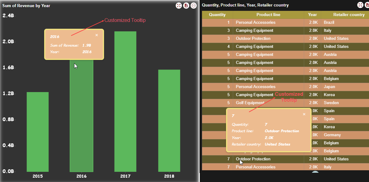
We are creating a dashboard with a Column Chart and a Data Table scenarios, and we will customize the dashboard tooltip in this example. Follow the steps below to customize the tooltip.
On the Document Portal, go to Create (+) > Create Dashboard.
Add a Column Chart Scenario
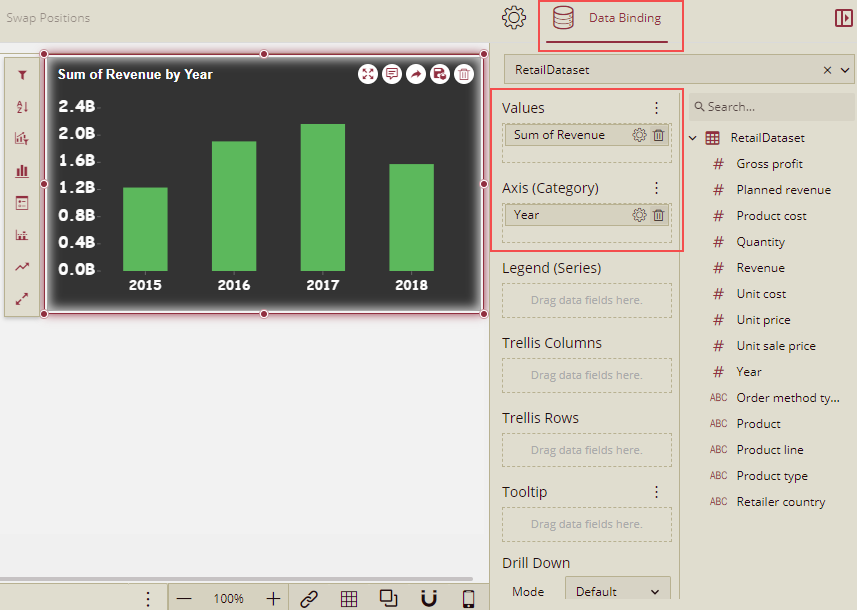
From the Data Visualization tab on the left of the dashboard designer, drag and drop a Column Chart on the design area.
From the Data Binding tab on the right, select Retail Dataset, which is already available to us. We will use this chart to analyze the revenue generated vs year.
Drag and drop the data fields as follows and see how the chart title is automatically generated.
Data Binding Property
Field
Values
Revenue
Axis (Category)
Year
Add a Data Table Scenario
From the Data Visualization tab on the left of the dashboard designer, drag and drop a Data Table on the design area.
From the Data Binding tab on the right, select Retail Dataset, which is already available to us.
Drag and drop the data fields as follows and see how the chart title is automatically generated.
Data Binding Property
Field
Columns
Quantity, Product Line, Year, Retailer Country
Tooltip
Product
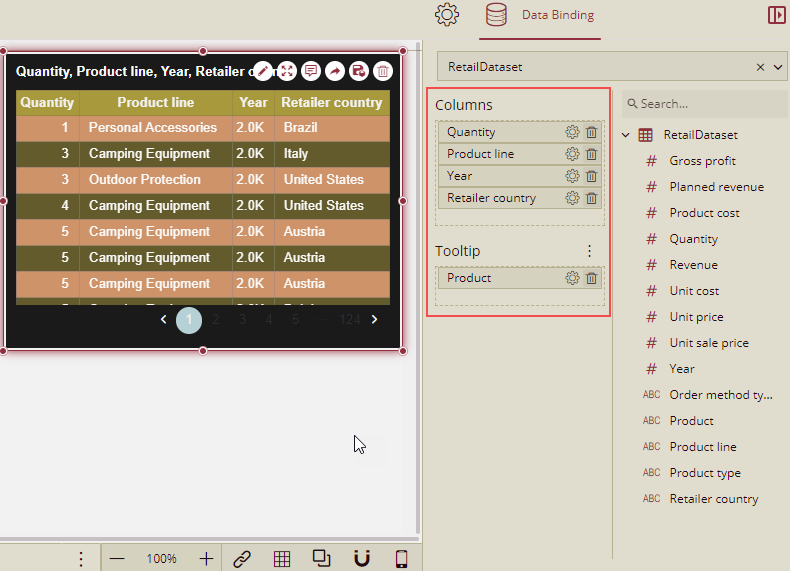
Note: To display the tooltip for the Data Table scenario, you need to set the Tooltip Mode to Show under the Inspector tab. For more details, refer topic Customize Scenario Tooltip
Customize Dashboard Tooltip
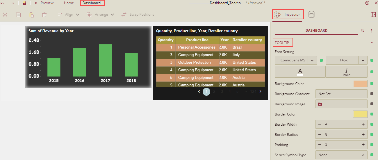
Click the Dashboard tab. You can see the Tooltip properties under the Inspector tab on the right side of the design area.
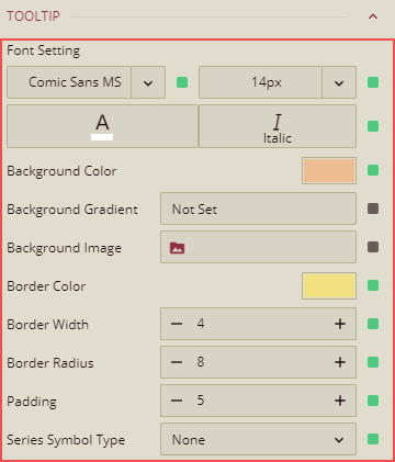
All the properties of the tooltip are defined below in the table.
Tooltip Property
Description
Font Setting
Set the dashboard tooltip text font family, font size, font color, and font style using these property options.
Background Color
Set the background color of the tooltip by selecting a color from the color palette using this property.
Background Gradient
Set the background gradient style and color of the tooltip by selecting a color from the color palette using this property.
Background Image
Add an embedded, shared, or external image as a background image for the tooltip.
Border Color
Set the border color of the tooltip using this property.
Border Width
Set the border thickness of the tooltip using this property.
Border Radius
This is the corner radius of the tooltip.
Padding
To create space around the tooltip text, set a padding value.
Series Symbol Type
This is applicable for the single scenario tooltip. For this, the Tooltip Mode of the dashboard scenario has to be set to Category. It has the following options: None, Circle (Default), Line, and Square.
In this example, we have set the dashboard properties as shown below in the image.
Click Preview and hover the mouse over the dashboard. The customized tooltip will be displayed.
The dashboard tooltip content is generated on its own. If you want to change the text of the content for each scenario, then you need to go to the tooltip settings to edit the content in the 'Tooltip Setting' dialog. For more details, refer topic Customize Scenario Tooltip
Note: The tooltip settings set in the 'Tooltip Setting' dialog (for a particular scenario) have priority over the Dashboard Tooltip settings.