- Getting Started
- Administration Guide
-
User Guide
- An Introduction to Wyn Enterprise
- Document Portal for End Users
- Data Governance and Modeling
- Working with Resources
- Working with Reports
-
Working with Dashboards
- Dashboard Designer
- Selecting a Dataset
- Data Attributes
- Dashboard Scenarios
- Dashboard Templates
- Component Templates
- 3D Scene
- Explorer
- Visualization Wizard
- Data Analysis and Interactivity
- Dashboard Appearance
- Preview Dashboard
- Export Dashboard
- Dashboard Lite Viewer
- Using Dashboard Designer
- Animating Dashboard Components
- Document Binder
- Dashboard Insights
- Add a New Page in Dashboard Designer
- View and Manage Documents
- Understanding Wyn Analytical Expressions
- Section 508 Compliance
- Subscribe to RSS Feed for Wyn Builds Site
- Developer Guide
Dynamic Display of Components
You can control the Visibility of the scenarios while designing the dashboard and you can change their visibility on the viewer using the Click Action commands. So, you can display and hide some components dynamically.
Like, while creating a dashboard, you might want to include too many charts, like the summary data and the detailed data, and show the details data when clicking on a button or clicking on a component. So, you can Control the Scenario Visibility on the designer and customize the scenarios based on the Click Action Commands
Control the Scenario Visibility in the Designer
Add a dashboard scenario. We are taking a Column Chart in this example. Go to the Inspector tab and set the Visibility to True under Appearance.
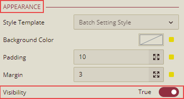
The Chart scenario will be visible on Preview.
Note: From the Inspector tab, if the Visibility is set to False under Appearance, then the Chart Scenario will not be visible on Preview.
Customize the scenarios based on the Click Action Commands.
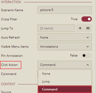
You can change the visibility of the scenario in the viewer, like showing the details data when clicking on a button or clicking on a component. For this, you need to set the Click Action Commands. You need to add an Image Component and on the Inspector tab, set the Image Click Action as Command.
Click  to add the command.
Command Setting dialog box is displayed.
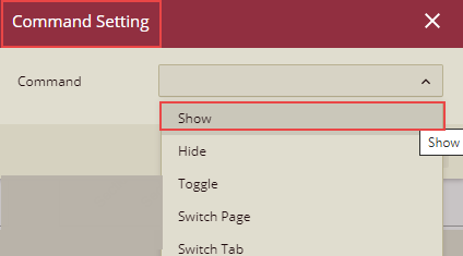
Note: Click Action-> Command Settings is only available in the Image component.
The following commands are displayed on the Command Setting dialog box.
Command | Description |
|---|---|
Show | This will show the hidden scenario on the Image click. |
Hide | This will hide the scenario on the Image click. |
Toggle | When this option is selected, the Image will work as a Toggle button to Show and Hide the scenario. |
Switch Page | This command is used to Switch from one page to another. |
Switch Tab | This command is used to Switch from one tab to another in the tab container. |
Each command listed above in the table has some properties as listed below:
Command | Property |
|---|---|
Show | Scenario: This is the scenario for which the command is set to show. Entrance Animation: Show command supports the following Entrance animations None\Fade In\From Top\From Bottom\From Left\From Right. This is the entrance animation for the scenario that is hidden and will be displayed on the click of the Image component. Delay(s): This sets the delay time for the scenario to enter or exit at the click of the image. This property is not shown when the Entrance and Exit animation is set to 'None'. Duration(s): This sets the duration it takes for the scenario to enter or exit at the click of the image. This property is not shown when the Entrance and Exit animation is set to 'None'. |
Hide | Scenario: This is the scenario for which the command is set. Entrance Animation: Show command supports the following Entrance animations None\Fade In\From Top\From Bottom\From Left\From Right. This is the entrance animation for the scenario that is hidden and will be displayed on the click of the Image component. Exit Animation: Show command supports the following Exit animations None\Fade out\To Top\To Bottom\To Left\To Right. This is the exit animation for the scenario that will be hidden on the click of the Image component. Delay(s): This sets the delay time for the scenario to enter or exit at the click of the image. This property is not shown when the Entrance and Exit animation is set to 'None'. Duration(s): This sets the duration it takes for the scenario to enter or exit at the click of the image. This property is not shown when the Entrance and Exit animation is set to 'None'. |
Toggle | Scenario: This is the scenario for which the command is set. Entrance Animation: Show command supports the following Entrance animations None\Fade In\From Top\From Bottom\From Left\From Right. This is the entrance animation for the scenario that is hidden and will be displayed on the click of the Image component. Exit Animation: Show command supports the following Exit animations None\Fade out\To Top\To Bottom\To Left\To Right. This is the exit animation for the scenario that will be hidden on the click of the Image component. Delay(s): This sets the delay time for the scenario to enter or exit at the click of the image. This property is not shown when the Entrance and Exit animation is set to 'None' Duration(s): This sets the duration it takes for the scenario to enter or exit at the click of the image. This property is not shown when the Entrance and Exit animation is set to 'None'. |
Switch Page | Page: This refers to the page where the user is directed to, after clicking the Image component. |
Switch Tab | Container: Select a particular TabContainer from the dropdown list as per your requirement. Tab: Select the particular tab of the TabContainer on which you want to go by clicking the image. |
Applying Animation for the show\hide component command
You can provide the animation effect for the show, hide, and toggle command components. You can also set the Delay and loading Duration (in seconds) for the selected animation.
The default value for Delay(s) is 0 seconds, and the default value for Duration(s) is 1.8 seconds.
Listed below are the available Entrance and Exit animations.
Entrance Animation | Exit Animation |
|---|---|
backInDown, backInLeft, backInRight, backInUp | backOutDown, backOutLeft, backOutRight, backOutUp |
bounceIn, bounceInDown, bounceInLeft, bounceInRight, bounceInUp | bounceOut, bounceOutDown, bounceOutLeft, bounceOutRight, bounceOutUp |
fadeIn, fadeInDown, fadeInLeft, fadeInRight, fadeInUp | fadeOut, fadeOutDown, fadeOutLeft, fadeOutRight, fadeOutUp |
slideInDown, slideInLeft, slideInRight, slideInUp | slideOutDown, slideOutLeft, slideOutRight, slideOutUp |
lightSpeedInRight, lightSpeedInLeft | lightSpeedOutRight, lightSpeedOutLeft |
rotateIn, rotateInDownLeft, rotateInDownRight, rotateInUpLeft, rotateInUpRight | rotateOut, rotateOutDownLeft, rotateOutDownRight, rotateOutUpLeft, rotateOutUpRight |
zoomIn, zoomInDown, zoomInLeft, zoomInRight, zoomInUp | zoomOut, zoomOutDown, zoomOutLeft, zoomOutRight, zoomOutUp |
Steps for Customizing the dashboard scenario
Customize using the Toggle Command to toggle the visibility of the scenario.
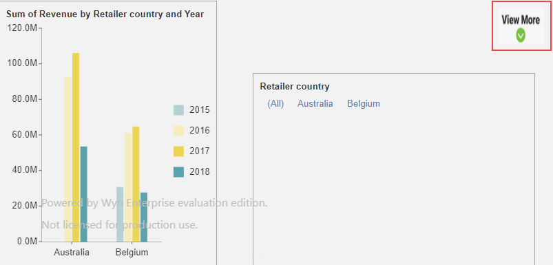
Add Column Chart Scenario
Create a Dashboard.
From the Data Visualization tab on the left of the dashboard designer, drag and drop a Column Chart on the design area.
From the Data Binding tab on the right, select Retail Dataset, which is already available to us. We will use this chart to analyze the revenue generated vs year.
Drag and drop the data fields as follows and see how the chart title is automatically generated.
Data Binding Property | Fields |
|---|---|
Values | Revenue |
Axis (Category) | Retailer Country |
Legend (Series) | Year |
You can add aggregations or other functions to the field in Values, in addition to renaming or adding filters.
5. From the Inspector tab, set the Visibility to True under Appearance.
•
Add a Label Slicer
From the Data Visualization tab on the left of the dashboard designer, drag and drop a Label Slicer on the design area.
From the Data Binding tab on the right, select Retail Dataset.
Drag and drop the data fields as follows.
Data Binding Property | Fields |
|---|---|
Columns | Retailer Country |
You can add aggregations or other functions to the field in Values, in addition to renaming or adding filters.
From the Inspector tab, set the Visibility to False under Appearance.
Now, add an Image Component (we have taken a "View More" image in this example), as shown below.
Now, on the Inspector tab, set the Image Click Action as Command.
Click
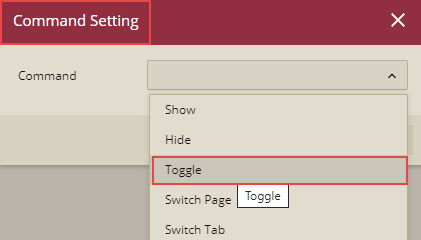
to add the command.Command Setting dialog box is displayed. Select the Toggle command from the dropdown list.
Properties related to the Toggle command are displayed.
Enter the details on the Command Setting dialog box.
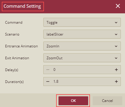
Click the OK button.
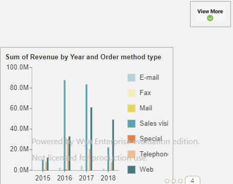
Click Save to save the dashboard and then click Preview.
You will see only one Column Chart (for which the visibility was set to True) and the View More image.
Click the View More image, the Label Slicer scenario will also be displayed along with the entrance animation.
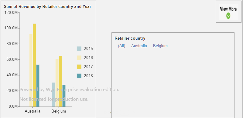
You can now filter the data based on the Slicer condition as well. Like here in this example, you can show the Sum of Revenue based on the selected Retailer Country from the Slicer. Select Australia to display detail only for Australia.
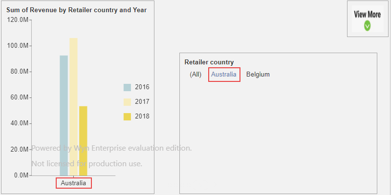
Click again on the View More image, the Slicer Retailer Country will be hidden.
So, the click on the View More image will Toggle the Slicer visibility on Preview.
Few More Cases to customize the dashboard scenarios
You can show or hide a component or a group of a component when clicking on a 'data point' on a component.
You can click on a button to trigger to show or hide a group of the components when previewing the dashboard.