- Getting Started
- Administration Guide
-
User Guide
- An Introduction to Wyn Enterprise
- Document Portal for End Users
- Data Governance and Modeling
- Working with Resources
- Working with Reports
-
Working with Dashboards
- Dashboard Designer
- Selecting a Dataset
- Data Attributes
- Dashboard Scenarios
- Dashboard Templates
- Component Templates
- 3D Scene
- Explorer
- Visualization Wizard
- Data Analysis and Interactivity
- Dashboard Appearance
- Preview Dashboard
- Export Dashboard
- Dashboard Lite Viewer
- Using Dashboard Designer
- Animating Dashboard Components
- Document Binder
- Dashboard Insights
- Add a New Page in Dashboard Designer
- View and Manage Documents
- Understanding Wyn Analytical Expressions
- Section 508 Compliance
- Subscribe to RSS Feed for Wyn Builds Site
- Developer Guide
Conditional Format
Conditional formatting is used to grab user attention on specific values and emphasize specific information in a scenario by highlighting certain data values based on the conditions specified.
Note: Conditional Formatting can be used in the following scenarios: Column (and its type), Bar (and its type), Pie, Donut, Rose, Radial Stacked Bar, Sunburst, Bar chart in Polar Coordinates, Bubble, Treemap, Combined, Funnel, Pivot Table, and Data Table.
Refer to the following sections for more details on conditional formatting.
Conditional Formatting in Charts
In Chart scenarios, conditional formatting is used to highlight certain columns (or bars, etc. depending on the chart type), based on the specified conditions.
From the Action Bar of the active chart scenario, select Conditional Format. Then, click the Add Conditional Format and specify the following fields as described below in the table.
Field | Description |
|---|---|
Target Value | Specify the data attribute on which you want to apply the formatting. Note that the target value shows only the bound data attributes. |
Condition (only for measures and date attributes) | Specify the condition for the formatting - Equal to, Greater Than, Between, Not Between, etc. |
Compare To (only for measures and date attributes) | Choose whether to compare the selected target value with a constant value, aggregated value, or a bound attribute value. |
Style (only for measures and date attributes) | Specify the color, border style, and data label style you want to use to highlight the attribute values when they meet the specified condition. |
Match Type (only for dimensions) | Specify the matching condition - Contains, Start With, End With, Exactly Match |
Case Sensitive (only for dimensions) | Specify if the filter should match the case. |
Match Value (only for dimensions) | Specify the value to match with, according to the filter condition. |
Apply Conditional Formatting on Charts
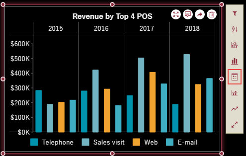
The following section describes the steps to apply conditional formatting in a chart to highlight the POS with sales revenue greater than '$3,00,000'.
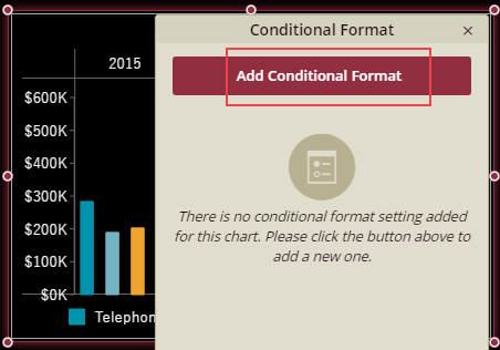
Select Conditional Format from the Action Bar corresponding to the selected dashboard scenario.
In the Conditional Format dialog that appears, click Add Conditional Format as shown below.
Set the Target Value to a suitable data attribute from the list on which you want to apply the conditional format. For example, select 'Average of Revenue' to apply the format on the revenue values.
Note that the list contains only the data attributes bound to the scenario.
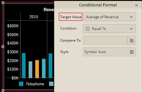
Choose the formatting condition from the list that you want to apply. For example, set the Condition to 'Greater Than' and Compare To to '300000' (constant value).
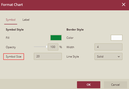
In the Format Chart dialog box that appears, specify the formatting style for the symbol and border in the Symbol tab. For example, set the fill color for the symbol to 'Green', border color to 'White', and border width to '3'.
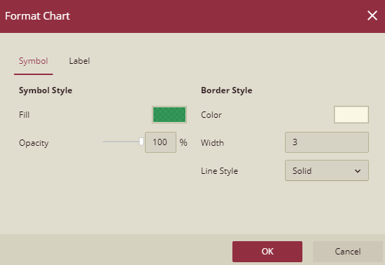
Note that in line chart and area chart scenarios, you can use the Symbol Size property to specify the size of the data points that meet the specified condition. This property is not available in other chart scenarios.
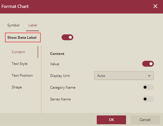
Switch to the Labels tab to specify the formatting styles for the data labels. It includes text style, position, content, and shape related properties. Note that you can set these properties only when the Show Data Label property is enabled.
Click Apply and then OK to save the changes.
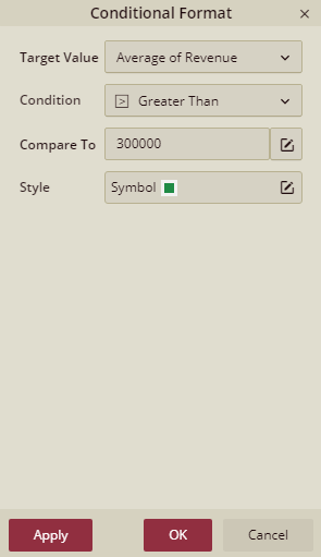
Preview the dashboard and visualize your data. The data bars with sales revenue greater than '$3,00,000' are colored 'Green'.

Conditional Formatting in Tables
In Table scenarios, conditional formatting is used to highlight the cells (or even rows) with colors, data bars, icons, etc. based on the certain rules you specify.
From the Action Bar of the active table scenario, select Conditional Format. Then, click the Add Conditional Format and specify the following fields as described below in the table.
Field | Description |
|---|---|
Set For | Specify the data attribute on which you want to apply the conditional formatting. You can also apply conditional formatting on an entire row in a data table scenario. Note that the target value shows only the bound data attributes. |
Based On | Choose whether to apply the conditional formatting based on a field value, another field, or comparison field. According to the chosen value, the properties in the dialog vary. Note that you can apply conditional formatting on a dimension in a pivot table only on the basis of the field value. • Field Value refers to the chosen target value based on which you want to apply the conditional formatting. Note that if you want to set the formatting for an entire row based on a field value, you need to specify the referenced field which accepts only the bound data attributes. • Another Field applies conditional formatting based on the values of another measure. For this, you need to specify the referenced field that can either be a new value (includes all the data attributes of the bound dataset) or a bound measure. • Comparison compares the target field values with the chosen comparison field. Specify the comparison condition for formatting (such as Equal to, Greater Than, Between, Not Between, etc.) and the comparison field (such as constant value, new value, or bound measure.) |
Style | Specify the formatting style you want to use to highlight the cell values (or rows) when they meet the specified condition. The styles available differ for the conditional formatting based on the field value, another field, and comparison field. • For field value, the available formatting styles are Highlight Cell Rules, Top/Bottom Rules, Data Bars, Color Scales, and Icon Sets. You can also create a custom rule depending on your requirements. Note that styles available to format the rows based on a field value are Highlight Cell Rules and Top/Bottom Rules. In case of dimensions, you can only use the Highlight Cell Rules style. • For another field, the available formatting styles are Highlight Cell Rules and Top/Bottom Rules. You can also create a custom rule depending on your requirements. • For comparison field, you can specify the font style, border color, fill color, etc. |
The different types of rules used for conditional formatting are described below:
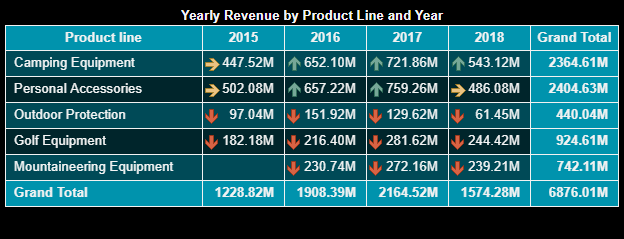
Highlight Cell Rules: Specify the rule for highlighting the cell values with a different color. For example, highlight the cells whose values are greater than 200M.
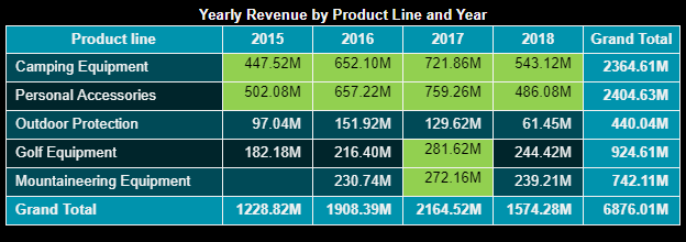
Top Bottom Rules: Highlights the top or bottom values in a range. The following image highlights the top 10 values.
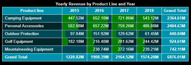
Data Bars: Displays a bar in the background for each cell. The length of the bar determines the value of the cell relative to values in other cells.
Color Scales: Changes colors by comparing the cell values. Cell with a dark shade represents a higher value and a cell with a lighter shade represents a lower value. For example, in the Green-Yellow-Red color scale, cells with higher values are colored in green, average values in yellow, and lower values in red.
Icon Sets: Add specific icons based on the values. You can choose to display the icon alone, or with the cell value.
Apply Conditional Formatting on Tables
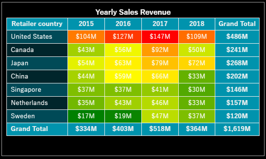
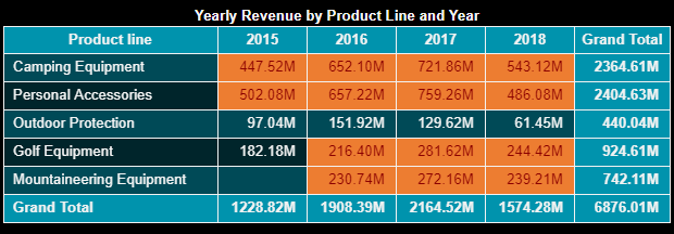
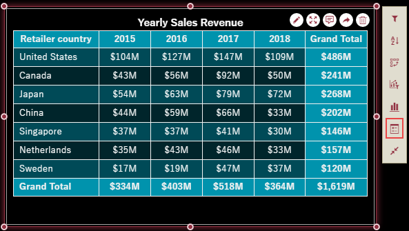
The following section describes the steps to apply conditional formatting in a pivot table to format the cell background based on the revenue values over the years.
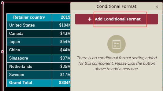
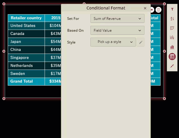
Select Conditional Format from the Action Bar corresponding to the selected dashboard scenario.
In the Conditional Format dialog that appears, click Add Conditional Format as shown below.
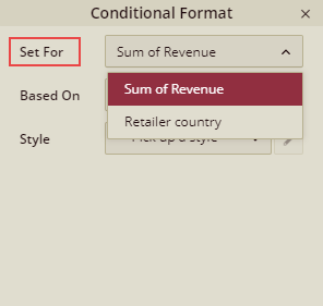
The Set For specifies the data attribute on which you want to apply the conditional format. For example, you can choose 'Sum of Revenue' from the list to apply the format on the revenue values.
Note that the list contains only the data attributes bound to the scenario.
Choose whether to apply the conditional formatting based on a field value, another field, or comparison field. For example, set Based On to 'Field Value' since you want to apply the conditional formatting based on the chosen target value, i.e. 'Sum of Revenue'.
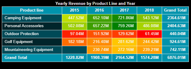
Pick a formatting style for the conditional format which you want to apply on the cells in the table. To format the cell background based on the cell values, choose Color Scales from the drop-down list, and then select the Red-Yellow-Green color scale.
The top color highlights the larger values, the center color highlights the middle values, and the bottom color highlights the smaller values.
Click the Apply button and then OK button to view the results. Cells with larger revenue values are highlighted in red, average values in yellow, and smaller values in green.