- Getting Started
- Administration Guide
-
User Guide
- An Introduction to Wyn Enterprise
- Document Portal for End Users
- Data Governance and Modeling
- Working with Resources
- Working with Reports
-
Working with Dashboards
- Dashboard Designer
- Selecting a Dataset
- Data Attributes
- Dashboard Scenarios
- Dashboard Templates
- Component Templates
- 3D Scene
- Explorer
- Visualization Wizard
- Data Analysis and Interactivity
- Dashboard Appearance
- Preview Dashboard
- Export Dashboard
- Dashboard Lite Viewer
- Using Dashboard Designer
- Animating Dashboard Components
- Document Binder
- Dashboard Insights
- Add a New Page in Dashboard Designer
- View and Manage Documents
- Understanding Wyn Analytical Expressions
- Section 508 Compliance
- Subscribe to RSS Feed for Wyn Builds Site
- Developer Guide
Trend Line
Trend Lines are additional lines that are added in a scenario to display trends in the data. They help in data forecasting and planning by predicting future values based on the current data values. The trend lines are useful in grabbing the user's attention to a specific area within the data series.
The trend lines supported in Wyn Enterprise are described as follows.
| Type | Description |
|---|---|
| Linear | It is a straight line that is used to determine how the data values are increasing or decreasing at a steady rate. It uses the following linear equation to compute the least squares, that is, y = mx + b where m is the slope and b is the intercept. |
| Polynomial | It is a curved line that is used to show fluctuations in the data values. It uses the following equation to compute the least squares, that is, y = b + (c1 * x) + (c2 * (x ^ 2)) + (c3 * (x ^ 3)) + .. where c1, c2, and c3 are the constants. Use the Degree property to specify the number of terms in the polynomial equation - the range for the degree is from 2 to 6. |
| Logarithmic | It is a curved line used to plot the data that increases or decreases quickly, and then levels out. It uses the following equation to compute the least squares, that is, y = m * ln (X) + c where m and c are the constants and ln is the natural logarithm function. |
| Power | It is a curved line that is used to compare the measurements increasing at a specific rate. It uses the following equation to compute the least squares, that is, y = c * x ^ b where c and b are the constants. Note that you cannot use the power trend line with zero or negative values. |
| Exponential | It is a curved line that shows data values with relatively higher rates of rising or falling. It uses the following equation to compute the least squares, that is, y = c * e ^ (b * x) where c and b are the constants and e is the natural logarithm. Note that you cannot use the exponential trend line with zero or negative values. |
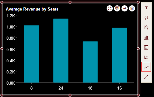
| Fourier | It is a trend line based on the Fourier series,  , , where T = '2 π' and  . . Use the Degree property to specify the number of terms in the Fourier Equation, ranging from 1 to 6. |
Note: In Wyn Enterprise, trend lines are supported in a variety of charts such as bar, column, area, line, scatter, and bubble. You cannot add a trend line to stacked percent charts, pie, radar, and similar charts.
Add a Trend Line
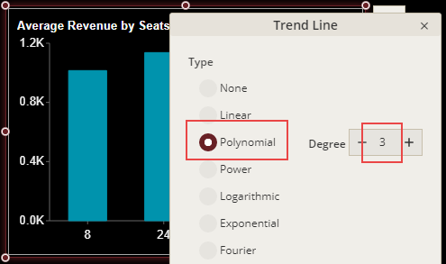
Select the dashboard scenario for which you want to add a trend line. Note that an Action Bar automatically appears on the right of the scenario.
From the Action Bar, select Trend Line.
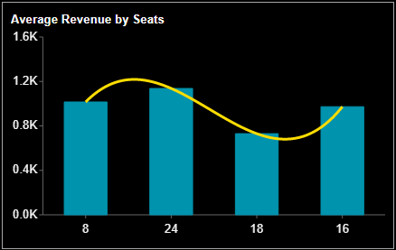
In the Trend Line dialog that appears, select a suitable type for the trend line depending on your data. For example, select 'Polynomial' and set its Degree to '3'. By default, the degree is set to 2.
Specify the line style for the trend line. You can set Line Style to 'Solid' (default) or change it to 'Dashed'.
Set the Scope for the trend line to either 'Total' or 'Group'. That is, specify if the trend line is calculated for the total data set or per detail group.
Customize the trend line appearance by setting the Line Width and Line Color to some suitable values. For example, set the line width to '3' and line color to 'Yellow' from the color picker.
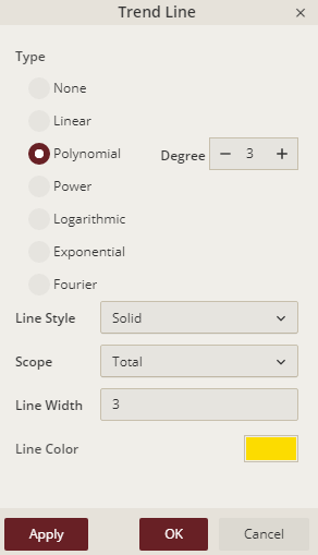
Click Apply and then OK to save the changes.