- Getting Started
- Administration Guide
-
User Guide
- An Introduction to Wyn Enterprise
- Document Portal for End Users
- Data Governance and Modeling
- Working with Resources
- Working with Reports
-
Working with Dashboards
- Dashboard Designer
- Selecting a Dataset
- Data Attributes
- Dashboard Scenarios
- Dashboard Templates
- Component Templates
- 3D Scene
- Explorer
- Visualization Wizard
- Data Analysis and Interactivity
- Dashboard Appearance
- Preview Dashboard
- Export Dashboard
- Dashboard Lite Viewer
- Using Dashboard Designer
- Animating Dashboard Components
- Document Binder
-
Dashboard Insights
- Add a New Page in Dashboard Designer
- View and Manage Documents
- Understanding Wyn Analytical Expressions
- Section 508 Compliance
- Subscribe to RSS Feed for Wyn Builds Site
- Developer Guide
Dashboard Insights
Dashboard insights are added to the Wyn Dashboards to show additional insights from your data that may not be visible otherwise such as outliers, trends, etc. It will refer to the data and extrapolate insights based on the changes within the data.
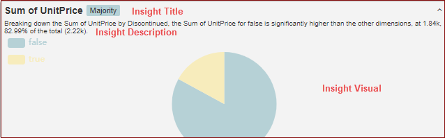
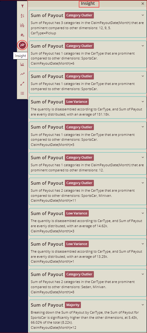
You can add data insight for the dashboards using the InsightIQ component or you can directly use the Insight option from the More Action menu as explained below in the section Scenarios that support the Data Insights. It will give the details on the data of a given visual. The insight item details contain 3 parts:
Title(Measure, Pattern)
Description
Related Visual
Insight Patterns
Wyn supports 7 insight patterns. It analyzes the data by all 7 patterns one by one and collects the matched patterns to show. So, not all 7 patterns are shown for every scenario. For scenarios if none of the patterns matches, then no insight is generated.
We will analyze the data by all 7 patterns one by one as below:
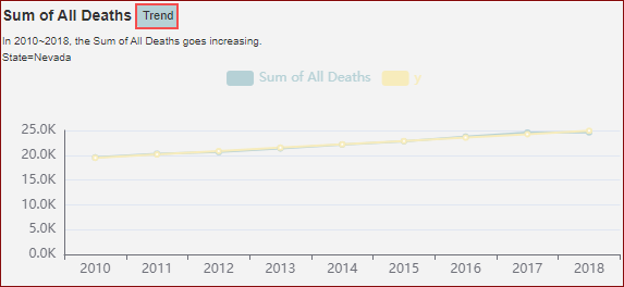
Trend: It shows which categories are significantly below average on a measure.
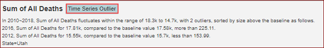
Time Series Outlier: It shows some data anomalies as compared to the baseline.
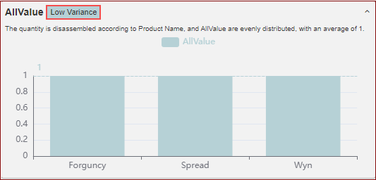
Low Variance: It shows which categories are significantly below average on a measure.
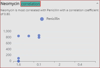
Correlation: The correlation between the two data is the highest, and the two measures in the given data show a high positive or negative correlation.
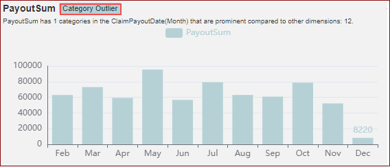
Category Outlier: It shows which categories stand out on a measure.
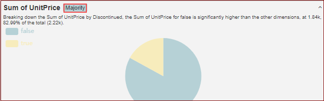
Majority: It shows the category that dominates in a measure.
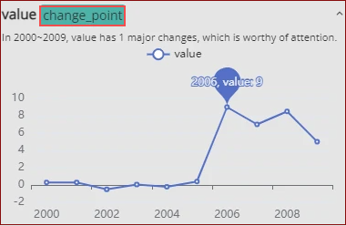
Change Point: It shows a point at which there is a dramatic change in the data.
Scenarios that support the Data Insights are listed below
Area Chart
Column Chart
Bar Chart
Bubble Chart
Candlestick Chart
Data Table
Donut chart
Filled Radar Chart
Funnel Chart
Line Chart
Percent Stacked Area Chart
Percent Stacked Bar Chart
Percent Stacked Column Chart
Pie Chart
Pivot Table
Radar Chart
Radial Stacked Bar Chart
Range Area Chart
Range Bar Chart
Range Column Chart
Rose Chart
Scatter Chart
Stacked Area Chart
Stacked Bar Chart
Stacked Bar in Polar Coordinates
Stacked Column Chart
Sunburst Chart
Treemap Chart
3D Column E-Chart
Bubble E-Chart
Column E-Chart
Funnel E-Chart
Line E-Chart
Pie E-Chart
Radar E-Chart
Word Cloud
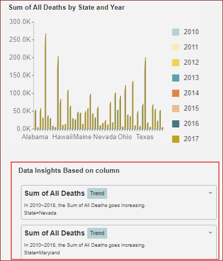
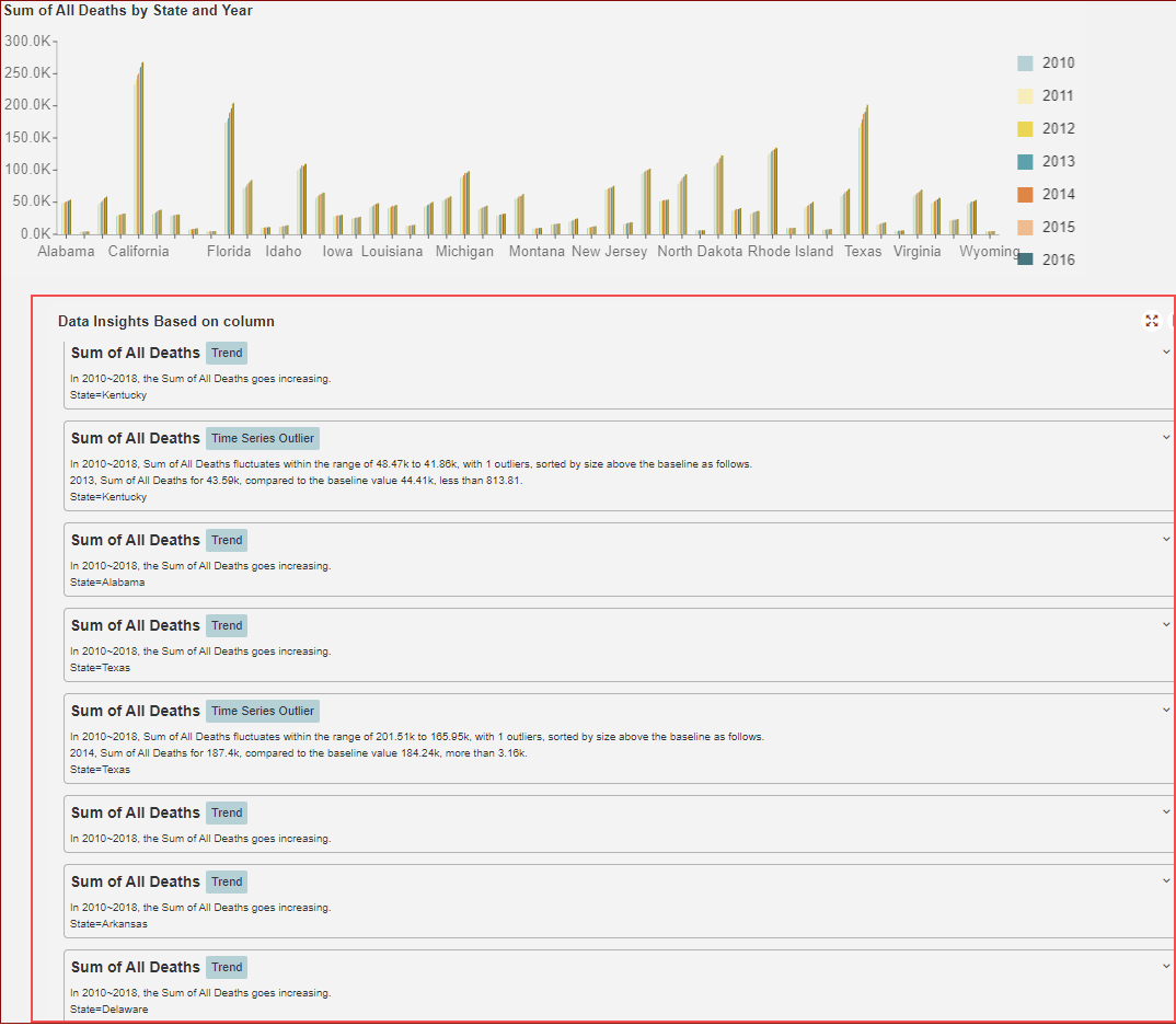
You can see the Insight option for each of these supported dashboard scenarios using the Action menu. Click the Insight option, you will be able to see the insight as shown below:
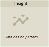
Not all scenarios will have an insight. So, when there are no insights, then by clicking the Insight option, you will see the following message.
Typically, the more data bindings you have, the more the chances that there is an insight that can be found as there is more data to pull out the patterns.
Adding Insights to the dashboard with a Column Chart
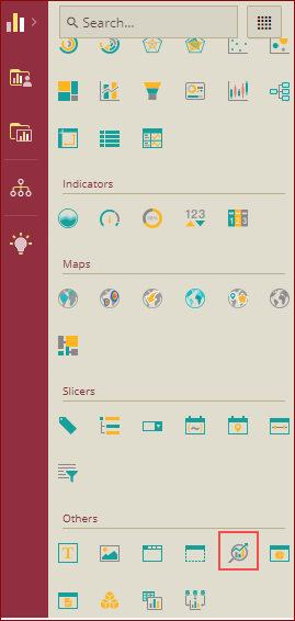
From the Dashboard Toolbox, open the Data Visualization node and drag-drop the InsightIQ on to the design area.
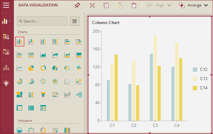
Drag the Column Chart scenario onto the design area.
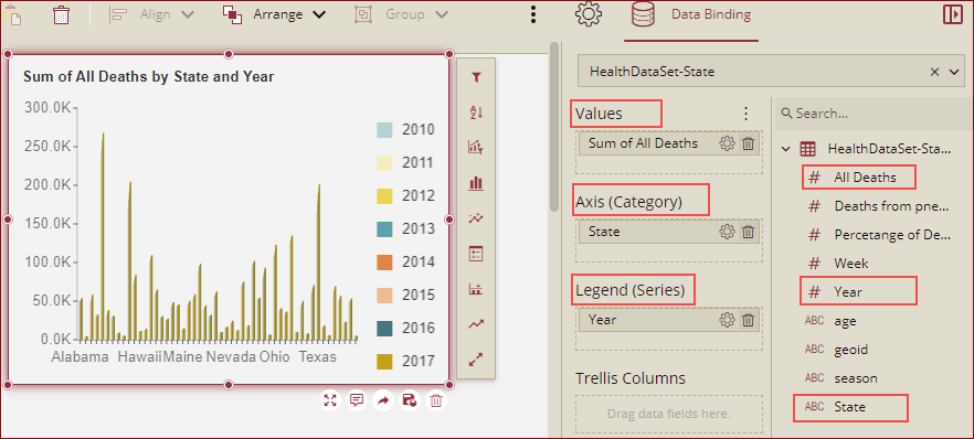
With the Column Chart selected, from the Data Binding tab, select the dataset and bind it as shown below in the figure.
.
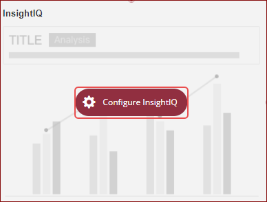
Bind the added chart to the InsightIQ component, by clicking the Configure InsightIQ option.
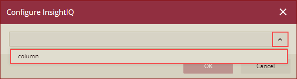
Configure InsightIQ dialog box is displayed. Select the option to bind from the dropdown list and click OK.
We can see that the insight has revealed some information.
Preview the dashboard, you can see that insights are displayed.
Please note that for all the scenarios that support insights, you can use the Insight option in the action menu, instead of using InsightIQ to generate the insights.
Note: When the target scenario has been affected by cross-filter, and drill-down then the insight visual will be updated accordingly.
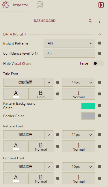
Dashboard Data Insight Property
Listed below are insight properties supported at the dashboard level.
Property | Description |
|---|---|
Insight Patterns | You can select the insight patterns from here. The dropdown list has the following options: All, Trend, Time Series Outlier, Low Variance, Category Outlier, Majority, Change Point, and Correlation. |
Confidence Level(0-1) | This is the parameter to control which insights to display. The default value is 0.5. You can select from 0-1 values. |
Hide Visual Chart | You can Show/Hide the visual chart in the generated insight. By default, this property is set to False. |
Tite Font | You can set the font for the insight Title by using this property. |
Pattern Background | You can select the color of the data pattern background of the insight by using this property. |
Border Color | You can select the border color of each insight pattern by using this property. |
Pattern Font | You can set the font for the insight pattern name by using this property. |
Content Font | You can set the font details for the insight content by using this property. |