- Getting Started
- Administration Guide
-
User Guide
- An Introduction to Wyn Enterprise
- Document Portal for End Users
- Data Governance and Modeling
- Working with Resources
- Working with Reports
-
Working with Dashboards
- Dashboard Designer
- Selecting a Dataset
- Data Attributes
- Dashboard Scenarios
- Dashboard Templates
- Component Templates
- 3D Scene
- Explorer
-
Visualization Wizard
- Data Analysis and Interactivity
- Dashboard Appearance
- Preview Dashboard
- Export Dashboard
- Dashboard Lite Viewer
- Using Dashboard Designer
- Animating Dashboard Components
- Document Binder
- Dashboard Insights
- Add a New Page in Dashboard Designer
- View and Manage Documents
- Understanding Wyn Analytical Expressions
- Section 508 Compliance
- Subscribe to RSS Feed for Wyn Builds Site
- Developer Guide
Visualization Wizard
The Visualization Wizard tab in the dashboard designer automatically generates smart scenarios based on the selected dataset. This feature is extremely beneficial to users who do not have prior knowledge related to BI tools.
This feature also saves users time and effort as they can easily use the Visualization Wizard to visualize the data. When you choose a dataset, the Visualization Wizard automatically generates the best suitable scenario for analyzing the data. In case, you are not satisfied with the generated scenario, you can change its type.
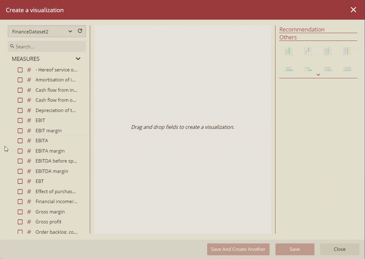
For better understanding, have a look at the below image.
For more details about Visualization Wizard, please refer to the following sections.
Visualization Wizard Components
This section describes the different components of the Visualization Wizard.
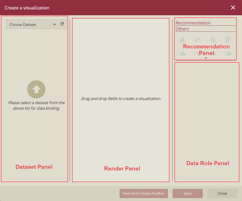
The wizard is composed of the following four components:
Dataset Panel - In this panel, you specify the dataset and data attributes for the data visualization. You can either select the data attributes from the list or drag them to the data binding area or the design area of the wizard.
Render Panel - It displays the recommended visualization scenario based on the selected attributes.
Recommendation Panel - It shows the recommended scenarios which you can choose to visualize the data in wizard. For details about the recommendation rules for generating smart scenarios, please see this section.
Data Role Panel - It displays the bound attributes for the scenario. You can also perform various operations on the data attributes such as modifying the data format or display unit, creating a hierarchy field, performing an aggregation method, applying quick functions, etc. For more details, please see the Data Attributes article.
Recommendation Rules
This section lists the default recommendation rules which the Visualization Wizard follows to generate the smart scenario.
Recommended Scenario | Binding case |
|---|---|
Map | • 1 Longitude, 1 Latitude, 0 to 2 Measures (1 Latitude, 1 Longitude, 0 to 1 Point→Size, 0 to 1 Point→Color) • 1 Region, 1 to 2 Measures (1 Region, 1 Point→Size, 0 to 1 Point→Color) |
Data Table | • 1 or more Image, 0 or more others (1 or more Columns) |
Pivot Table | • 1 or more Dimensions excluding Image (1 or more Rows) |
KPI Matrix | • 1 to 2 Measures (1 Actual Value, 0 to 1 Target Value) |
Line Chart | • 1 Measure, 1 or more Date, 0 or more Dimensions (1 Value, 1 Axis, 0 to 1 Legend, 0 or more Trellis Columns) • 3 or more Measures, 1 Date, 0 or more Dimensions (2 or more Values, 1 Axis, 0 or more Trellis Columns) |
Combined Chart | • 2 Measures, 1 Dimension or Date (1 Left-Value Axis, 1 Right-Value Axis, 1 Axis, 0 to 1 Legend, 0 or more Trellis Columns) |
Column Chart | • 1 Measure, 1 Dimension (1 Value, 1 Axis, 0 to 1 Legend, 0 or more Trellis Columns) • 3 Measures, 0 or more Dimensions (3 or more Values, 0 to 1 Axis, 0 or more Trellis Columns) |
The Latitude, Longitude, Region, and Image are defined in the data model and dataset designer through the Data Category property. Based on these definitions, Visualization Wizard can recommend a scenario according to the attribute's data type.
For example, a string data type can be specified as Geography (Region), Image URL, and Image Binary. A numeric data type can be specified as Currency, Geography (Latitude), and Geography (Longitude).
The below section describes the recommendation rules which the Visualization Wizard follows to generate the smart scenario based on the number of measures and dimensions.
In the case of 1 or more Image, Data Table is recommended.
In the case of 1 Latitude, 1 Longitude, and 0 to 2 Measures, Map (1 Latitude, 1 Longitude, 0 to 1 Point → Size, 0 to 1 Point → Color) or Pivot Table (0 to 2 Values, 2 Rows) is recommended.
For more details, please see the table below.
Number of Measures | Number of Dimensions | Recommended Smart Scenario |
|---|---|---|
0 | 1 or more | • Pivot Table (1 or more Rows) |
1 | 0 | • KPI Matrix ( 1 Actual Value) • Column/Bar Chart (1 Value) • Pivot Table (1 Value) |
1 | 1 | • Map (1 Region, 1 Point → Size) (Region) • Line/Area Chart (1 Value, 1 Axis) (Date) • Column/Bar Chart (1 Value, 1 Axis) • Pie Chart (1 Value, 1 Legend) • Radar Chart (1 Value, 1 Axis) • Treemap Chart(1 Value, 1 Detail) • Floor Plan (1 Area, 1 Color) • Pivot Table (1 Value, 1 Row) |
1 | 2 or more | • Line/Area Chart (1 Value, 1 Axis, 1 Legend, 0 or more Trellis Columns) (Date) • Column Chart (1 Value, 1 Axis, 1 Legend, 0 or more Trellis Columns) • Bar Chart (1 Value, 1 Axis, 1 Legend, 0 or more Trellis Rows) • Treemap Chart(1 Value, 2 Details, 0 to 2 Trellis Columns, 0 or more Trellis Rows) • [Percent] Stacked Area Chart (1 Value, 1 Axis, 1 Legend, 0 or more Trellis Columns) (Date) • [Percent] Stacked Column Chart (1 Value, 1 Axis, 1 Legend, 0 or more Trellis Columns) • [Percent] Stacked Bar Chart (1 Value, 1 Axis, 1 Legend, 0 or more Trellis Rows) • Sunburst Chart (1 Value, 2 or more Details) • Radar Chart (1 Value, 1 Axis, 1 Legend, 0 or more Trellis Columns) • Pivot Table (1 Value, 2 or more Rows) |
2 | 0 | • KPI Chart/Gauge/Indicator (1 Actual Value, 1 Target Value) • Column/Bar Chart (2 Values) • Scatter Chart (1 X-Axis, 1 Y-Axis) • Range Column/Bar Chart (1 Upper Value, 1 Lower Value) • Pivot Table (2 Values) |
2 | 1 | • Map (1 Region, 1 Point→Size, 1 Point→Color)(Region) • Combined Chart (1 Left-Value Axis, 1 Right-Value Axis, 1 Axis) • Line/Area Chart (2 Values, 1 Axis)(Date) • Column/Bar Chart (2 Values, 1 Axis) • Range Area Chart (1 Upper Value, 1 Lower Value, 1 Axis)(Date) • Range Column/Bar Chart (1 Upper Value, 1 Lower Value, 1 Axis) • Radar Chart (2 Values, 1 Axis) • Scatter Chart (1 X-Axis, 1 Y-Axis, 1 Legend) • Pivot Table (1 Rows, 2 Values) |
2 | 2 or more | • Combined Chart (1 Left-Value Axis, 1 Right-Value Axis, 1 Axis, 1 Legend, 0 or more Trellis Columns) • Line/Area Chart (2 Values, 1 Axis, 1 or more Trellis Columns)(Date) • Column Chart (2 Values, 1 Axis, 1 Trellis Columns) • Bar Chart (2 Values, 1 Axis, 1 Trellis Rows) • Range Area Chart (1 Upper Value, 1 Lower Value, 1 Axis, 1 Legend, 0 or more Trellis Columns)(Date) • Range Column Chart (1 Upper Value, 1 Lower Value, 1 Axis, 1 Legend, 0 or more Trellis Columns) • Range Bar Chart (1 Upper Value, 1 Lower Value, 1 Axis, 1 Legend, 0 or more Trellis Rows) • Pivot Table (2 or more Rows, 2 Values) |
3 | 0 | • Column/Bar Chart (3 Values) • Bubble Chart(1 Size, 1 X-Axis, 1 Y-Axis) • Pivot Table (3 Values) |
3 | 1 | • Line/Area Chart (3 Values, 1 Axis)(Date) • Column/Bar Chart (3 Values, 1 Axis) • Bubble Chart (1 Size, 1 X-Axis, 1 Y-Axis, 1 Legend) • Pivot Table (3 Values, 1 Row) |
3 | 2 or more | • Line/Area Chart (3 Values, 1 Axis, 1 or more Trellis Columns)(Date) • Column/Bar Chart (3 Values, 1 Axis, 1 or more Trellis Columns/Rows) • Pivot Table (3 Values, 2 or more Rows) |
4 or more | 0 | • Column/Bar Chart (4 or more Values) • Pivot Table (4 or more Values) |
4 or more | 1 or more | • Line/Area Chart (4 or more Values, 1 Axis, 0 or more Trellis Columns)(Date) • Column/Bar Chart (4 or more Values, 1 Axis, 0 or more Trellis Columns/Rows) • Pivot Table (4 or more Values, 1 or more Rows) |
Create Smart Scenario using Visualization Wizard
Follow the below steps to create a scenario using the Visualization Wizard.
Note: To open the Visualization Wizard directly when creating a new dashboard, the admin must set the Show Visualization Wizard For New Dashboard property to True in the Dashboard Settings tab of the Admin portal.
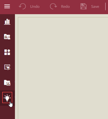
Click the Visualization Wizard tab on the left of the dashboard designer.
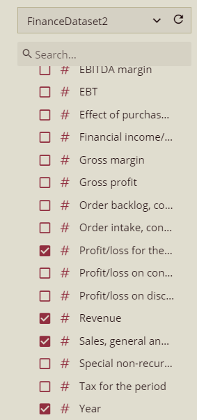
In the Create a visualization window that appears, select the dataset from the Dataset panel which you want to use for the smart scenario. For example, select the FinanceDataset2 dataset as shown.
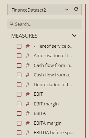 .
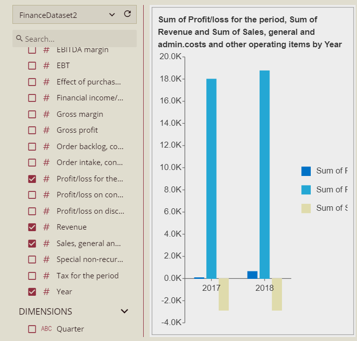
.Once the dataset is loaded successfully, you will see the measures and dimensions available in the Dataset panel. Click the data attributes that you want to use for data visualization. For example, select the following attributes - Profit/Loss for the period, Revenue, Sales general and admin costs, and Year.
You can also drag-drop the data attributes directly to the Render panel to create a visualization. Depending on the attributes chosen, the wizard displays a recommended smart scenario in the Render panel.
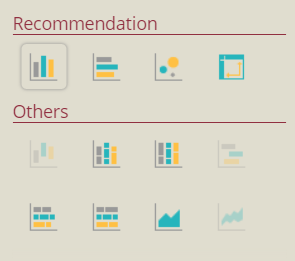
To change the recommended scenario type, choose the scenario type which is best suitable for you.
Click the Save button to add the smart scenario to the dashboard. Or, click the Save and Create Another button to generate another smart scenario.