- Getting Started
- Administration Guide
-
User Guide
- An Introduction to Wyn Enterprise
- Document Portal for End Users
- Data Governance and Modeling
- Working with Resources
- Working with Reports
-
Working with Dashboards
- Dashboard Designer
- Selecting a Dataset
- Data Attributes
- Dashboard Scenarios
- Dashboard Templates
- Component Templates
- 3D Scene
- Explorer
- Visualization Wizard
- Data Analysis and Interactivity
- Dashboard Appearance
- Preview Dashboard
- Export Dashboard
- Dashboard Lite Viewer
- Using Dashboard Designer
- Animating Dashboard Components
- Document Binder
- Dashboard Insights
- Add a New Page in Dashboard Designer
- View and Manage Documents
- Understanding Wyn Analytical Expressions
- Section 508 Compliance
- Subscribe to RSS Feed for Wyn Builds Site
- Developer Guide
Dashboard Designer
Wyn Dashboards Designer provides a friendly user interface to create highly interactive dashboards. It makes it easy for the users to create and edit the dashboards without any prior knowledge.
Here is a video walkthrough of our Dashboard Designer.
Dashboard Designer Elements
Wyn Dashboards Designer contains Toolbox, Menu bar, Data Binding and Properties panels, Design area, and a Page Setup bar as shown in the following image.
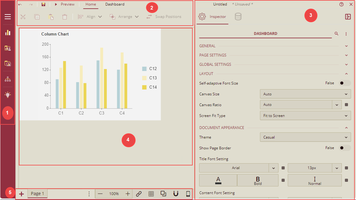
Dashboard Toolbox: Contains scenarios, components, and slicers to build dashboards.
Data Visualization: Contains built-in scenarios such as charts, tables, maps, etc.
Custom Visualization: Contains user-defined scenarios.
Component Template: These are pre-designed dashboard components that offer a convenient way to incorporate them into your dashboard designs. These templates serve as a starting point, enabling you to create new dashboards and leverage the pre-configured settings of the dashboard components.
Explorer: Provides an overview of the hierarchy of the added dashboard components and it displays the current selection and allows selection of other dashboard items.
Visualization Wizard: Generates smart scenarios for better data visualization. This is extremely beneficial for new users who have no prior knowledge of the BI tools.
Menu Bar: It allows you to undo and redo actions, save a dashboard, preview the dashboard, and specify document settings.
Undo: Undo an action in the designer.
Redo: Redo an action in the designer.
Save: Save a dashboard in the designer.
Preview: Preview the dashboard in the designer.
Document Settings: Allows you to specify properties for the dashboard such as general, document appearance, layout, and global settings.
Cut: Cut the dashboard scenario(s) in the designer.
Copy: Copy the dashboard scenario(s) in the designer.
Paste: Paste the dashboard scenario(s) in the designer.
Delete: Delete the dashboard scenario(s) in the designer.
Align: Align the dashboard scenarios to left, right, middle, top, and bottom in the designer.
Arrange: Arrange the position of the scenario(s) to front or back in the designer.
Swap Positions: Swap the positions of the scenarios in the designer.
Data Binding and Inspector Panels: You can switch between these two panels by clicking the required tab in the designer.
Data Binding: This panel contains the dataset and associated data attributes, and the data binding area. In the databinding area, you bind the data to the scenarios, and set the properties associated with measures and dimensions. It should be noted that each dashboard scenario has a set of data sections, such as Values for Chart and Pivot table; Columns, and Rows for KPI Matrix and Pivot table; and Columns for Slicers.
Inspector: This panel contains the properties of the selected scenario in the designer to enhance its appearance.
As there are too many properties in the inspector tab, you can click the Collapse/Expand toggle button
 to collapse and expand the property categories in the designer.
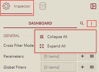
Both, the property of the component, and document settings of the dashboard can expand and collapse.
To Collapse the component property, select the component, click the Collapse/Expand toggle button, and select the Collapse All option. All the properties will be collapsed.
You can click on the particular property's Expand/Collapse icon, Category Name, or Split Line to expand only that particular property.
4. Design Area: Create and edit dashboards by simply dragging and dropping the scenarios from the Toolbox into the design area.
5. Page Setup Bar: Lets you add new pages, set zoom percentage, switch between multiple pages, etc.
* Add Page: Add a new page in the dashboard.
* Navigation Button: Switch between multiple pages in a dashboard.
* Zoom: Change the zoom percentage of the design area by clicking the zoom-in and zoom-out buttons.
* Interaction Setting: Set a relationship between scenarios in the dashboard.
* Show Grid Line: Displays or hides the grid lines in the design area.
* Enable Overlap: Enables overlapping of the scenarios in the dashboard.
* Snap: Enables the scenarios to automatically snap to the closest grids and guides when you drag them in the design area. You can move the components using the keyboard arrow keys.
* Mobile Designer: Switch to the mobile designer view of the dashboard designer. The default is Web Designer.
See this help doc to learn more about using the Mobile Designer for your dashboard scenarios.
Dashboard Component Operations
This section will explain the basic operations of dashboard components, which will help you in creating the dashboards. Listed below are the basic operations.
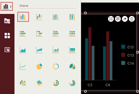
Adding a Component
From the Dashboard Toolbox, open the Data Visualization node, to add a component. A list of built-in scenarios such as charts, tables, maps, etc. is displayed. Select the desired component and simply drag and drop it into the design area.
Selecting Multiple Components
You can select multiple components in the design area and set their common properties like the Appearance, Title, etc. on the Inspector tab. There are two ways for selecting the components:
Ctrl key + Mouse click.
Drag the mouse to select a frame.
Adjusting the Position of a Component
You can adjust the positioning of the component by selecting the component and dragging it to the target position and then releasing the mouse button.
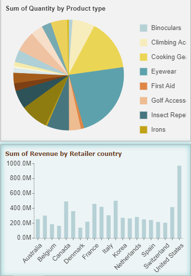
Swap Positions
You can exchange the positions of the components in the design area. To exchange the positions, select two components, then right-click and select the Swap Positions option.
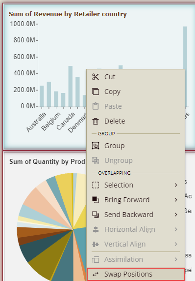
The position of the components will be exchanged.
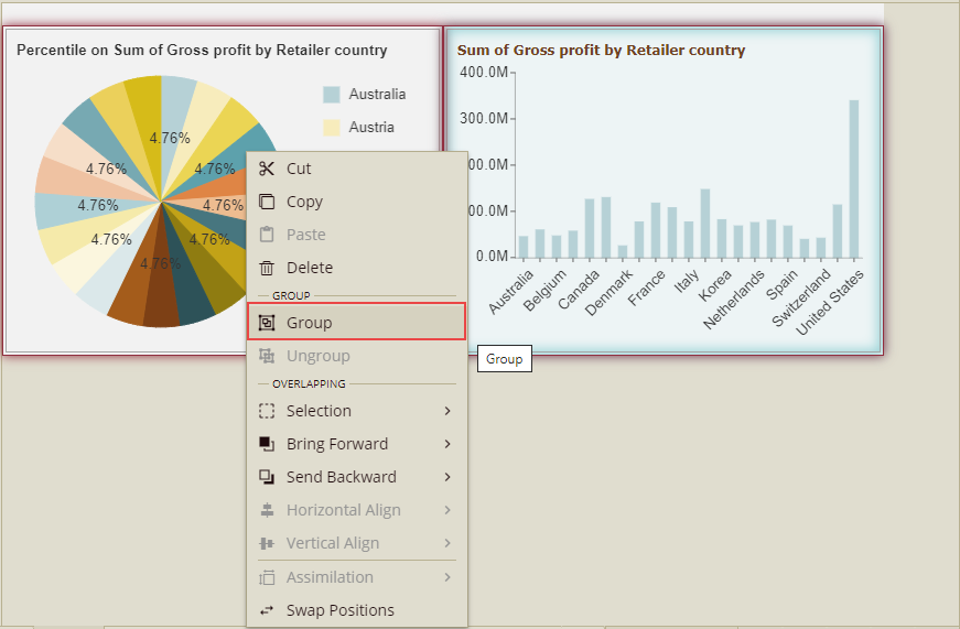
Group/Ungroup Components
In various cases, you might use multiple components in a dashboard to display the same kind of analysis. So, in such cases, you can combine multiple components together which will be more convenient for further operations.
Group: To combine multiple components, select the components by mouse frame selection or by mouse click + keyboard CTRL method, and then right-click and select the option, Group.
You can also select the individual component in the group. For this, click any component in the group to select the combination, and then click the particular component again to select it.
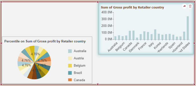
Example: In the image below, there are two components (1 and 2) grouped together. Click component 1. Both the components are selected as a group.
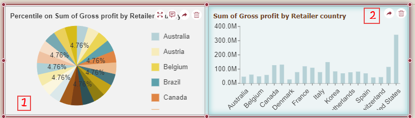
Now again click component 1. Component 1 will be selected individually in that group, and you can move, resize, scale, etc. this component in the group.
If you again want to select components 1 and 2 as a group, then just click outside the component and again click any component, it will be selected as a group.
You can also integrate this group into other applications through URL and DIV.
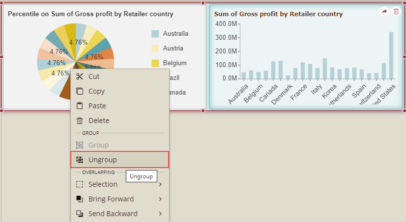
Ungroup: You can ungroup the grouped components. Select the group, right-click the mouse, and select the option Ungroup.
Cut, Copy, Paste, and Delete Components
Select the component(s), right-click the mouse, and select the corresponding operation.
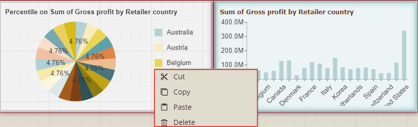
Alternatively, you can use keyboard shortcuts to operate: Ctrl+C→copy; Ctrl+X→cut, Ctrl+V→paste, Delete key→delete.
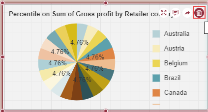
When only one component is selected, then you can delete it by clicking the delete icon in the upper right corner of the component.
Focus On a Component
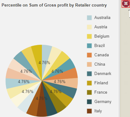
This option lets you focus on an individual dashboard component. Click the Focus icon in the upper right corner of the component, to enter the focus mode.
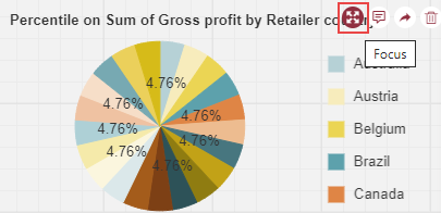
In focus mode, the entire editing area displays only the currently focused component. Click Back to Designer, to exit the focus mode.
Layout Settings
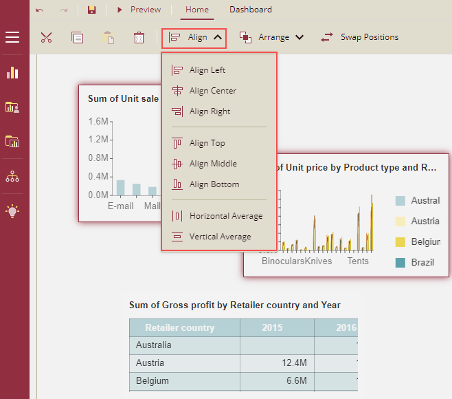
When designing the dashboard, you can align the components quickly with the help of the layout settings, instead of moving them one by one. You can use these settings from the following two places:
Align dropdown list below the menu bar
Context Menu
Using Align dropdown list below the menu bar
The Align dropdown list below the menu bar has the following options as shown below.
Note: When the number of selected scenarios is below 2, the Align dropdown list below the menu bar will be disabled.
Align Left: All the selected scenarios will be aligned with the leftmost border of the occupied space.
Align Center: All the selected scenarios will be aligned with the center border of the occupied space.
Align Right: All the selected scenarios will be aligned with the rightmost border of the occupied space.
Align Top: All the selected scenarios will be aligned with the topmost border of the occupied space.
Align Middle: All the selected scenarios will be aligned with the middle border of the occupied space.
Align Bottom: All the selected scenarios will be aligned with the bottommost border of the occupied space.
Horizontal Average: When this option is selected, then the leftmost and rightmost scenarios are fixed, and only the position of the rest scenarios is adjusted. Please ensure distances among all selected scenarios' left borders are equal.
Vertical Average: When this option is selected, then the topmost and bottommost scenarios are fixed, only the position of the rest of the scenarios is adjusted. Please ensure that the distances among all the selected scenarios' top borders are equal.
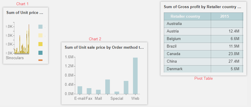
Example 1: Left align the scenarios
In this example, we have taken a dashboard having two column charts (Chart 1 and Chart 2) and a pivot table as shown below in the figure.
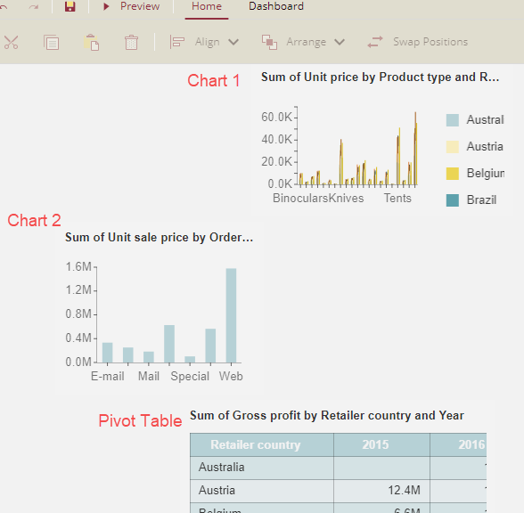
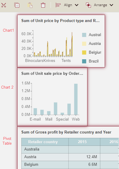
Select all three scenarios, click the dropdown list Align, and select the Align Left option.
All the scenarios will be aligned with the leftmost border of the occupied space. As Chart 2 is at the leftmost border of the occupied space, so, all the scenarios will be left aligned with Chart 2.
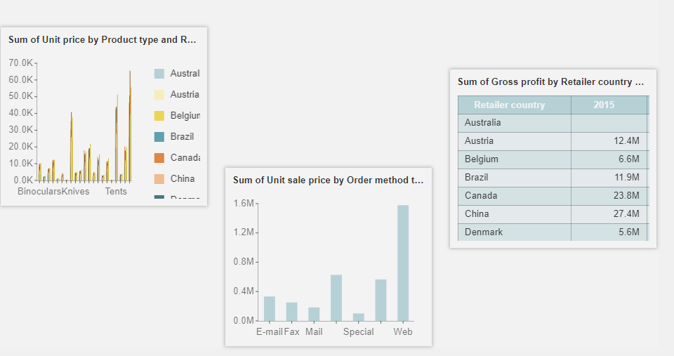
Example 2: Apply the Horizontal Average on the scenarios
In this example, we have taken a dashboard having two column charts (Chart 1 and Chart 2) and a pivot table as shown below in the figure.
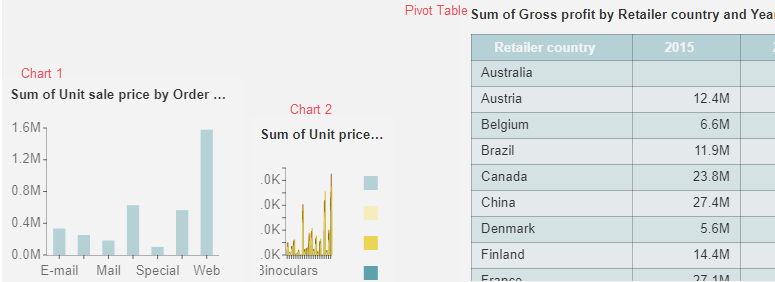
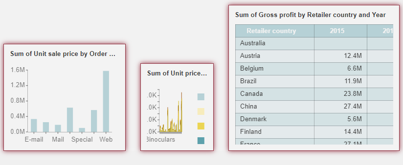
Select all three scenarios, click the dropdown list Align, and select the Horizontal Average option.
So the leftmost scenario ( Chart 1)and the rightmost scenario ( Pivot Table) are fixed, only the position of Chart 2 is adjusted.
Using Layout Settings from Context Menu
Layout settings are also available on the context menu. On the context menu these settings are categorized as - Horizontal Align,Vertical Align, Distribution, and Assimilation. In the context menu, we have a target-selected scenario. After selecting the scenarios, we right-click the mouse on any target scenario to get the context menu options. As we have a target-selected scenario, so other scenarios will be aligned with the target scenario based on the option selected from the context menu.
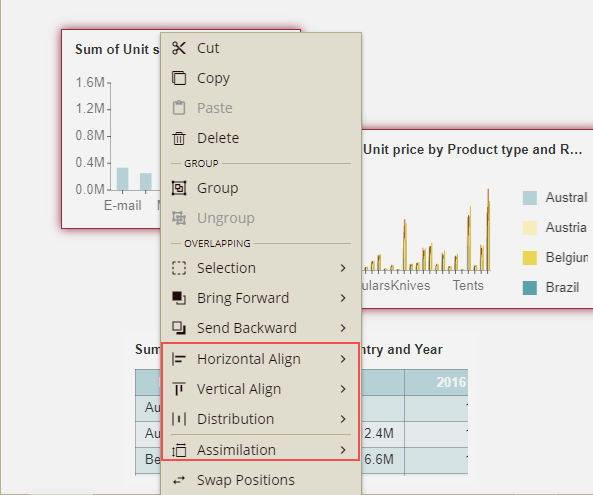
Horizontal Align: It has the following options: Align Left, Align Center, and Align Right.
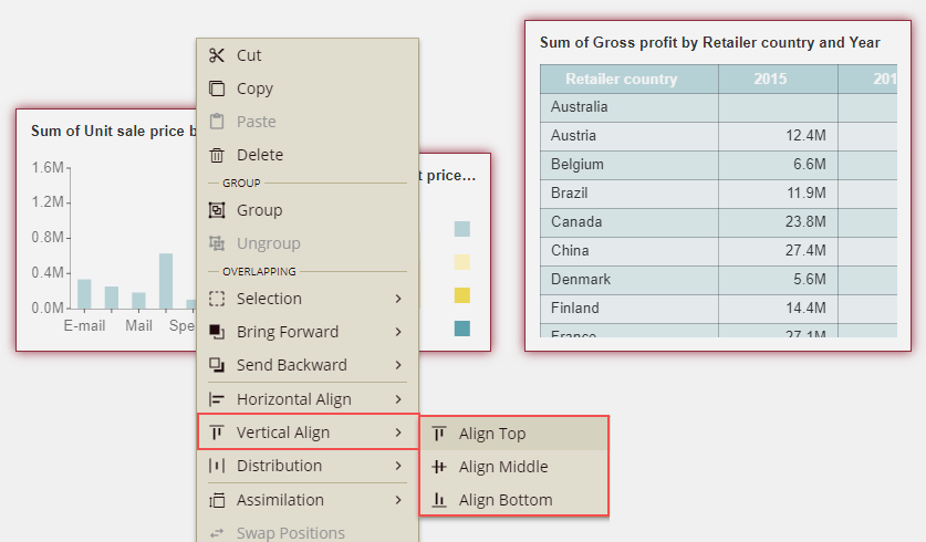
Vertical Align: It has the following options: Align Top, Align Middle, and Align Bottom.
Distribution: It has the following options: Horizontal Average and Vertical Average.
Assimilation: It has the following options: Same Width, Same Height, and Same Size.
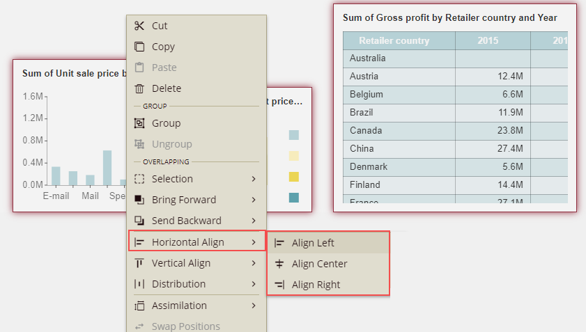
Example 1: Left Align from the context menu
In this example, we have taken a dashboard having two column charts (Chart 1 and Chart 2) and a pivot table as shown below in the figure.
Select all three scenarios, right-click the mouse on the target scenario ( here we have right-clicked on Chart 2), and select the option Align Left from the Horizontal Align category.
As we have a target-selected scenario, so other scenarios will be left-aligned with the target scenario i.e. Chart 2 in this example.
Note: The rest of the Horizontal Align and Vertical Align methods will follow the same concept as Align Left.
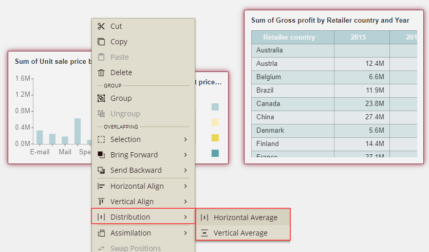
Example 2: Distribution- Using Horizontal Average from the context menu
In this example, we have taken a dashboard having two column charts (Chart 1 and Chart 2) and a pivot table as shown below in the figure.
Select all three scenarios, right-click the mouse on the target scenario and select the option Horizontal Average from the Distribution category.
The leftmost and rightmost scenarios are fixed ( i.e. chart 1 and pivot table), only the position of chart 2 will be adjusted.
Note: The Vertical Average method will follow the same concept as Horizontal Average.
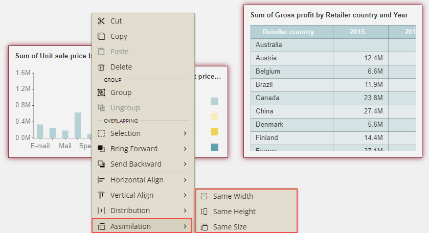
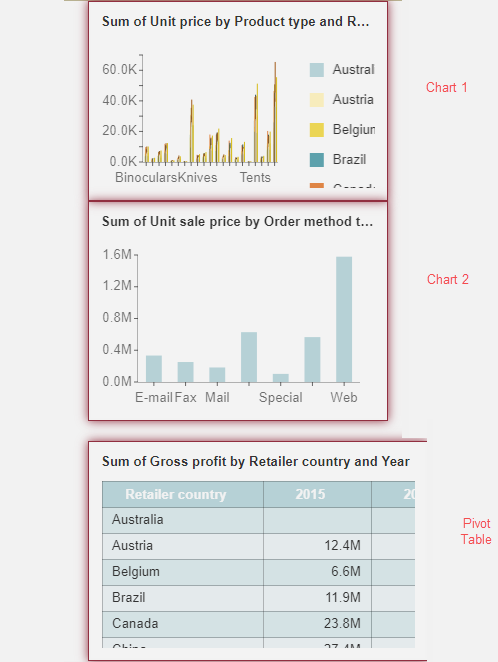
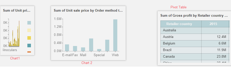
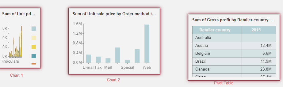
Example 3: Assimilation
In this example, we have taken a dashboard having two column charts (Chart 1 and Chart 2) and a pivot table as shown below in the figure.
Select all three scenarios, right-click the mouse on the target scenario (here we have right-clicked on the pivot table), and select the option Same Size from the Assimilation category.
The rest of the scenarios i.e. chart 1 and chart 2 will be adjusted to the same size as the pivot table.
Note: The Same Width and Same Height method will follow the same concept as Same Size in Assimilation.