- Getting Started
- Administration Guide
-
User Guide
- An Introduction to Wyn Enterprise
- Document Portal for End Users
- Data Governance and Modeling
- Working with Resources
- Working with Reports
-
Working with Dashboards
- Dashboard Designer
- Selecting a Dataset
- Data Attributes
- Dashboard Scenarios
- Dashboard Templates
- Component Templates
- 3D Scene
- Explorer
- Visualization Wizard
- Data Analysis and Interactivity
- Dashboard Appearance
- Preview Dashboard
- Export Dashboard
- Dashboard Lite Viewer
- Using Dashboard Designer
- Animating Dashboard Components
- Document Binder
- Dashboard Insights
- Add a New Page in Dashboard Designer
- View and Manage Documents
- Understanding Wyn Analytical Expressions
- Section 508 Compliance
- Subscribe to RSS Feed for Wyn Builds Site
- Developer Guide
Conditional Visualization
The Conditional Visualization feature is used to filter, compare, and rank data on a dashboard.
Ranking
The Ranking feature allows users to display a scenario's dimension values according to specified conditions or "ranking rules". For example, you can use ranking to uncover your company's top three selling products in each country this quarter by adding a conditional filter to the visualization.
The fields available for establishing the specified conditions or "ranking rules" are described in the table below:
Field | Description |
|---|---|
Rank By | Specifies the data attribute and the aggregation method that you want to use for ranking. By default, this property is set to the bound attribute. Note: If you rank the values by "measure", it displays all six aggregation methods. If you rank the values by "dimension", it displays only two aggregation methods. See Aggregation Methods for more information. |
Rank For | Specifies WHERE you want to apply the ranking; in Total Chart, Trellis Row, Trellis Column, and Advanced. Note: By default, this property is set to the dimension bound to the scenario. |
Type | Specifies the ranking type to either 'Rank' or 'Percentage'. Note: By default, this property is set to 'Rank'. |
Keep | Specifies the Top, Bottom, and Middle values you want to keep while ranking the values. Note: By default, this property is set to Top, and its value is set to 3. |
Equal As | Specifies the rule for ranking numbers. Choose from Unique, Competition, Modified Competition, and Dense. - Unique(1,2,3,4): Allocates a unique rank number to each value in the data. - Competition(1,2,2,4): Allocates the same ranking number to identical values and skips to the succeeding rank number. - Modified Competition(1,3,3,4): Allocates the same ranking number to identical values and skips the preceding rank. - Dense(1,2,2,3): Allocates the same ranking number to identical values without skipping any rank. Note: By default, this property is set to 'Unique(1,2,3,4)'. |
Setting Rank Filter
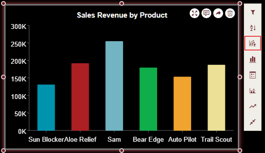
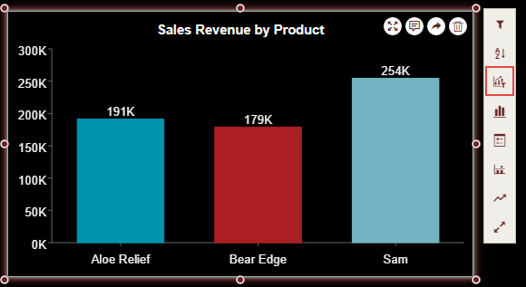
As an example, let's suppose you have a chart scenario that shows the sales revenue for different products in your company and you want to rank the data to find the top three selling products. Let's see how a ranking filter can be implemented to accomplish this in a few easy steps elaborated below:
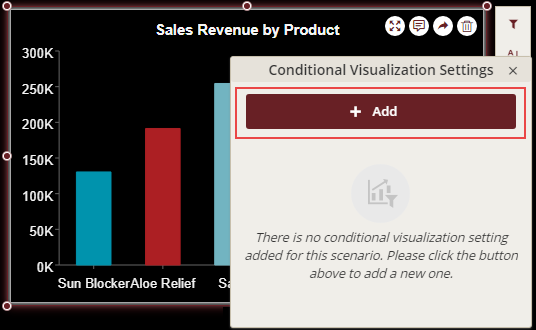
Select Conditional Visualization from the Action Bar associated with the scenario.
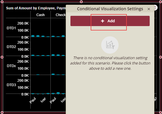
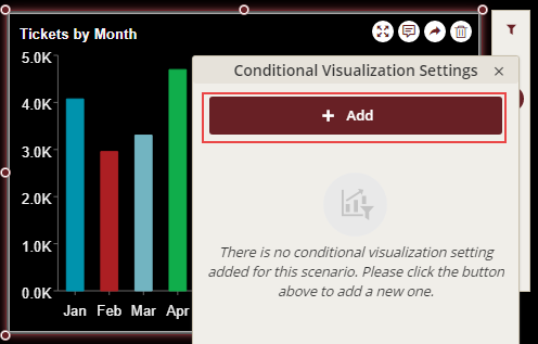
In the Conditional Visualization Settings dialog that appears, click Add to create a ranking filter.
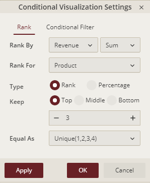
Under the Rank tab, set the fields for the ranking conditions as shown in the following dialog. Note that these ranking settings show the top three products in the scenario.
Click Apply and then OK to view the result.
Applying Advanced Ranking
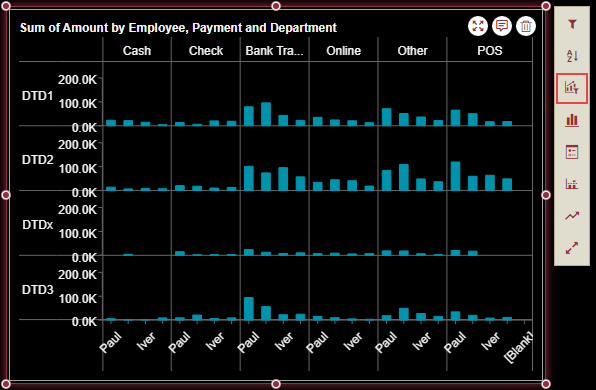
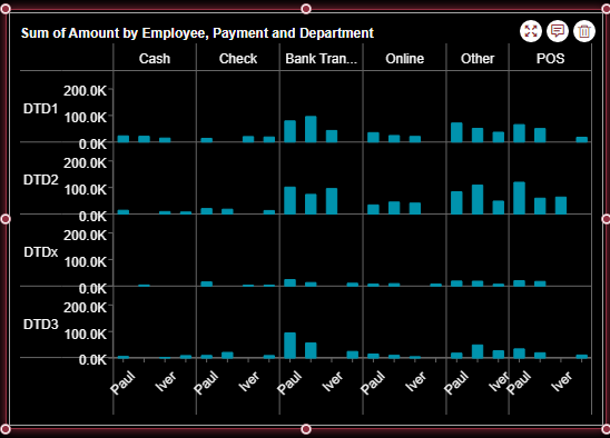
As an example, let's suppose you have a chart scenario that shows the sum of amount by employee, department, and payment. This chart also has the Trellis Rows bound to 'department' and Trellis Columns bound to 'payment'.
To rank the data to find the top three employees in each department with regards to payment, specify the 'Partitioning' and 'Addressing' settings under Advanced Rankings. The following steps show how this can be easily accomplished:
Select the dashboard scenario for which you want to rank the data.
Note: An Action Bar automatically appears on the right of the selected scenario.
From the Action Bar, select Conditional Visualization.
In the Conditional Visualization Settings dialog that appears, click Add to create a ranking filter.
Under the Rank option, set Rank By to a suitable dimension and aggregation method from the list.
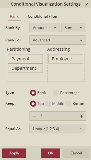
Next, we must specify the fields in the 'partitioning' and 'addressing' settings. To do so, set Rank By to Advanced and drag the required dimensions from the 'Addressing' area into the 'Partitioning' area. Since we want the top three employees within each Department and Payment, drag 'Department' and 'Payment' from the 'Addressing' area into the 'Partitioning' area and leave the 'Employee' in the addressing area.
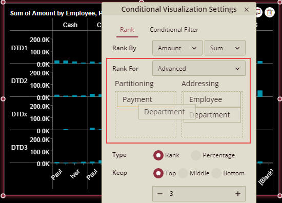
Select the Type to either 'Rank' or 'Percentage'. Choose 'Rank' since we want to display the rank values.
Specify whether you want to show the top, bottom, or middle values in the scenario in Keep. Also, provide the count of values that should be displayed, like in our case, '3'.
Choose an appropriate ranking rule from the list that you want to apply. For example, set Equal As to Unique(1,2,3,4) to set a unique ranking for each value.
After specifying the ranking conditions, your Conditional Visualization Settings dialog should look like the following.
Click Apply and then OK to view the result. Note that you can see only the top three employees in each Department and Payment.
Conditional Filter
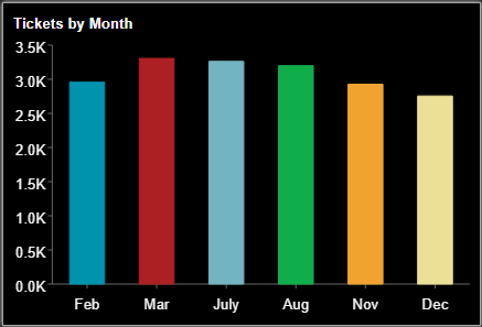
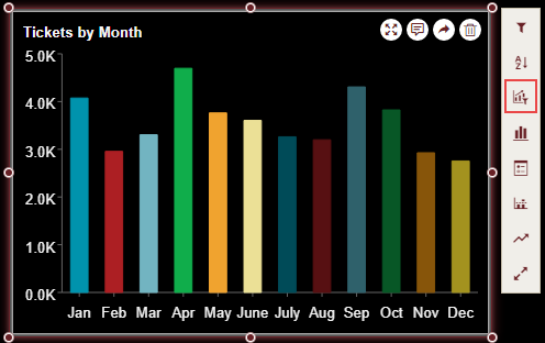
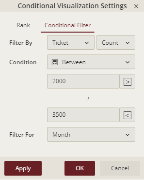
The Conditional Filter displays the dimension values according to specified values and conditions. As an example, let's suppose you have a chart that displays total number of tickets sold and you want to display only the months in which total tickets sold were between the range of 2000 to 3500 tickets.
This can be accomplished by using a conditional filter with the specified ranges. The Conditional Visualization Settings are described below:
Field | Description |
|---|---|
Filter By | Specifies the data attribute and the aggregation method that you want to use for filtering. Note: By default, this property is set to the bound measure and aggregation method. If you filter the values by 'measure', it shows all the six aggregation methods and if you filter the values by 'dimension', it shows only two aggregation methods. |
Condition | Specifies the filter condition. |
Filter For | Specify where you want to apply the filter. Note: By default, this property is set to the dimension bound to the scenario. |
Setting Conditional Filter
Select Conditional Visualization from the Action Bar associated with the scenario.
In the Conditional Visualization Settings dialog that appears, click Add to create a conditional filter.
Select the Conditional Filter option and set the fields for the filter conditions as shown in the following image. Note that these settings show the months whose ticket values lie between 2000 and 3500.
Click Apply and then OK to view the result.