- Getting Started
- Administration Guide
-
User Guide
- An Introduction to Wyn Enterprise
- Document Portal for End Users
- Data Governance and Modeling
- Working with Resources
- Working with Reports
-
Working with Dashboards
- Dashboard Designer
- Selecting a Dataset
- Data Attributes
- Dashboard Scenarios
- Dashboard Templates
- Component Templates
- 3D Scene
- Explorer
- Visualization Wizard
- Data Analysis and Interactivity
- Dashboard Appearance
- Preview Dashboard
- Export Dashboard
- Dashboard Lite Viewer
- Using Dashboard Designer
- Animating Dashboard Components
- Document Binder
- Dashboard Insights
- View and Manage Documents
- Understanding Wyn Analytical Expressions
- Section 508 Compliance
- Subscribe to RSS Feed for Wyn Builds Site
- Developer Guide
Pie E-Chart
Pie E-Charts offer an intuitive and compelling way to represent data distribution and proportions. Pie E-Charts blend with traditional pie charts with advanced interactive capabilities of modern technology. With vibrant colors, proportional slices, and interactive features, pie E-Charts communicate the relative size of different data segments efficiently. The interactive nature of Pie E-Charts elevates the user experience by enabling deeper exploration and context-based analysis. Learn more about creating and using Pie E-Charts in Wyn Enterprise below.
In this help article, you will find the following information,
Create a Pie E-Chart
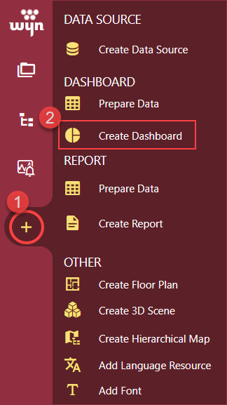
To create a pie E-Chart, navigate to the Resource or Document Portal and follow the below instructions,
Click the + Create button and then click the Create Dashboard option.
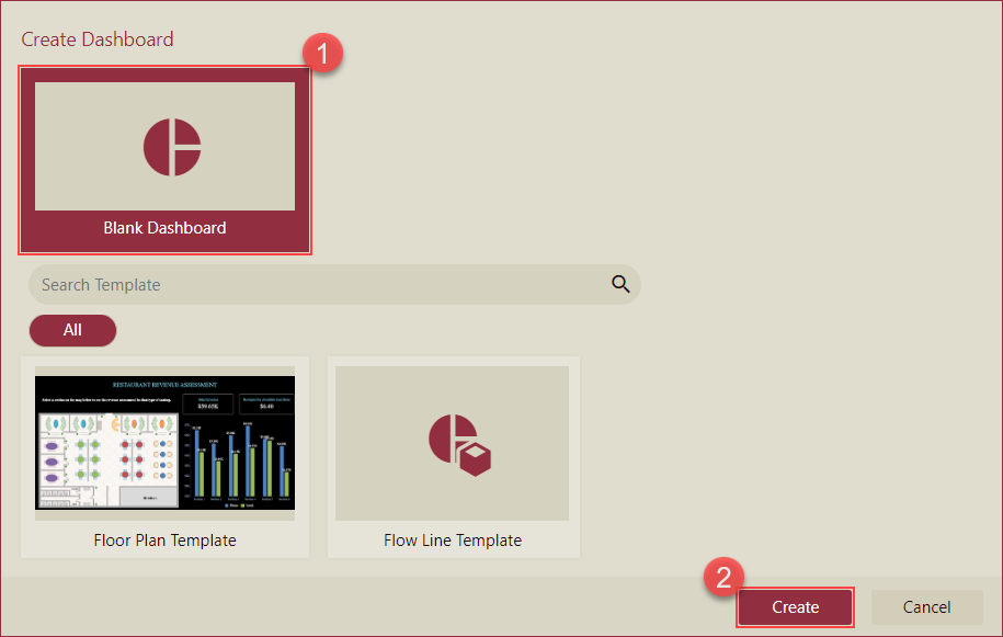
Select the Blank Dashboard option or select a template and click the Create button.
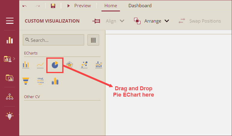
Navigate to the Custom Visualization tab from the Designer Toolbox and drag and drop the Pie Chart(Echarts) onto the design area.
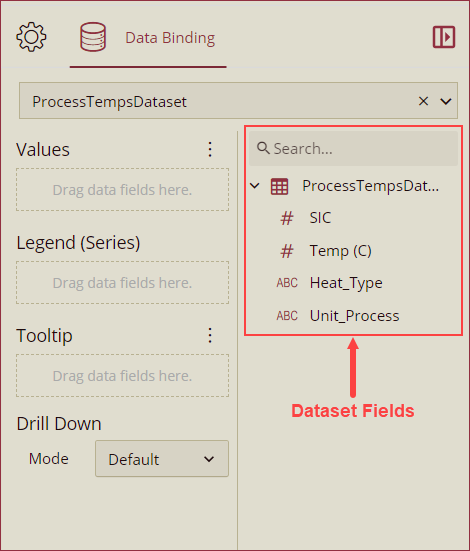
Bind Dataset to Pie e-Chart
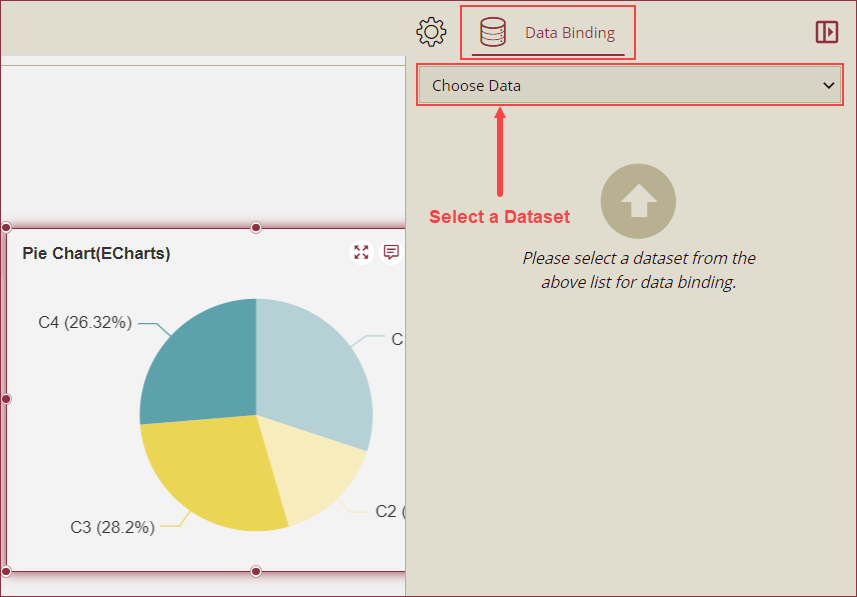
With the Pie E-Chart selected, choose a dataset from the Choose Data dropdown in the Data Binding panel.
Now, drag and drop the applicable dataset fields in the Values, Axis (Category), Legend (Series), and Tooltip data containers. You can also select a drill-down mode (Default, Pre-set Targets, or Pre-set Path) from the Mode dropdown under the Drill Down option. See theDrill Down help article for more information on drilling down in Wyn Enterprise.
Format Data Attributes
You can perform various operations in a Pie E-Chart to format the data attributes and control data display. Use the settings icon in the Data Field containers to format data attributes. The following operations are included in the Pie E-Chart scenario;
Aggregation Method: Use the Aggregation Method option to display a summarized value by aggregating multiple values of a data attribute. Aggregation Method supports Sum, Average, Max, Min, Count, and Distinct Count methods. See the Aggregation Method help article for more information.
Quick Functions: Use the Quick Functions option to highlight key indicators in your chart scenario by applying powerful calculations on measures. Quick Functions in Wyn Enterprise support Date Based Functions, Ranking Calculation, Percentile Calculation, Running Calculation, Moving Calculation, and Original Value. See the Quick Functions help article for more information.
Filter: Use the Filter option to display relevant data in your chart scenario. See the Filter Data help article for more information.
Rename: Use the Rename option to change the name of a data attribute to make it comprehensible and meaningful. See the Rename a Data Attribute help article for more information.
Remove: Use the Remove option to remove a data attribute from the chart scenario.
Tooltip Setting: Use the tooltip setting to customize the tooltips. You can customize the background image, color, and font style, add new data fields, modify the data fields, and modify expressions for data binding.
Analyze Data
Wyn dashboard scenarios support rich data analysis and exploration capabilities to help you analyze massive amounts of information and make data-driven decisions. The following analysis operations are available in the Action Bar corresponding to each scenario in the designer;
Filter: To filter out relevant data in your chart scenario. See the Filter Data help article, for information on using the filter options in a dashboard scenario.
Sort: To arrange the chart data in a more meaningful order. See the Sort help article for information on using the sort options in a dashboard scenario.
Conditional Visualization: To filter, compare, and rant the data in a dashboard scenario. See the Conditional Visualization help article for information on using various visualization options.
Data Binding: To modify the data binding of the dashboard scenario with new attributes use the Data Binding option. See the Modify Data Binding help article for more information.
Reference Line: To add a static line as a reference line on the chart use the Reference Line option. See the Reference Line help article for information on using various formatting options.
Show Data: To show the data linked to the bound dataset in a tabular form, use the Show Data option.
Focus: To expand the chart scenario to full-screen size, use the Focus option.
Customize Appearance
Navigate to the Inspector Panel and modify the settings as per your requirements. The properties of the Pie E-Chart are listed and described below.
CHART STYLE
Property | Description |
|---|---|
Maintain Color Assignments | To change the color assignments of the column bars, turn the flag to True and change the color of the data items from the Assign Colors popup using the Color Assignment property. To use the default color palettes for the column bars, turn the flag to False and select a default color palette from the Palette property. By default, the value of the Main Color Assignment property is set as False. |
Palette | Palette property is visible only when the Maintain Color Assignment property is set to False. Palette is used to select the group of colors for the column bars. |
Graph Opacity | Use the Graph Opacity property to set the opacity level of the e-chart. The value of the Graph Opacity property ranges from 0% to 100%. |
Start Angle | Set the starting edge position of the pie chart using this property. |
Radius | Set the inner and outer radius of the pie chart using this property. |
Corner Radius | Set the radius of the curves of the pie chart using this property. |
Auto Gradient | To set an automatic color gradient in the chart, set the Auto Gradient property to True. By default, the value of this property is set as False. |
Custom Echarts Option | Use the Custom Echarts Option to customize the chart using JavaScript code. |
Custom Behavior | Use the Custom Behavior option to write the JavaScript code and use the setTimeout/setInterval/myChart (echart instance) to customize the behavior of the chart. It will dynamically change the chart content in real time. Refer to section E-Charts Custom Behavior for more details. |
ANIMATION
Property | Description |
|---|---|
Entrance Animation | Select an option from the dropdown to set the animation style of the appearance of the chart scenario. After selecting an option (SlideInDown, SlideInLeft, SlideInRight, SlideInUp, SlideInDown, BackInDown, BackInLeft, or BackInRight) from the dropdown, set the delay and duration of the animation using the Delay(s) and Duration(s) properties respectively. |
DATA VISUALIZATION
Property | Description |
|---|---|
Automatic Carousel | To highlight the columns one at a time and display the tooltip, set the Automatic Carousel property to True. By default, this property is set to False. |
Include All Dimensions | To include the labels with Null values in the chart scenario, set this property to True. |
DATA LABELS
Property | Description |
|---|---|
Show Data Labels | To display data labels set the Show Data Label property to True. By default, the value of the Show Data Label property is set to False. |
Display Pattern | You can add a line break between Category, Value, and Series by using the Display Pattern property for the data labels. The dropdown list has 3 display pattern options. |
Value | To disable the display of the data label values set the Value property to True. By default, the value of the Value property is set to False. |
Value As Percentage | To display the value of the data labels as a percentage, set the Value As Percentage property to True. By default, this property is set as False. |
Series Name | To display the name of the series data values, set the Series Name property to True. By default, this property is set to False. |
Location | Select the Around or On Slice option from the dropdown to display the data labels around or on a slice of the pie bars. |
Show Connecting Line | To disable the display of connecting lines of the data labels, set the Show Connecting Line property to False. By default, this property is set as True. |
Line Width | Set the width of the connecting line using this property. |
Connecting Line Color | Select the color of the connecting line using this property. |
Display Mode | Select an option from the dropdown to set the display mode of the data labels. The available options are Auto and All. |
Data Label Font Setting | Set the font family, font size, font color, font weight, and font style of the data labels using this property. |