- Getting Started
- Administration Guide
-
User Guide
- An Introduction to Wyn Enterprise
- Document Portal for End Users
- Data Governance and Modeling
- Working with Resources
- Working with Reports
-
Working with Dashboards
- Dashboard Designer
- Selecting a Dataset
- Data Attributes
- Dashboard Scenarios
- Dashboard Templates
- Component Templates
- 3D Scene
- Explorer
- Visualization Wizard
- Data Analysis and Interactivity
- Dashboard Appearance
- Preview Dashboard
- Export Dashboard
- Dashboard Lite Viewer
- Using Dashboard Designer
- Animating Dashboard Components
- Document Binder
- Dashboard Insights
- Add a New Page in Dashboard Designer
- View and Manage Documents
- Understanding Wyn Analytical Expressions
- Section 508 Compliance
- Subscribe to RSS Feed for Wyn Builds Site
- Developer Guide
Containers and Components
Wyn Enterprise provides additional scenarios like containers and components that help the user create a feature-rich dashboard.
Containers
The container scenarios - Container and Tab Container, help users in organizing the dashboard layout. These scenarios make the dashboard formatting easier as you can apply the same style template on all the scenarios inside the container. Also, you can move multiple dashboard scenarios by moving the container containing the scenarios.
Note: Nesting the container scenarios is not allowed in Wyn Enterprise.
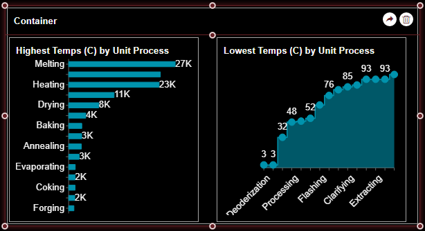
Container
The Container scenarios greatly facilitate the layout design of the dashboards. You can place dashboard scenarios with the same theme in the same container to apply a uniform theme.
You can resize a container using the following two options;
Mouse Drag: Using the mouse to drag the edges of a container, all inherent dashboard components will resize according to the scale.
CTRL + Mouse Drag: Using the CTRL key + mouse drag on a container will simply resize the container without affecting the size of the inherent dashboard components.
Note: The Container’s Filter Scope property value 'Global' is now renamed 'Page’.
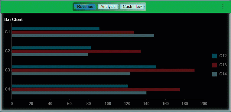
Tab Container
In the Tab Container, you can add multiple tabs where each tab can hold one or more dashboard components. Tab Containers can contain other dashboard components like charts, indicators, tables, maps, rich text components, images, slicers, embedded dashboards, and embedded reports. Tab Containers are used to display one container pane at a time from multiple container tabs and organize the dashboard components in a visually appealing manner.
Note: Selected instances and cross-filtering of data in a tab of a tab container will be retained when switching to another tab.
You can modify the interaction and appearance properties of the Tab Containers as described below.
Tab Strip
This section manages the tab display.
Property | Description |
|---|---|
Show Tab Strip | To hide the tab strips, set this property to False. By default, this property is set as True. |
Style | Select a template from the dropdown to apply a style to the Tab scenario. |
Tab Display Mode | Select the Top or Bottom from the dropdown list to manage the tab display at the top or bottom of the tab container. |
Tab Alignment | Select Left, Right, or Center alignment of the title of the tabs of the tab container from the dropdown list. |
Tab Width Mode | Set the width proportion of the tab using this property. Select the option Fixed to fix the tab width, select the option Auto to adjust the width of the tab according to the tab name, and select the option Distribute, to evenly distribute the width of all the tabs. |
Tab Height Mode | Set the height of the tab using this property. Select the option Fixed to fix the tab width, and select the option Auto for the default height. |
Tab Height | This option is visible if the Tab Height Mode is set to Fixed. Set the height of the tab using this property. |
Tab Space | Set the space between the tabs using this property. |
Font Setting | Set the family, size, color, weight, and style of the font of tab text using this property. |
Background Color | Set a background color of the tab strip using this property. |
Padding | Use this property to create space around tab names from left, right, top, and bottom. |
Border | Set the border color of the tab strip using this property. |
Show Split Line | Set this property to True to display the split lines around each tab on the tab strip. |
Show Menu Icon | Set this property to True to show the Menu Icon. The Menu Icon includes the name of each tab on the Tab Strip. You can click the particular tab from the Menu Icon to navigate to it. |
Tab Arrow Navigator | You can manage the display of the tab navigator using the Tab Arrow Navigator property. Select the Tab Arrow Navigator as Hidden from the dropdown list, to hide the tab navigation arrows on the preview. By default, the value is set to Default. |
Mobile Auto Layout Policy | Set the mobile layout using this property. Mobile Auto Layout Policy includes the following two options: Flow and Scale. |
Group Style
This section manages the group styling properties of the tab strip. This will apply to the group of all the tabs in the Tab Strip.
Property | Description |
|---|---|
Corner Radius | All tabs can have rounded corners. Set the radius of the corners from left, right, top, and bottom using this property. |
Padding | Use this property to create space around grouped tab names from left, right, top, and bottom. |
Background Color | Set the background color of all the tabs using this property. select a color from the color palette. |
Background Gradient | Set the background gradient using this property to blend the background color and gradient. |
Interaction
This section manages the grouping properties of the tabs on the tab strip. This will apply to the group of all the tabs in the Tab Strip.
Property | Description |
|---|---|
Scenario Name | Add a name to the Tab Container scenario using this property. |
Filter Scope | Filtering is applied to all the dashboard scenarios. If the scenarios are placed inside a container, the scope of filtering can be limited to the container by setting the Filter Scope property to Container. By default, the Filter Scope property is set as Page. |
Auto Switch Tab | To allow automatic switching of the tabs, set the Auto Switch Tab property to True. By default, it is set to False. |
Auto Switch Interval | This property is enabled when the Auto Switch Tab property is set to True. Set a switch interval between the tabs using the Auto Switch Interval property. |
Tab Switch Animation | Select the type of animation (None, Slide, or Fade In) for the tab switch using the Tab Switch Animation property. By default, the value of the Tab Switch Animation property is set as None. And, the animation duration is 1.8 seconds. |
Title
This section manages the display of the Title of the Tab Container.
Property | Description |
|---|---|
Show Title | To show the title of the Tab Container scenario set this property to True. By default, this property is set as False. |
Title | This property is enabled, when Stow Title is set to True. Add or edit the title of the Tab Container scenario using this property. |
Alignment | Select the Left, Center, or Right alignment of the title of the Tab Container scenario using the dropdown. |
Title Font Setting | Set the family, size, color, weight, and style of the font of the Tab Container scenario title using the Title Font Setting options. |
Padding | To create space around the title of the Tab Container scenario use the Padding property. It supports Padding Left and Padding Right and their values are the same. |
Fit Mode | Set the height proportion of the title height using the Fit Mode property. The available options are Fixed and Auto. Fixed is used to keep the title height unchanged and the Auto option is used to make the title height change according to the size of the tab container. The default value of the Fit Mode property is Fixed. |
Title Height | Set the height of the title using the Title Height property. When the Fit Mode is set to Fixed, the default value of Title Height is set to 40. |
Regular Style
This section manages the Regular Style properties of the tab strips.
Property | Description |
|---|---|
Background | To set the color of each tab of the Tab Container scenario, select a color from the color palette. Apart from the selected tab, all other tabs will be displayed in this color. |
Text Color | Set the color of the text on the Tabs using this property. |
Corner Radius | All tabs can have rounded corners. Set the radius of the corners from left, right, top, and bottom using this property. |
Background Gradient | Set the background gradient using this property to blend the background color and gradient. |
Background Image | To add an image as the background of the tabs of the tab strip, select an image using this property. You can select images from three sources Embedded, Shared, or an External URL. |
Shadow | Create a shadow on the tabs by setting the Shadow Type, Shadow Color, and Thickness. |
Border Thickness | Set the border thickness of tabs around the shadow using this property. |
Border Color | Set the border color of tabs around the shadow using this property. |
Hover Style
This section manages the Hover Style properties of the tabs. These properties will be displayed while hovering over the tabs.
Property | Description |
|---|---|
Background | Set the background color of tabs to be displayed on hover using this property. |
Text Color | Set the color of the text on the Tabs to be displayed on hover using this property. |
Corner Radius | Set the radius of the corners of the tabs from left, right, top, and bottom using this property. The corner radius will be displayed while hovering over the tabs. |
Background Gradient | Set the background gradient using this property to blend the background color and gradient. This will be displayed while hovering over the tabs. |
Background Image | To add an image as the background of the tabs of the tab strip, select an image using this property. You can select images from three sources Embedded, Shared, or an External URL. |
Shadow | Create a shadow on the tabs by setting the Shadow Type, Shadow Color, and Thickness. This will be displayed while hovering over the tabs. |
Border Thickness | Set the border thickness of tabs around the shadow using this property. This will be displayed while hovering over the tabs. |
Border Color | Set the border color of tabs around the shadow using this property. This will be displayed while hovering over the tabs. |
Selected Style
This section manages Selected Style properties of the tabs. These properties will be displayed when the particular tab is selected.
Property | Description |
|---|---|
Background | Set the background color of tabs to be displayed when selected using this property. |
Corner Radius | Set the radius of the corners of the tabs from left, right, top, and bottom using this property. The corner radius will be displayed for the selected tab. |
Background Gradient | Set the background gradient using this property to blend the background color and gradient. This will be displayed for the selected tab. |
Background Image | To add an image as the background of the tabs of the tab strip, select an image using this property. You can select images from three sources Embedded, Shared, or an External URL. |
Shadow | Create a shadow on the tabs by setting the Shadow Type, Shadow Color, and Thickness. This will be displayed for the selected tab. |
Border Thickness | Set the border thickness of tabs around the shadow using this property. This will be displayed for the selected tab. |
Border Color | Set the border color of tabs around the shadow using this property. This will be displayed for the selected tab. |
Indicator Color | Set the Indicator Color of tabs using this property. This represents the selected tab. |
Layout
This section manages the position and dimensions of the Tab Container scenario.
Property | Description |
|---|---|
X-Position | Set the horizontal position of the Tab Container scenario using the X Position property. |
Y-Position | Set the vertical position of the Tab Container scenario using the Y Position property. |
Width | Set the width of the Tab Container scenario using this property. You can set the minimum width up to 8. |
Height | Set the height of the Tab Container scenario using this property. You can set the minimum height up to 8. |
Appearance
This section manages the style template, background color, margin, visibility, background image, border, and shadow of the Tab Container scenario.
Property | Description |
|---|---|
Style Template | Select a template from the dropdown to apply a style to the Tab Container scenario. |
Background Color | Set a background color of the Tab Container scenario using this property. |
Padding | To create space around the Tab Container scenario, set a padding value. |
Margin | Set the margin value for the Tab Container scenario using this property. |
Visibility | To hide the Tab Container scenario from the dashboard scenario, set this property to False. By default, the Visibility property is set as True. |
Background Image | Add an embedded, shared, or external image as a background image to the Tab Container scenario. |
Border | Set the border type, border color, and thickness of the Tab Container scenario using this property. |
Shadow | Create a shadow of the Tab Container scenario by setting the Shadow Type, Shadow Color, and thickness. |
Note: On previewing a dashboard and applying cross-filtering, filtering is applied to all the scenarios (or slicers). If the scenarios are placed inside a container, the scope of filtering can be limited to the container by setting the Filter Scope property of the container to Container. By default, the Filter Scope property is set as Page.
Note: On the Inspector tab, for the Container and Tab Container scenarios, the Padding property under the Title section, supports Padding Left and Padding Right and their values are the same. Whereas for other scenarios Title section supports Padding Left, Padding Top, Padding Right, and Padding Bottom, and their values can be different.
Components
Wyn Enterprise supports two different types of component scenarios - Rich Text and Image. Both of these scenarios are used to display additional information to enhance the dashboard.
Rich Text
Rich Text provides the user the ability to add explanatory text in the dashboard, for example, you can add rich text to explain the scenarios to the users viewing the dashboard. This makes the dashboard more informative. You can also format the text and add links to jump to a URL, a dashboard, or a report, in the rich text editor.
You can refer Rich Text topic for more details.
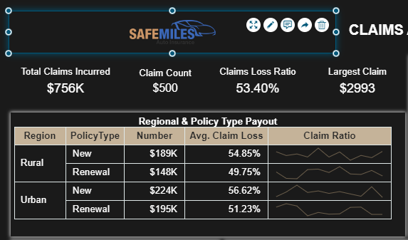
Image
Add images to create a dashboard design more appealing to the users. For example, you can include images for your company logos, product items, etc. to create an interactive dashboard. They also make the information for the user easier to understand. You can add an embedded image, shared image, or external URL for the image in the dashboard.
Embedded Components
Wyn Enterprise supports two types of embedded components - Embedded Dashboard and Embedded Report. Typically, an embedded component is used to embed a document (dashboard or report) into another dashboard for additional business insights. This provides a unified view to the users with all the diverse documents in a single dashboard. Additionally, inserting a document into a dashboard will help the users in the decision-making process.
Note: Embedding the current document into an embedded component is not supported in Wyn Enterprise (also valid for cyclic embedded relationships within the dashboards).
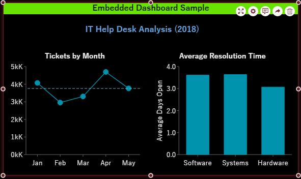
Embedded Dashboard
Embed a dashboard into another dashboard using the Embedded Dashboard scenario. The embedded dashboard displays the same content as that of the referenced dashboard. Drop the scenario onto the design area and define the settings for the embedded dashboard using the Configure option. The configuration settings include the following -
Document - Use the dropdown to select the dashboard to embed in the component.
Initial Page Number - Set the page number that should preview initially when embedding a multi-page dashboard.
Parameters - Specify the parameter(s) for the embedded dashboard, if any.
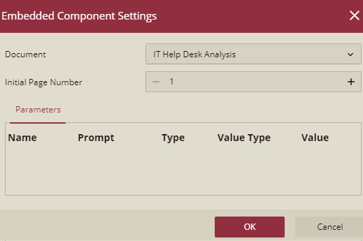
You can also modify the appearance of the scenario by specifying its background color, border width and color, padding, margin, etc. Apart from this, you can customize the behavior of the scenario on preview by enabling cross-filtering, managing the visibility of menu items, and pinning the annotation to the scenario.
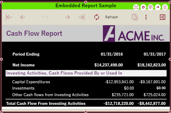
Embedded Report
Use this scenario to embed a report into a dashboard. It shares the same functionality as that of the Embedded Dashboard scenario. You can define the settings for the embedded report using the Configure button present on top of the scenario. These configuration settings include the following -
Document - Use the dropdown to select the report to embed in the component.
Page Size Mode - Set the page zoom mode for the embedded report in the component. The possible values are 'Fit to Page' and 'Fit to Width'. By default, this setting is set to 'Fit to Width'.
Page Display Mode - Specify the page view mode for the embedded report in the component. The supported values are 'Single Page View', 'Galley Mode', and 'Continuous'. The default value for this setting is 'Single Page View'.
Show Toolbar - Choose whether to display the preview toolbar in the embedded component.
Parameters - Specify the parameter(s) for the embedded report, if any.
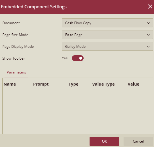
You can also modify the appearance of the scenario by specifying its background color, border width and color, padding, margin, etc. Apart from this, you can customize the behavior of the scenario on preview by managing the visibility of menu items and pinning the annotation to the scenario.