- Getting Started
- Administration Guide
-
User Guide
- An Introduction to Wyn Enterprise
- Document Portal for End Users
- Data Governance and Modeling
- Working with Resources
- Working with Reports
-
Working with Dashboards
- Dashboard Designer
- Selecting a Dataset
- Data Attributes
- Dashboard Scenarios
- Dashboard Templates
- Component Templates
- 3D Scene
- Explorer
- Visualization Wizard
- Data Analysis and Interactivity
- Dashboard Appearance
- Preview Dashboard
- Export Dashboard
- Dashboard Lite Viewer
- Using Dashboard Designer
- Animating Dashboard Components
- Document Binder
- Dashboard Insights
- Add a New Page in Dashboard Designer
- View and Manage Documents
- Understanding Wyn Analytical Expressions
- Section 508 Compliance
- Subscribe to RSS Feed for Wyn Builds Site
- Developer Guide
Calc Charts
With the help of Calc Charts, users can easily organize, gather, maintain, and visualize the data that is immediately unavailable in the dataset. These charts enable the users to dynamically calculate and visualize the custom metrics in a dashboard based on the current business demands. The data in the calc chart is presented in such a manner that it becomes easier for the user to make an informed business decision.
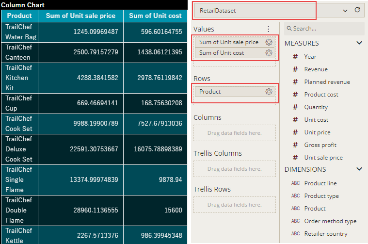
Let's say, we want to view the markup values for each product in 'RetailDataset', but currently, the dataset does not contain any defined data attribute that contains any markup details. So, in such a case, we need to create a new dynamic aggregation and use it as a calculated field for the calc chart.
Design a Calc Chart in Wyn Enterprise
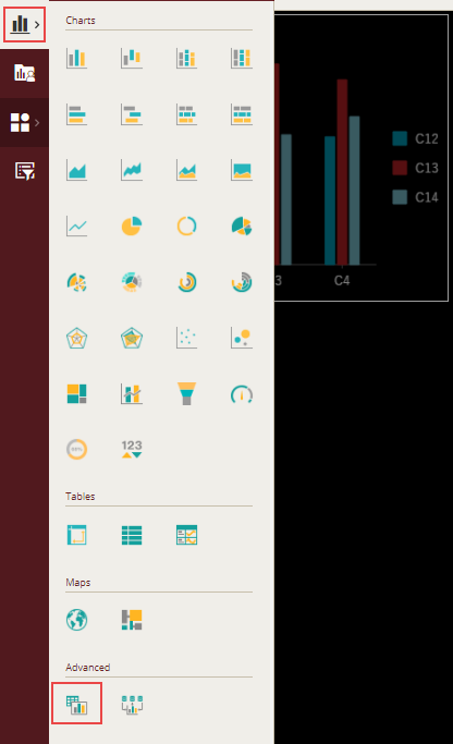
From the Dashboard Toolbox, open the Data Visualization node and drag-drop the Calc Chart scenario onto the design area.
Configure Data
The Calc chart is extremely different from the rest of the charts in Wyn Enterprise as we cannot use the data directly from the dataset; instead we need to generate the data for the calc chart. Click the Custom Configure Dataset button ![]() on the top-right corner of the scenario to generate our own custom data. This opens the calc editor as shown.
on the top-right corner of the scenario to generate our own custom data. This opens the calc editor as shown.
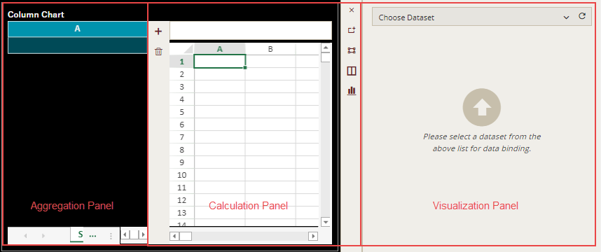
The calc editor consists of the following panels -
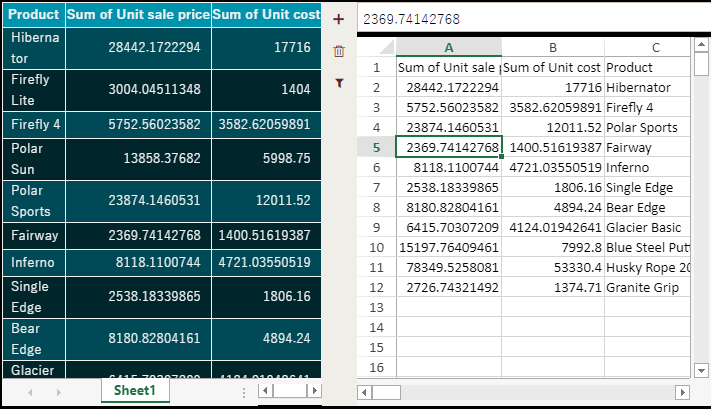
Aggregation Panel - It displays data aggregations in the form of a pivot table. You can add multiple pivot sheets to display data aggregations from different datasets. You can also delete the pivot table that you no longer require, or filter the data to use only the required information for your calculation.
Calculation Panel - It displays an Excel-like spreadsheet where you can calculate the desired metrics or manually enter the data you want to use. You can enter the text in a spreadsheet manually or copy-paste the text from the pivot table to the spreadsheet or use the GETPIVOTDATA formula to reference the data dynamically in the spreadsheet.
You can automatically create this function by selecting a cell in the spreadsheet typing "=", and then selecting a cell in the pivot table. The general syntax for the function is -GETPIVOTDATA(measure name, sheet name, [dimension name, entry name of dimension],...)In the right-side of the Calculation panel, you get the following options to manage data -- Exit the Configuration - closes the calc editor
- Set Selection Range as Data Source - specifies the selected range in the spreadsheet as the data source
- Show Data Source Range - shows or hides the selected data source range in the spreadsheet
- Layout - changes the editor layout by displaying only the chosen panels, such as aggregation, calculation, aggregation and calculation, calculation and visualization, or all.
- Chart Type - changes the default chart type to any chart (such as bar, area, line, pie, treemap, etc.) or a table (for now only data table is supported).
Visualization Panel - It visualizes the data selected in the Calculation Panel. By default, this panel is not visible. When you select a data range as a data source for the calc chart, it displays a list of all the available measures and dimensions in the Data Binding panel.
Prepare Pivot Table Data
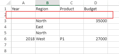
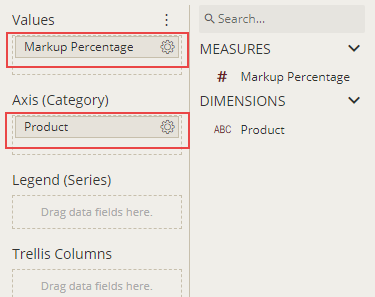
The use of pivot table within a calc chart is to display the data aggregations that can be used for calculating the custom data. To display the 'Markup Percentage' for each product, bind the pivot table to the 'RetailDataset' dataset and drag-drop the required data attributes to the Data Binding area of the scenario. Observe that a pivot table is plotted accordingly in the Aggregation Panel of the editor. Now, this pivot table will act as the real time need-based data source for the calc chart.
Use Aggregation Data for Calculation
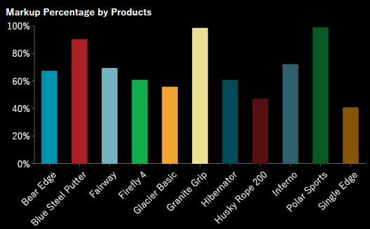
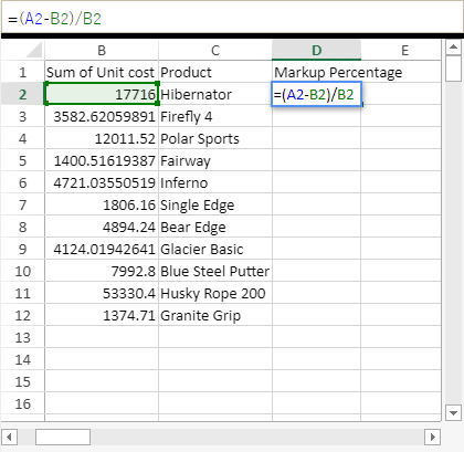
Let's now move to the Calculation Panel of the editor where we will calculate the desired metrics by using the data aggregations calculated in the pivot table. We want to show the markup percentage to determine the total profit on each product. Generally, markup percentage is used in the retail industries and can be calculated using the following formula - ((Selling Price - Unit Price) / Unit Price ) * 100
Copy the required values from the pivot table and paste them in the spreadsheet as shown. Note that we have used the filter option  to display the data for only a few products in the pivot table.
Now, we will use the formula bar in the spreadsheet to calculate the markup percentage for each product.
Binding Chart to the Calculated Fields
Now calc chart will use the calculated fields (or custom data) as its data source, available from the calculation panel.
As shown in the image, we will select the range of data containing the product names and their corresponding markup values and use it as a data source by selecting the 'Set Selection Range As Data Source' option available on the right of the Calculation Panel.
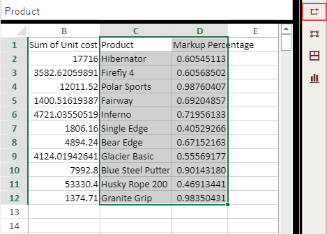
The Data Binding area now shows the calculated fields from the range selected as the data source in the spreadsheet. Drag and drop the required data attributes to the Data Binding area of the scenario and observe that the chart is plotted accordingly in the bottom section of the editor.
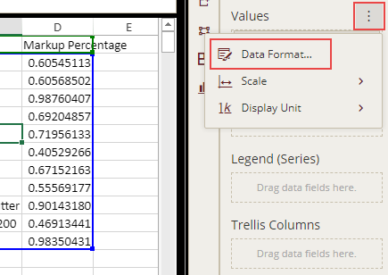
Format Data Attributes
You can format the data attributes and control the display of data attributes in a dataset by performing a variety of operations such as renaming, changing data format and display unit, and modifying value scale.
For more information about these operations, see Data Attributes.
The data format for the data attribute in calc chart is modified to display the sales revenue in 'percentage' as shown.
Analyze Data
Wyn Dashboards scenarios support rich data analysis and exploration capabilities that can help analyze massive amounts of information and make data-driven decisions. For example, sorting data, applying conditional formatting, adding reference lines, trend lines, etc. Note that you can apply all these operations using the Action Bar corresponding to each scenario in the designer.
For more information, see Data Analysis and Interactivity in Dashboards.
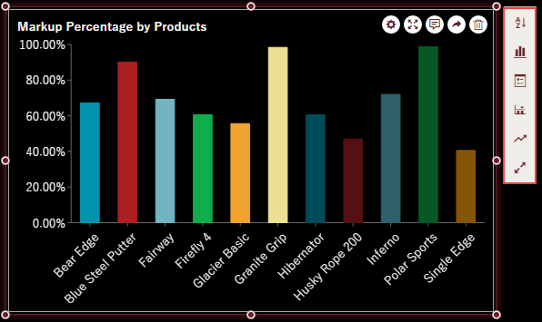
In the following chart scenario, a data sort is applied to arrange the product names alphabetically in the chart scenario. Note that only manual sort is available due to the dynamic nature of the calc chart.
Customize Appearance
You can customize the default appearance of calc charts by setting properties in the Inspector tab of the scenario such as adding a border, modifying data labels, setting chart style, renaming chart title, displaying grid lines, etc.
Show Grid Lines
To display horizontal grid lines in a calc chart scenario, you can set the Show Grid Lines property of the value axis to 'True'. By default, this property is set to 'False'. You can also specify the grid line color by choosing a suitable color from the color palette.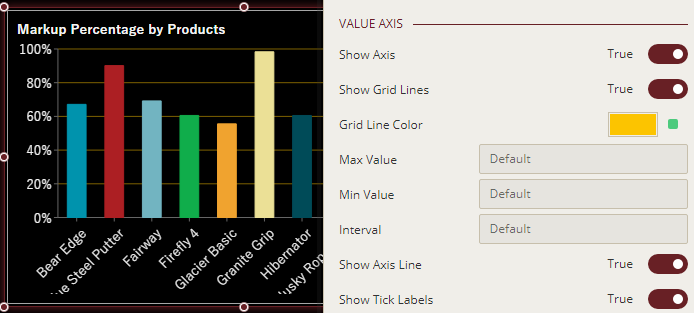
Format Axis Titles
You can show or hide axis titles for a chart by using the Show Title property for the Legend, Value axis, and Category axis. When you set the Show Title property to 'True', the axis titles are enabled. Wyn Dashboards set data attributes' names as the axis titles. You can provide a custom name to the axis title by renaming the attributes in the Data Binding area. For more information on renaming data attributes, see the topic on Rename an Attribute.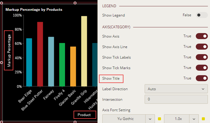
Change Axis Scale
To customize the scale values for the Value axis of a chart scenario, use the Max Value, Min Value, or Interval properties and set them to some suitable values.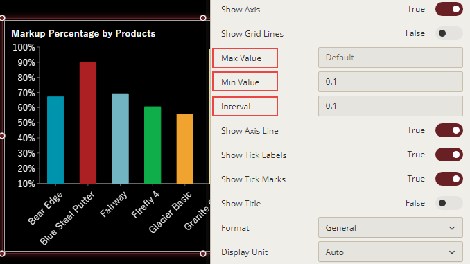
Remove Empty Cells
In calc charts, you can remove null values from the custom data that may occur in the spreadsheet as unresolved formula cells or no data in selection by using the Remove Empty Cells property. This property provides you the following options:None - Choose this option to keep all the empty cells. It is the default value for the property.
Empty Cells - Choose this option to exclude any empty cell, whether an empty value or group, from being presented on the chart.
Empty Dimensions - Choose this option when you want to exclude the rows/columns groups that have no data from being presented on the chart.
Empty Rows/Columns - Choose this option when you want to remove the data rows/columns having empty rows/columns groups as well as empty values.