- Getting Started
- Administration Guide
-
User Guide
- An Introduction to Wyn Enterprise
- Document Portal for End Users
- Data Governance and Modeling
- Working with Resources
- Working with Reports
-
Working with Dashboards
- Dashboard Designer
- Selecting a Dataset
- Data Attributes
- Dashboard Scenarios
- Dashboard Templates
- Component Templates
- 3D Scene
- Explorer
- Visualization Wizard
- Data Analysis and Interactivity
- Dashboard Appearance
- Preview Dashboard
- Export Dashboard
- Dashboard Lite Viewer
- Using Dashboard Designer
- Animating Dashboard Components
- Document Binder
- Dashboard Insights
- Add a New Page in Dashboard Designer
- View and Manage Documents
- Understanding Wyn Analytical Expressions
- Section 508 Compliance
- Subscribe to RSS Feed for Wyn Builds Site
- Developer Guide
Rich Text
Rich Text is a dashboard component in the Wyn Enterprise application that enables you to add rich text content to your dashboard. Rich Text makes your dashboard informative by adding textual information with various editing properties such as formatting, listing, positioning, dynamic data options, and navigation. The mentioned properties are listed and explained in the Editor Toolbar Properties section.
Using the Rich Text Component
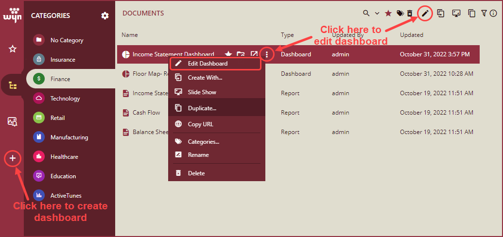
You can access the Rich Text component when you create or edit the dashboard. Follow the below instructions to access and use the Rich Text component in Wyn Enterprises,
Navigate to the Dashboard Designer page by either creating a new dashboard or editing an existing one.
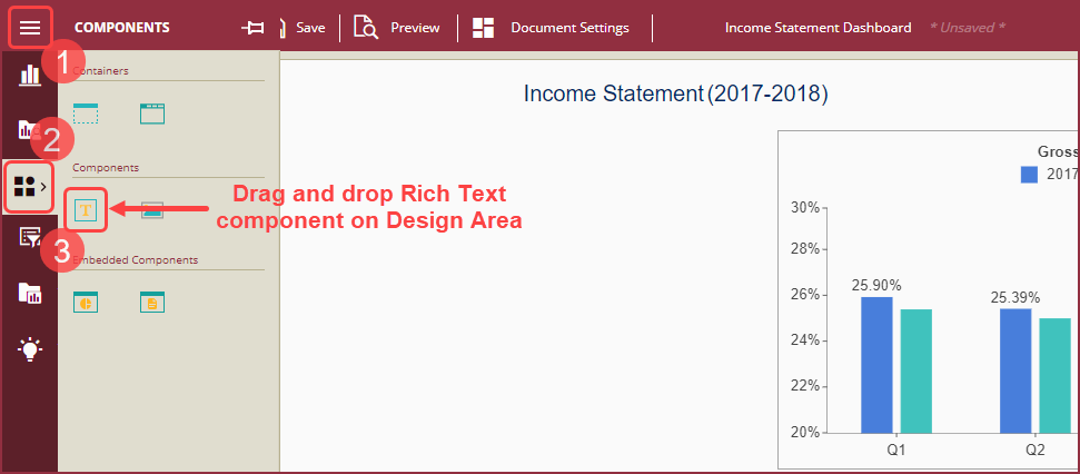
On the Dashboard Designer page, click the Components icon from the Dashboard Toolbox, and drag and drop the Rich Text component icon to the Design Area.
Rich Text component appears on the Design Area. Hover on the rich text component and click the edit icon from the Action Menu to edit. You can also save the rich text component as a template using the Save As Component Template icon from the Action Menu as shown in the image below.
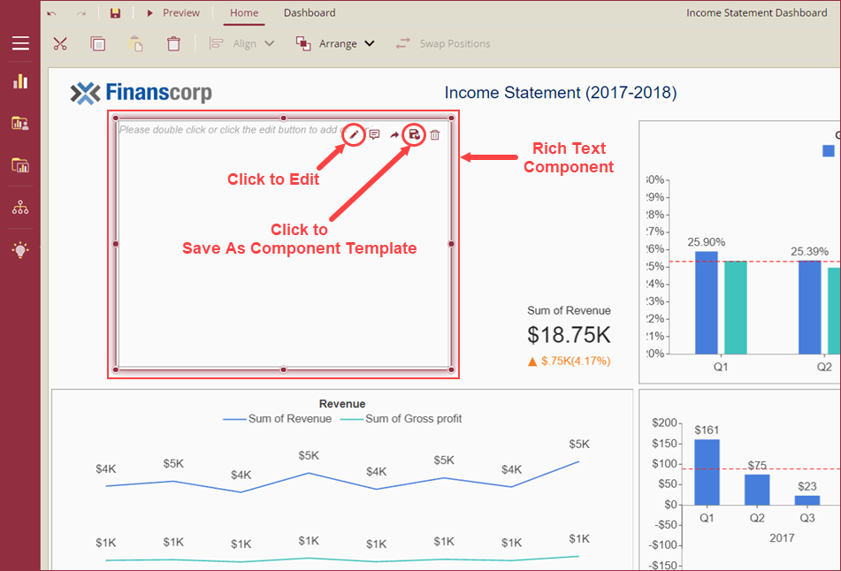
Note: The Action Menu will appear in the top-right corner of the component and in case the Rich Text component is at the top of the Dashboard, the Action Menu will appear at the bottom of the rich text component.
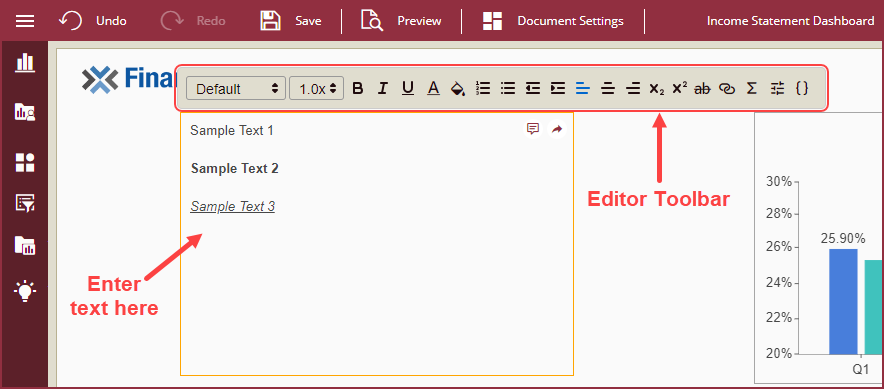
In the edit mode, enter the text in the Rich Text component and use the Editor Toolbar to enhance the appearance of the text with formatting, listing, positioning, dynamic data, and navigation options. The properties of the Editor Toolbar are listed and explained in the Editor Toolbar Properties section of this topic.
Inspector Panel on the right side of the Dashboard Design Area can be used to further enhance the text for interaction, blank and null data content, layout, and appearance. The properties of the Inspector Toolbar are listed and explained in the Inspector Panel Properties section of this topic.
Attributes of Rich Text
Rich Text Component
Rich Text component is an advanced text editor with special features to add textual information on dashboards. Following properties are available in the Rich Text component.
Edit – Use the Edit icon to access the Editor Toolbar used to edit the text in the Rich Text component. Editor Toolbar Properties section lists and describes the properties available in the Rich Text component.
Add Annotation – Use the Add Annotation icon on the Rich Text component to add comments or explanations to the text.
Share Scenario – Use the Share Scenario icon to embed a particular scenario of the Wyn Dashboard in your application. Embed the scenario using iFrame or Div containers.
Delete – Use the Delete icon to remove the Rich Text component from the Dashboard.
Editor Toolbar Properties
Dynamic Data Options
Dynamic Data Options are used to display dynamic data by adding expressions to bind data fields of a dataset. The following Dynamic Data Options are available in the edit mode of the Rich Text component;
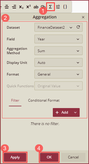
Insert Data Aggregation - To insert a summarized value by aggregating multiple values of a data attribute in a Dataset, click the Σ icon from the Editor Toolbar. Then, select a Dataset, Field, Aggregation Method, Display Unit, Format, and click Apply to add. You can also add filters and conditional formatting to the data aggregates.
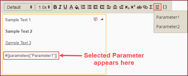
Insert Parameter - To insert parameters to the dashboard, click the Insert Parameter icon from the Editor Toolbar and select the parameters to add to the Rich Text component. See this help topic for more information on using parameters in Wyn Enterprise application.
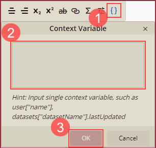
Insert Variable - To insert user-defined variables used in a particular context, click the {} icon from the Editor Toolbar and input a single context variable such as, user["name"], datasets["datasetName"].lastUpdated.
Note: Variables in the referenced document are contained within #{}. However, in the Rich Text variable, this is not required.
Navigation
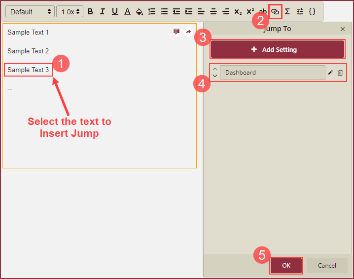
Navigation option (Jump To) is used to add navigation to other documents (reports or dashboard), and internal or external URLs for adding more details of the metrics to the visualization. To insert jump, select the text from the Rich Text component, click the Jump To icon from the Editor Toolbar, and then click Ok button. When using the Jump To feature in a Rich Text, Images or Annotation, you can set the color of the Jump To hyperlink text by changing the font color of the text from the Editor Toolbar.
See Jump To help article for more information on how to add and manage settings of the Jump To scenario.
Formatting
Option | Description |
|---|---|
Font | To select a Font Family for the text. |
Font Size | To set a Font Size for the text. |
Bold | To make the text heavier and darker than normal text. Bold Font Style is generally used to strongly emphasize the text. |
Italics | To make the text slant to the right. Italic Font Style is used to emphasize words or phrases of the text. |
Underline | To add a line beneath a section of the text. Underline Font Style is used to draw attention to the text. |
Strikethrough | To draw a horizontal line through the text. Strikethrough is used to mark the text that is not valid anymore. |
Background Color | To mark the background of the selected text in a different color. |
Font Color | To change the color of the selected text. Font Color is used to emphasize a particular word or phrase. |
Listing
Option | Description |
|---|---|
Numbered List | To create a list where the items are numbered. |
Bulleted List | To create a list where the items are listed by dotted points. |
Positioning
Option | Description |
|---|---|
Text Align | To set the horizontal alignment of the text. Text can be left, right or center aligned. |
Text Indent | To set a blank space between the margin and the beginning of a new line of text. You can increase or decrease the text indentation using the Increase or Decrease Indent options. |
Superscript | To add a number or letter slightly above another letter or word. |
Subscript | To add a number or letter slightly below another letter or word. |
Inspector Panel
On selecting the Rich Text component, the following Inspector Panel Properties of the Rich Text component will appear on the right side of your screen;
Interaction – includes the Scenario Name, Cross Filter option, Visible Menu Items, Pin Annotation option, and Hyperlink Underline for visibility.
Blank Data content – includes customization options for the blank data which is an output of the data binding from datasets in the Rich Text component.
Null Data content – includes customization options for the null data which is an output of the data binding from datasets in the Rich Text component.
Layout – includes options for the positioning of the Rich Text component. Layout options include X Position, Y Position, Width, and Height.
Appearance – includes options to modify the appearance of the Rich Text component including Style Template, Background Color, Padding, Visibility, Background Image, etc.
Inspector Panel Properties
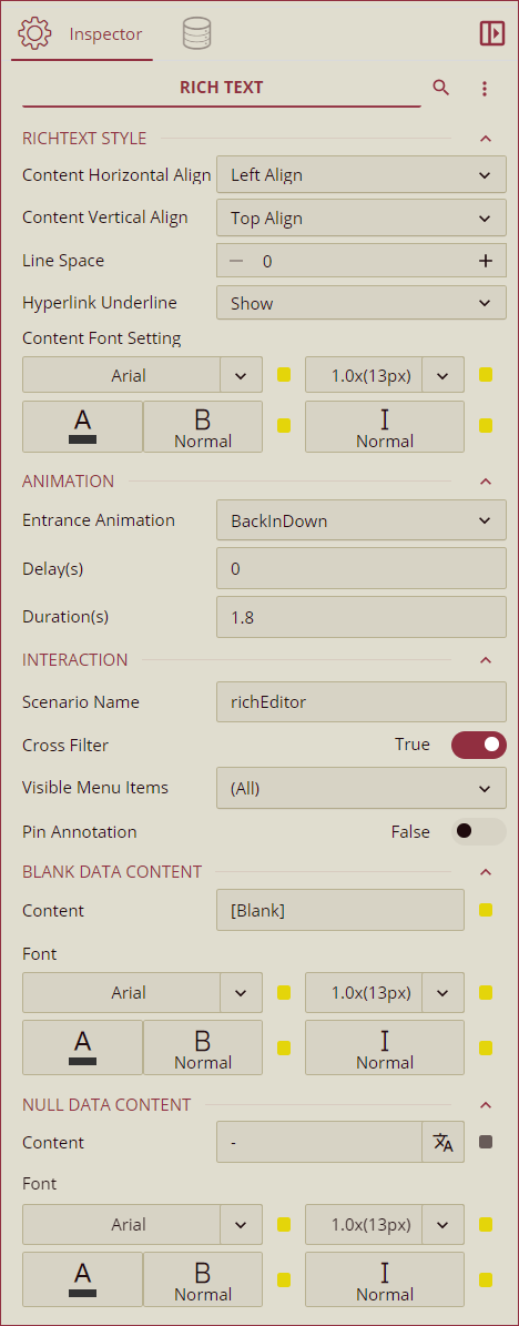
RichText Style
Option | Description |
|---|---|
Content Horizontal Align | Select a horizontal alignment option from the dropdown. The available options are Left Align, Center Align, and Right Align. |
Content Vertical Align | Select a vertical alignment option from the dropdown. The available options are Top Align, Middle Align, and Bottom Align. |
Line Space | Set the spacing between adjacent lines using the Line Space property. The default value of this property is 0. |
Hyperlink Underline | Select an option to either show, hide, or show the hyperlink on hover using this property. The available options are Show, Hide, and Show on Hover. |
Content Font Setting | Use this property to set the Font Family, Size, Weight, and Emphasis of the text. |
Animation
Option | Description |
|---|---|
Entrance Animation | Select an option from the dropdown to set the animation style of the appearance of the RichText data. After selecting an option (SlideInDown, SlideInLeft, SlideInRight, SlideInUp, SlideInDown, BackInDown, BackInLeft, or BackInRight) from the dropdown, set the delay and duration of the animation using the Delay(s) and Duration(s) properties respectively. |
Interaction
Option | Description |
|---|---|
Scenario Name | To add a name to the Rich Text scenario. |
Cross Filter | To reflect the data throughout the dashboard. Cross filters provide a simplified and deeper analysis of what you want to observe. |
Visible Menu Items | To make Annotations visible on the user interface. |
Pin Annotation | To pin the annotations set this property to True. |
Hyperlink Underline | To show or hide the underline for hyperlinks. |
Blank Data Content
Option | Description |
|---|---|
Content | To set the display content of the blank data text fetched by binding data from datasets. |
Font | To set the Font Family, Size, Weight, and Emphasis of the text. |
Null Data Content
Option | Description |
|---|---|
Content | To set the display content of the null data fetched by binding data from datasets. |
Font | To set the Font Family, Size, Weight, and Emphasis of the text. |
Layout
Option | Description |
|---|---|
X Position | To set the horizontal position of the Rich Text component. X=0 and Y=0 being the top-left corner of the Dashboard Designer Area. |
Y Position | To set the vertical position of the Rich Text component. |
Width | To set the width of the Rich Text component. |
Height | To set the height of the Rich Text component. |
Appearance
Option | Description |
|---|---|
Style Template | To set the appearance of the Rich Text component choose one of the options from the drop-down. |
Background Color | To set the background color of the Rich Text component. |
Padding | To create spacing around the content and the border of the Rich Text component. It supports Padding Left, Padding Top, Padding Right, and Padding Bottom and their values can be different. The default value of this property is 1 which makes the content in the rich text component 1px away from the borders on all sides. |
Background Image | To set an image as a background of the Rich Text component. |
Border | To set a border of the Rich Text component. You can select the type, color, and thickness of the border. |
Shadow | To add shadow to the Rich Text component. You can set the color and thickness of the shadow as well. |
Content Font Setting | To globally set the font family, font size, font color, font weight, and font style of the text in the Rich Text component. |
Vertical Align Middle | To vertically align the text in the middle of the Rich Text component. |