- Getting Started
- Administration Guide
-
User Guide
- An Introduction to Wyn Enterprise
- Document Portal for End Users
- Data Governance and Modeling
- Working with Resources
- Working with Reports
-
Working with Dashboards
- Dashboard Designer
- Selecting a Dataset
- Data Attributes
- Dashboard Scenarios
- Dashboard Templates
- Component Templates
- 3D Scene
- Explorer
- Visualization Wizard
- Data Analysis and Interactivity
- Dashboard Appearance
- Preview Dashboard
- Export Dashboard
- Dashboard Lite Viewer
- Using Dashboard Designer
- Animating Dashboard Components
- Document Binder
- Dashboard Insights
- View and Manage Documents
- Understanding Wyn Analytical Expressions
- Section 508 Compliance
- Subscribe to RSS Feed for Wyn Builds Site
- Developer Guide
Gauge E-Chart
Gauge E-chart is a a type of chart used to visualize a single value within a specified range. Gauge E-chart represents the values on a dial or a gauge-like display. In Wyn Enterprise you can configure various properties of the gauge chart in ECharts to customize its appearance and behavior, such as the minimum and maximum values, the start and end angles, and the color range.
In this help article you will find the following information;
Create a Gauge E-chart
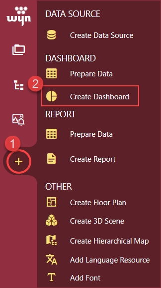
To create a Gauge E-chart, navigate to the Resource or Document Portal and follow the below instructions,
Click the + (Create) button and then click the Create Dashboard option.
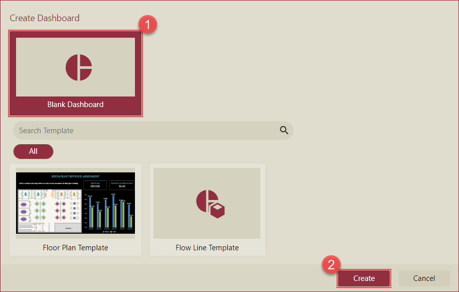
Select the Blank Dashboard option or select a template and click the Create button.
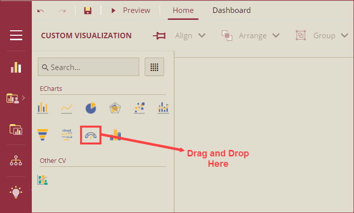
Navigate to the Custom Visualization tab from the Designer Toolbox and drag and drop the Gauge Chart(Echarts) onto the design area.
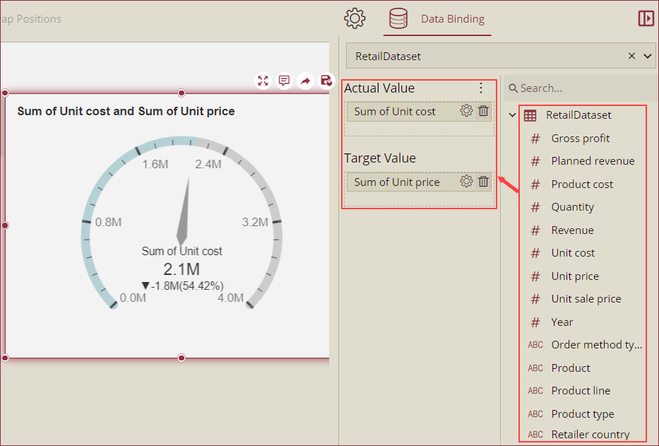
Bind Dataset to Chart Scenario
To bind a dataset to the Gauge E-chart scenario, follow the below instructions,
Select the Gauge E-Chart, and then pick a dataset from the Choose Data dropdown within the Data Binding panel.
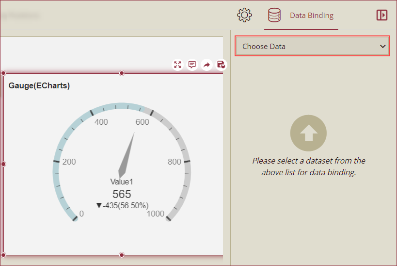
Now, drag and drop the applicable dataset fields in the Actual Value and Target Value data containers.
Format Data Attributes
You can perform various operations in a Gauge E-Chart to format the data attributes and control data display. Use the settings icon in the Data Field containers to format data attributes. The following operations are included in the Gauge E-Chart scenario;
Aggregation Method: Use the Aggregation Method option to display a summarized value by aggregating multiple values of a data attribute. Aggregation Method supports Sum, Average, Max, Min, Count, and Distinct Count methods. See the Aggregation Method help article for more information.
Quick Function: Use the Quick Functions option to highlight key indicators in your chart scenario by applying powerful calculations on measures. Quick Functions in Wyn Enterprise support Date Based Functions, Ranking Calculation, Percentile Calculation, Running Calculation, Moving Calculation, and Original Value. See the Quick Functions help article for more information.
Filter: Use the Filter option to display relevant data in your chart scenario. See the Filter Data help article for more information.
Rename: Use the Rename option to change the name of a data attribute to make it comprehensible and meaningful. See the Rename a Data Attribute help article for more information.
Remove: Use the Remove option to remove a data attribute from the chart scenario.
Analyze Data
Wyn dashboard scenarios support rich data analysis and exploration capabilities to help you analyze massive amounts of information and make data-driven decisions. The following analysis operations are available in the Action Bar corresponding to each scenario in the designer;
Filter: To filter out relevant data in your chart scenario. See the Filter Data help article, for information on using the filter options in a dashboard scenario.
Chart Type: To change the chart type from the decomposition tree to any other chart type.
Customize Appearance
Value Settings
Property | Description |
|---|---|
Actual Value Source | To change the actual value of the gauge indicator to a custom input, select the Custom Input option from the dropdown. By default the value of this property is set as From Query. |
Target Value Source | To change the target value of the gauge indicator to a custom input, select the Custom Input option from the dropdown. By default the value of this property is set as From Query. |
Chart Style
Property | Description |
|---|---|
Gauge Style | Select a style to apply to the gauge from the four options available in the dropdown. |
Show Pointer | To hide the point of the gauge indicator, set the Show Pointer property as False. By default, the value of this property is set as True. |
Pointer Color | Select a color from the custom colors menu to set the color of the gauge pointer. |
Graph Opacity | Set the opacity of the gauge chart using this property. |
Custom Echarts Option | Use the Custom Echarts Option to customize the chart using JavaScript code. |
Custom Behavior | Use the Custom Behavior option to write the JavaScript code and use the setTimeout/setInterval/myChart (echart instance) to customize the behavior of the chart. It will dynamically change the chart content in real time. Refer to section E-Charts Custom Behavior for more details. |
Animation
Property | Description |
|---|---|
Entrance Animation | Select an option from the dropdown to set the animation style of the appearance of the chart scenario. After selecting an option (SlideInDown, SlideInLeft, SlideInRight, SlideInUp, SlideInDown, BackInDown, BackInLeft, or BackInRight) from the dropdown, set the delay and duration of the animation using the Delay(s) and Duration(s) properties respectively. |
Interaction
Property | Description |
|---|---|
Scenario Name | Add a name to the chart scenario using this property. |
Cross Filter | To reflect the filtered data throughout the dashboard, set this property to True. Cross filters provide a simplified and deeper analysis of what you want to observe. |
Jump To | To create a shortcut to another dashboard scenario, report, or URL use this property. See the Jump To help article for more information. |
Auto Refresh | Set None, Polling, or Real Time option from the dropdown to refresh the chart data. Dropdown options are described below, None - Select None to disable auto-refresh of the chart data. Polling - Select Polling to enable auto refresh and set an interval to refresh chart data in the Refresh Interval property. |
Visible Menu Items | Select the filtering and sorting options you wish to display on the chart scenario from the dropdown. |
Pin Annotations | To pin the annotation to the chart scenario, set this property to True. By default, this property is set as False. |
Context Menu Options | Select multiple Context Menu Options from the dropdown. Context Menu Options include - Keep, Exclude, Jump, and Add Data Monitoring. |
Click Action | Select None, Show Tooltip, Keep, Exclude, or Jump option from the dropdown to perform an action on click. |
Title
Property | Description |
|---|---|
Show Title | To hide the title of the chart scenario set this property to False. By default, this property is set as True. |
Title | Add or edit the title of the chart scenario using this property. |
Alignment | Select the Left, Center, or Right alignment of the title. |
Title Font Setting | Set the font family, size, color, weight, and style of the title using the Title Font Setting options. |
Padding | To create space around the title of the chart scenario use the Padding property. It supports Padding Left, Padding Top, Padding Right, and Padding Bottom. Their values can be different. |
Sub Title
Property | Description |
|---|---|
Show Sub Title | To disable the display of sun title under the gauge indicator, set the Show Sub title property to False. By default, this property is set as True. |
Sub Title | Add a sub title of your choice using this property. |
Sub Title Font Setting | Set the font family, size, color, weight, and style of the sub title font using this property. |
Data Label
Property | Description |
|---|---|
Data Label Font Setting | Set the font family, font size, font color, font weight, and font style of the data labels using this property. |
Display Unit | Select the unit to display for the data labels from the dropdown. The available options are Auto, None, Thousands, Millions, Billions, and Trillions. |
Custom Unit | Add a custom unit as per your requirement to display the data labels. Custom Unit property can hold numeric, alphabetic, and special characters. |
Custom Unit Font Setting | Set the font family, size, color, weight, and style of the custom unit font using this property. |
Comparison Label
Property | Description |
|---|---|
Show Label | To disable the comparison label, set the Show Label property to False. By default, this property is set as True. |
Show Symbol | To disable the indicator symbol for the comparison label, set the Show Symbol property to False. By default, this property is set as True. |
Show Percentage | To disable the display of percentage value of the comparison label, set the Show Percentage property to False. By default, this property is set as True. |
Calculation Mode | Select a calculation mode for the percentage value of the comparison label from the dropdown. The available options are Ratio and Delta. This property is visible only when the Show Percentage property is set as True. |
Label Font Setting | Set the font family, size, color, weight, and style of the comparison label font using this property. |
Value Axis
Property | Description |
|---|---|
Min Value | Set the minimum value of the axis label using the Min Value property. |
Max Value | Set the maximum value of the axis label using the Max Value property. |
Axis Line Color | Set the color of the axis line of the gauge indicator using this property. |
Axis Line Width | Set the width of the axis line using this property. |
Progress Color | Using this property, set the color of the progress that is the area of axis line to the left of the gauge pointer. |
Show Round Cap | To flatten the corners of the axis line and progress, set the Show Round Cap property to False. By default, the property is set as True. |
Show Grid Lines | To disable the grid lines on the axis line, set the Show Grid Lines property to False. By default, this property is set as True. |
Grid Line Color | Set the color of the grid lines using this property. |
Split Number | Specify the number of divisions for the axis line by using the Split Number property. |
Show Tick Marks | To disable the tick marks that further divides the split divisions of the axis line, set the Show Tick Marks property to False. By default, this property is set as True. |
Tick Mark Position | Modify the position of the tick marks using this property. The available options in the dropdown are Inner and Outer. |
Tick Mark Color | Select a color of the tick marks using this property. |
Show Tick Labels | To hide the tick labels, set the Show Tick Labels property to False. By default, this property is set as *True. |
Display Unit | Select a unit from the dropdown to display on the gauge chart. The available options are Auto, None, Thousands, Millions, Billions, and Trillions. |
Format | Select the format of the tick labels from the dropdown. The available options are General, Number, Currency, Percentage, and Custom. |
Axis Font Setting | Set the font family, size, color, weight, and style of the axis labels using this property. |
Special Data
Property | Description |
|---|---|
Show Null As | Set the content to display in place of null data in the chart scenario using this property. |
Show Blank As | Set the content to display in place of blank data in the chart scenario using this property. |
No Data Content
Property | Description |
|---|---|
Content | Set the display content in case no data is found in the chart scenario. |
Text Align | Select the Left, Right, or Center option from the dropdown to align the no data content text. |
Vertical Align | Set the vertical alignment of the no-data content. |
Font | Set the font family, size, color, weight, and style of the no-data content using this property option. |
Background Image | Add an embedded, shared, or external image as a background image for the no-data content. |
Layout
Property | Description |
|---|---|
X Position | Set the horizontal position of the chart scenario using the X Position property. |
Y Position | Set the vertical position of the chart scenario using the Y Position property. |
Width | Set the width of the chart scenario using this property. You can set the minimum width up to 8. |
Height | Set the height of the chart scenario using this property. You can set the minimum height up to 8. |
Appearance
Property | Description |
|---|---|
Style Template | Select a template from the dropdown to apply a style to the chart scenario. |
Background Color | Set a background color of the chart scenario using this property. |
Padding | To create space around the chart scenario, set a padding value. |
Margin | Set the margin value for the chart scenario using this property. |
Visibility | To hide the chart from the dashboard scenario, set this property to False. By default, the Visibility property is set as True. |
Background Image | Add an embedded, shared, or external image as a background image to the chart scenario. |
Border | Set the border type, border color, and thickness using this property. |
Shadow | Create a shadow of the chart scenario by setting the Shadow Type, Shadow Color, and thickness. |