- Getting Started
- Administration Guide
-
User Guide
- An Introduction to Wyn Enterprise
- Document Portal for End Users
- Data Governance and Modeling
- Working with Resources
- Working with Reports
-
Working with Dashboards
- Dashboard Designer
- Selecting a Dataset
- Data Attributes
- Dashboard Scenarios
- Dashboard Templates
- Component Templates
- 3D Scene
- Explorer
- Visualization Wizard
- Data Analysis and Interactivity
- Dashboard Appearance
- Preview Dashboard
- Export Dashboard
- Dashboard Lite Viewer
- Using Dashboard Designer
- Animating Dashboard Components
- Document Binder
- Dashboard Insights
- Add a New Page in Dashboard Designer
- View and Manage Documents
- Understanding Wyn Analytical Expressions
- Section 508 Compliance
- Subscribe to RSS Feed for Wyn Builds Site
- Developer Guide
Decomposition Tree
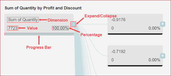
Decomposition Tree in Wyn Enterprise is a chart-style dashboard component used to visualize complex data into its constituent components in a flowchart-like structure.
The decomposition tree enables you to break down and explore the hierarchical relationships and dependencies among different dimensions and measures in datasets. It is used to drill down into the dimensions of your data based on certain criteria. A decomposition tree node contains the following attributes;
Dimension
Value
Percentage Text
Expand/Collapse
Progress Bar
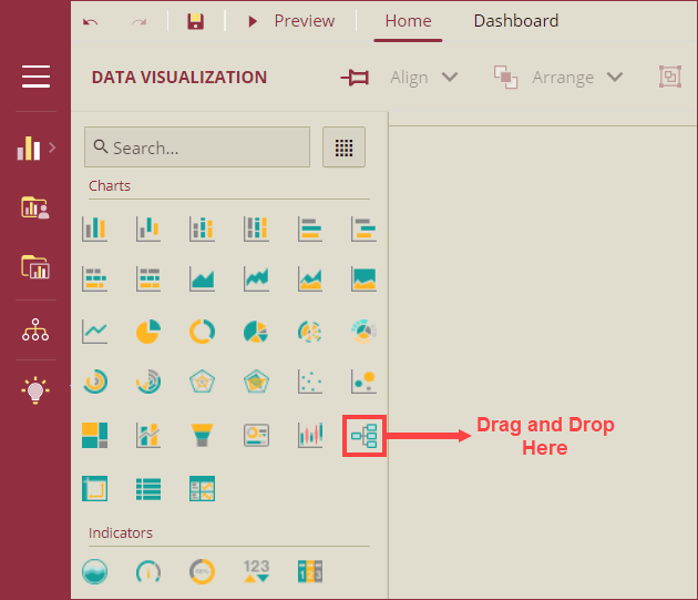
In this help article, you will find the instructions to add or modify a decomposition tree on dashboards. Navigate to the dashboard designer and follow the below instructions,
Design a Decomposition Tree
On the Dashboard Designer page, navigate to the Charts section of Data Visualization of the Dashboard Toolbox, and drag and drop the Decomposition Tree scenario onto the design area.
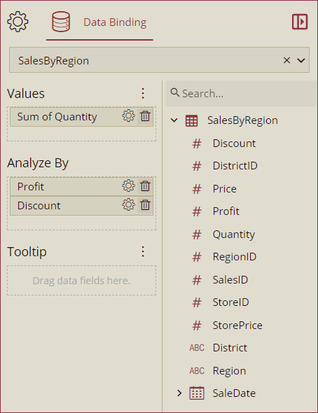
Bind Dataset to Decomposition Tree
With the Decomposition Tree scenario selected, select the dataset from the Data Binding tab to bind. Once the dataset loads successfully, the data binding panel automatically expands and displays the data attributes available for data binding. Drag and drop the data fields in the Values, Analyze By, and Tooltip data containers.
Values: Values data fields hold the measure values. Only one measure is supported in the Values input field.
Analyze By: The Analyze By data field holds the dimension values and supports one or more dimensions. Analyze By data field represents the node hierarchy.
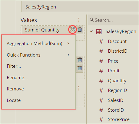
Format Data Attributes
You can perform various operations to format the data attributes on a KPI Kanban and control the data display. Use the settings icon in the Data Field containers to format data attributes. The following operations are included in the KPI Kanban scenario,
Data Format: Use the Data Format option to control the unit display of measures in the dashboard scenario. See the Modify Data Format help article for more information.
Display Unit: Use the Display Unit option to display units of measure and eliminate ambiguity. See the Modify Display Unit help article for more information.
Aggregation Method: Use the Aggregation Method option to display a summarized value by aggregating multiple values of a data attribute. Aggregation Method supports Sum, Average, Min, Max, Count, and Distinct Count methods. See the Aggregation Method help topic for more information.
Quick Functions: Use the Quick Functions option to highlight key indicators in your scenario by applying powerful calculations on measures. Quick Functions in KPI Kanban support Ranking Calculation, Percentile Calculation, Running Calculation, Moving Calculation, and Original Value. See the Quick Functions help article for more information.
Filter: Use the Filter option to display relevant data in your chart scenario. See the Filter Data help article for more information.
Rename: Use the Rename option to change the name of a data attribute to make it comprehensible and meaningful. See the Rename a Data Attribute help article for more information.
Remove: Use the Remove option to remove a data attribute from the chart scenario.
Analyze Data
Wyn dashboard scenarios support rich data analysis and exploration capabilities to help you analyze massive amounts of information and make data-driven decisions. The following analysis operations are available in the Action Bar corresponding to each scenario in the designer;
Filter: To filter out relevant data in your chart scenario. See the Filter Data help article, for information on using the filter options in a dashboard scenario.
Sort: To arrange the chart data in a more meaningful order. See the Sort help article for information on using the sort options in a dashboard scenario.
Chart Type: To change the chart type from the decomposition tree to any other chart type.
Data Binding: To modify the data binding options use this option. The data binding panel will appear as a pop-out on your screen.
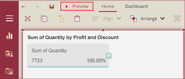
Preview Dashboard Scenario
To preview the decomposition tree scenario, click the Preview button at the top-left corner of the dashboard designer page.
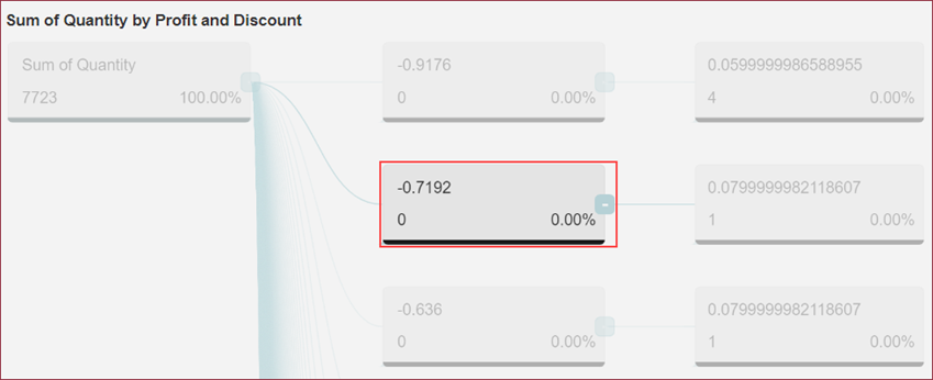
In the preview mode, use the expand (+) and collapse (-) buttons to expand or collapse nodes of the decomposition tree.
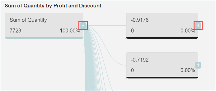
When a node of the decomposition tree is selected, the selected node will be highlighted and all other nodes will become transparent.
Customize Appearance
To customize the appearance of the Decomposition Tree, navigate to the Inspector Panel on the right side of your screen and modify the properties as per your requirements. The properties of the Decomposition Tree are listed and described below,
Chart Style
Property | Description |
|---|---|
Chart Layout | Select an option from the dropdown to set the layout of the tree nodes. The available options are, Left-Right: Left to right, Right-Left: Right to left, and Horizontal. |
Item Background Color | Use this property to set the fill color of each node. |
Progress Background Color | Use this property to set the progress background color. |
Progress Color | Use this property to set the progress color of each node. |
Percentage Base On | Select an option to set the percentage of the parent node or the percentage of the head node (total value). The available options are Parent Node and Head Node. |
Font Style | Set the font family, size, color, weight, and style of tree nodes using this property. |
Connect Line Color | Use this property to set the color of connection lines. |
Connect Line Width | Use this property to set the line width of connection lines. |
Collapse Background Color | Use this property to set the fill colors of the collapsed dimensions. |
Collapse Text Color | Use this property to set the color of the expand (+) and collapse (-) buttons. |
Animation
Property | Description |
|---|---|
Entrance Animation | Select an option from the dropdown to set the animation style of the appearance of the chart scenario. After selecting an option (SlideInDown, SlideInLeft, SlideInRight, SlideInUp, SlideInDown, BackInDown, BackInLeft, or BackInRight) from the dropdown, set the delay and duration of the animation using the Delay(s) and Duration(s) properties respectively. |
Interaction
Property | Description |
|---|---|
Scenario Name | Add a name to the chart scenario using this property. |
Cross Filter | To reflect the filtered data throughout the dashboard, set this property to True. Cross filters provide a simplified and deeper analysis of what you want to observe. |
Jump To | To create a shortcut to another dashboard scenario, report, or URL use this property. See the Jump To help article for more information. |
Auto Refresh | Set None, Polling, or Real Time option from the dropdown to refresh the chart data. Dropdown options are described below,
|
Visible Menu Items | Select the filtering and sorting options you wish to display on the chart scenario from the dropdown. |
Pin Annotation | To pin the annotation to the chart scenario, set this property to True. By default, this property is set as False. |
Context Menu Actions | Select multiple Context Menu Options from the dropdown. Context Menu Options include - Keep, Exclude, Jump, and Add Data Monitoring. |
Title
Property | Description |
|---|---|
Show Title | To hide the title of the chart scenario set this property to False. By default, this property is set as True. |
Title | Add or edit the title of the chart scenario using this property. |
Alignment | Select the Left, Center, or Right alignment of the title. |
Title Font Setting | Set the font family, size, color, weight, and style of the title using the Title Font Setting options. |
Padding | To create space around the title of the chart scenario use the Padding property. It supports Padding Left, Padding Top, Padding Right, and Padding Bottom. Their values can be different. |
Tooltip
Property | Description |
|---|---|
Tooltip Mode | Select None or Show options from the dropdown to disable or enable tooltip display in the chart scenario. |
No Data Content
Property | Description |
|---|---|
Content | Set the display content in case no data is found in the chart scenario. |
Text Align | Select the Left, Right, or Center option from the dropdown to align the no data content text. |
Vertical Align | Set the vertical alignment of the no-data content. |
Font | Set the font family, size, color, weight, and style of the no-data content using this property option. |
Background Image | Add an embedded, shared, or external image as a background image for the no-data content. |
Layout
Property | Description |
|---|---|
X Position | Set the horizontal position of the chart scenario using the X Position property. |
Y Position | Set the vertical position of the chart scenario using the Y Position property. |
Width | Set the width of the chart scenario using this property. You can set the minimum width up to 8. |
Height | Set the height of the chart scenario using this property. You can set the minimum height up to 8. |
Appearance
Property | Description |
|---|---|
Style Template | Select a template from the dropdown to apply a style to the chart scenario. |
Background Color | Set a background color of the chart scenario using this property. |
Padding | To create space around the chart scenario, set a padding value. |
Margin | Set the margin value for the chart scenario using this property. |
Visibility | To hide the chart from the dashboard scenario, set this property to False. By default, the Visibility property is set as True. |
Background Image | Add an embedded, shared, or external image as a background image to the chart scenario. |
Border | Set the border type, border color, and thickness using this property. |
Shadow | Create a shadow of the chart scenario by setting the Shadow Type, Shadow Color, and thickness. |