- Getting Started
- Administration Guide
-
User Guide
- An Introduction to Wyn Enterprise
- Document Portal for End Users
- Data Governance and Modeling
- Working with Resources
- Working with Reports
-
Working with Dashboards
- Dashboard Designer
- Selecting a Dataset
- Data Attributes
- Dashboard Scenarios
- Dashboard Templates
- Component Templates
- 3D Scene
- Explorer
- Visualization Wizard
- Data Analysis and Interactivity
- Dashboard Appearance
- Preview Dashboard
- Export Dashboard
- Dashboard Lite Viewer
- Using Dashboard Designer
- Animating Dashboard Components
- Document Binder
- Dashboard Insights
- Add a New Page in Dashboard Designer
- View and Manage Documents
- Understanding Wyn Analytical Expressions
- Section 508 Compliance
- Subscribe to RSS Feed for Wyn Builds Site
- Developer Guide
Column Chart
Column charts are used to compare categorical data through vertical bars with categories plotted on x-axis and data values along the vertical axis. Column charts find applications where the number of values is too large to be used on an x-axis. For example, the population share of different countries across the globe can be represented using a column chart.
In this video tutorial, we will show you how to create and customize each type of column chart in Wyn Enterprise.
Wyn Enterprise supports the following types of column charts.
Column Chart  : It is used to compare categorical data through the vertical bars, where length of each bar represents the value of the corresponding category.
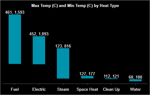
Range Column Chart  : It is similar to a column chart where each bar represents the difference between the minimum and maximum values for each category.
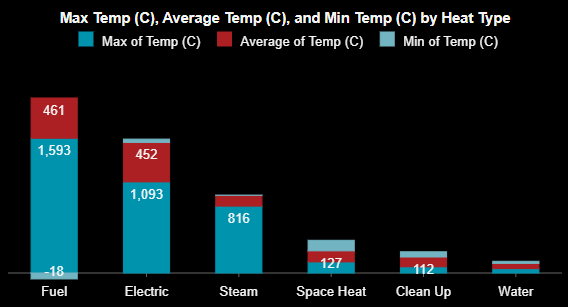
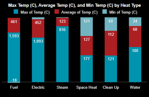
Stacked Column Chart  : It is used to display the relationship of specific items to the whole across different categories and plot values in two-dimensional vertical rectangles. This chart stacks the data series vertically (in a vertical direction).
Percent Stacked Column Chart  : It is used to perform comparisons of percentages that each of the values are contributing to the total, across all your categories in the spreadsheet. This chart stacks the data series vertically and also equalizes the plotted values to meet 100%. The plotted values are displayed in two-dimensional rectangles.
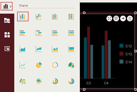
Design a Column Chart in Wyn Enterprise
From the Dashboard Toolbox, open the Data Visualization node and drag-drop the Column Chart scenario onto the design area.
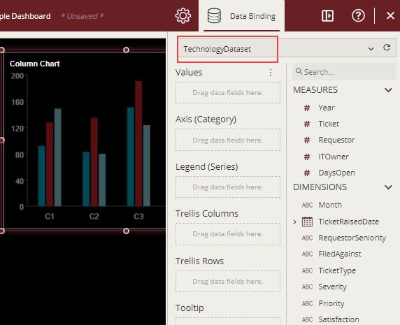
Bind Dataset to Chart Scenario
With the scenario selected, from the Data Binding tab, select the dataset. Once the dataset is successfully loaded in the designer, the data binding panel automatically expands and displays the data attributes available in the dataset.
The following image shows the chart scenario bound to the 'TechnologyDataset' dataset.
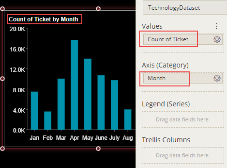
On dragging and dropping the data attributes to the data binding area of the scenario, the chart is plotted accordingly, with a default chart title on the design area.
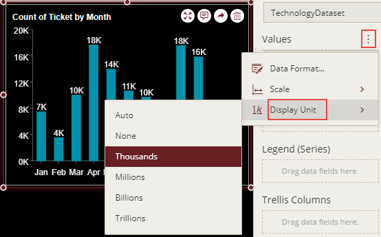
Format Data Attributes
You can format the data attributes in a dataset by performing a variety of operations such as renaming, modifying data format and display unit, creating a hierarchy field, applying an aggregation method, etc. Using these operations, you can control the display of data attributes in a scenario.
For more information about these operations, see Data Attributes.
The following image shows the Display Unit property for the value axis and data labels in a chart set to 'Thousands'.
Analyze Data
Wyn Dashboards scenarios support rich data analysis and exploration capabilities that can help analyze massive amounts of information and make data-driven decisions. For example, adding filters to scenarios, sorting data, reference lines, trend lines, Insight, etc. Note that you can apply all these operations using the Action Bar corresponding to each scenario in the designer.
For more information, see Data Analysis and Interactivity in Dashboards.
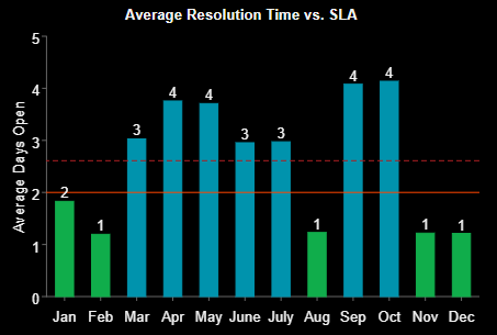
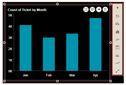
The following image shows relevant data by applying filtering on data in the chart scenario for the following months i.e. Jan, Feb, Mar, and Apr.
The column chart supports insights, and it has an Insight option in the action menu that shows insight without using the InsightIQ control. For details refer to the topic Dashboard Insights.
Customize Appearance
You can customize the default chart appearance by setting properties in the Inspector tab of the scenario such as adding a border, modifying data labels, setting chart style, renaming chart title, setting corner radius, etc.
General Settings
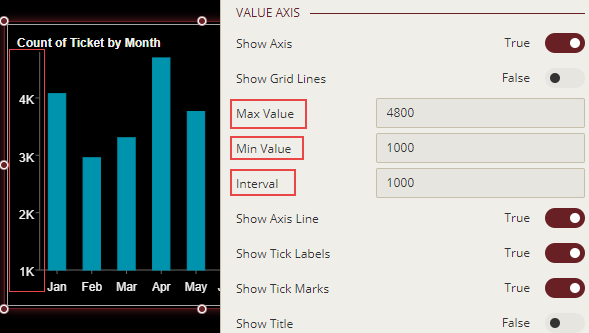
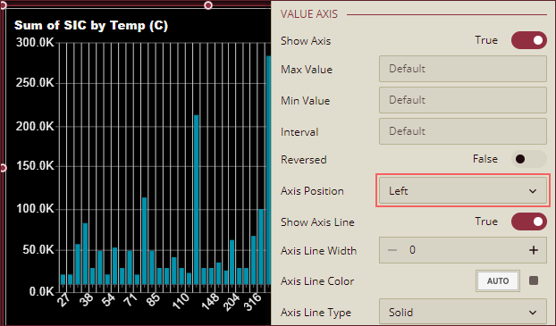
Change Axis Scale
To customize the scale values for the Value axis of a chart scenario, select the axis and set the Max Value, Min Value, or Interval properties.
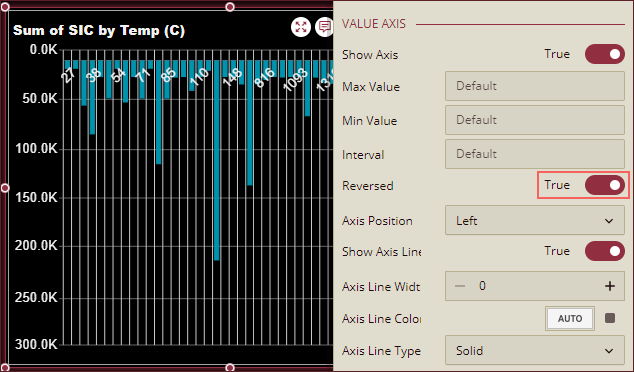
Reverse Value Axis Position
To reverse the direction of the Value Axis, set the Reversed property to True. By default, this property is set as False.
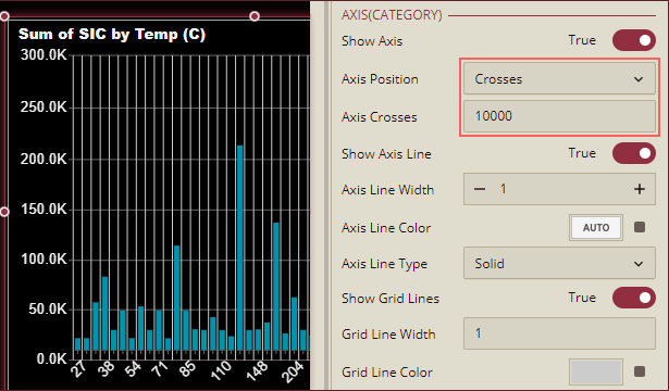
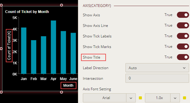
Change Axis Position
Axis (Category): To change the position of the Category Axis, use the Axis Position property dropdown to select an option from Crosses, Bottom, or Top. When Crosses is selected, Axis Crosses property appears below the Axis Position property where you can enter a value at which the Category Axis crosses the Value Axis.
Value Axis: To change the position of the Value Axis, use the Axis Position property dropdown to select an option from Left or Right.
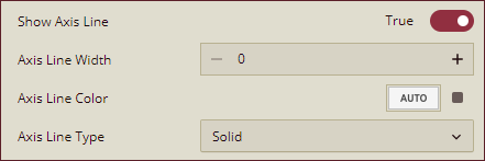
Show Axis Lines
To hide the axis lines of the Value or Category Axis, set the Show Axis Line property to False. By default, this property is set as True. You can also specify the width, color, and type (solid or dashed) of the axis lines using the Axis Line Width, Axis Line Color, and Axis Line Type properties.
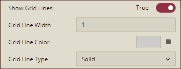
Show Grid Lines
To display horizontal and vertical grid lines in a chart scenario, set the Show Grid Lines property of the Value Axis and Axis (Category) to True. By default, this property is set as False. You can also specify the width, color, and type (solid or dashed) of the grid lines using the Grid Line Width, Grid Line Color, and Grid Line Type properties.
Format Axis Titles
You can show or hide axis titles for a chart by using the Show Title property for the Value and Category axes. When you set Show Title property to 'True', the axis titles are enabled. Wyn Dashboards set data attributes' names as the axis titles. You can provide a custom name to the axis title by renaming the attributes in the data binding area. For more information on renaming data attributes, see the topic on Rename an Attribute.
Format Data Labels
You can show or hide data labels in a chart using the Show Data Label property. When you set the Show Data Label property to True, the data labels are enabled. You can customize the data label's appearance using the Same Color As Legend and Data Label Font Setting properties. When you set the Same Color As Legend property to True, the color of the data labels changes to the same as the data points. However, Data Label Font Setting allows you to set font style and color as per your choice.
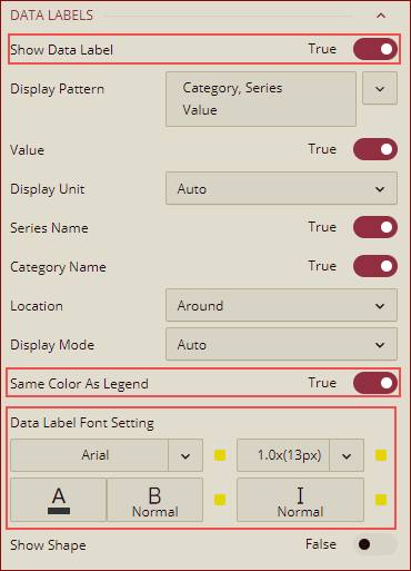
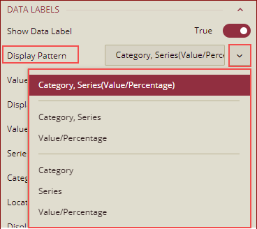
Data Labels - Display Pattern
The column chart supports the line break in the data label, and you can add a line break between Category, Series, and Value, by using the Display Pattern property for the data labels as shown below.
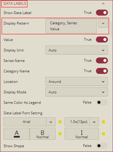
You can select any pattern from the dropdown list.
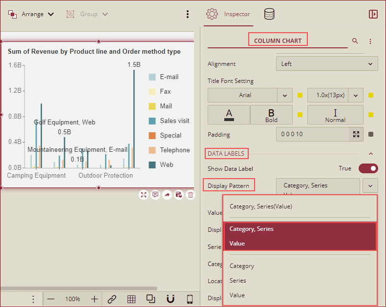
Note: The display patterns displayed in the dropdown list here, apply to the following column charts: Column Chart, Range Column Chart, and Stacked Column Chart.
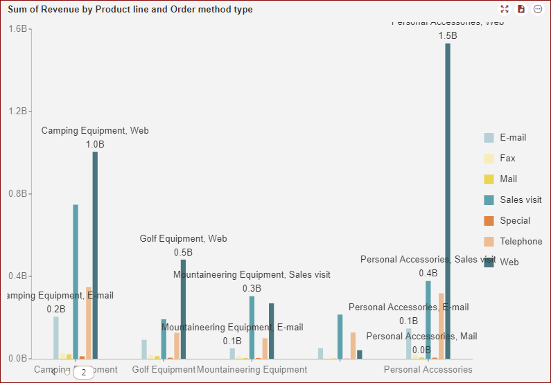
Preview the chart, the data labels will be shown as per the display pattern selected in the designer.
Please note, in the case of the Percentage Stacked Column Chart, the following display patterns are displayed in the dropdown list.
Advanced Settings
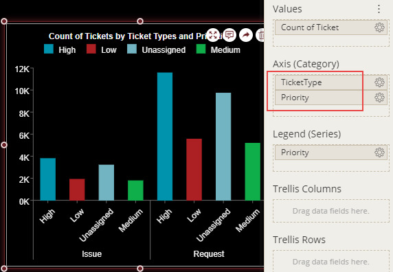
Analyze Multivariate Data
In complex Chart scenarios, you may want to analyze multivariate data. With Wyn Dashboards, you can easily establish potential relationships and correlations between multiple data attributes for such analysis.
For example, if you want to analyze the number of tickets by ticket types and priorities, you need to bind the Axis (Category) to multiple dimensions, that is, TicketType and Priority in the data binding area as shown.
Set Corner Radius
Round corners make the charts look more modern and appealing. For rounded corners, you need to specify the value of the radius in the Corner Radius property. The Corner Radius property lets you change the default square-shaped corners in a chart to rounded corners. With the release version v7.0, the Corner Radius property has been enhanced and you can now set the radius of each corner (top-left, top-right, bottom-left, and bottom-right) of the column bars as shown in the image below.
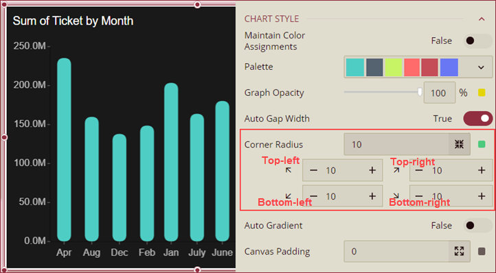
Note: The Corner Radius property applies to Column, Range Column, Stack Column, and Percentage Stack Column charts only.
Add Series Total
To improve your chart’s readability, you can display the total values for each category in a series using the Show Series Total property. On setting this property to True, the data values for each category are summed up and displayed as a separate data label floating on top of the chart as shown. You can also customize the appearance of the total’s label by changing its background color, position, font size, display unit, etc.
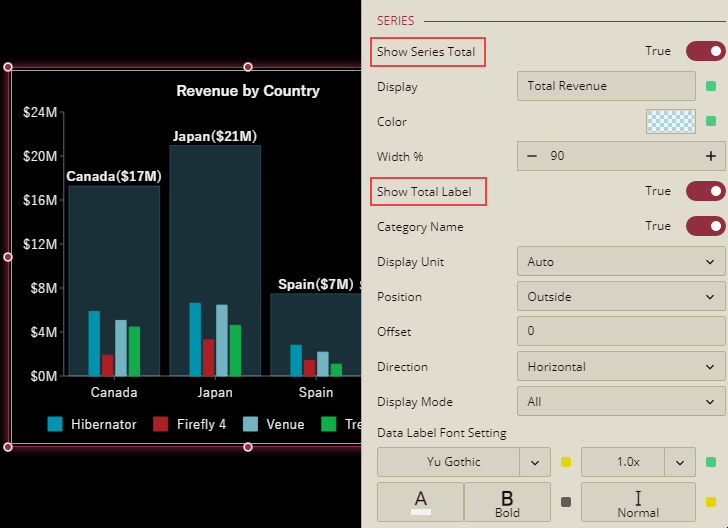
Note: This feature is only available in the column and stacked column charts.