- Getting Started
- Administration Guide
-
User Guide
- An Introduction to Wyn Enterprise
- Document Portal for End Users
- Data Governance and Modeling
- Working with Resources
- Working with Reports
-
Working with Dashboards
- Dashboard Designer
- Selecting a Dataset
- Data Attributes
- Dashboard Scenarios
- Dashboard Templates
- Component Templates
- 3D Scene
- Explorer
- Visualization Wizard
- Data Analysis and Interactivity
- Dashboard Appearance
- Preview Dashboard
- Export Dashboard
- Dashboard Lite Viewer
- Using Dashboard Designer
- Animating Dashboard Components
- Document Binder
- Dashboard Insights
- Add a New Page in Dashboard Designer
- View and Manage Documents
- Understanding Wyn Analytical Expressions
- Section 508 Compliance
- Subscribe to RSS Feed for Wyn Builds Site
- Developer Guide
Pie Chart
Pie charts, the most common tool used for data visualization, are circular graphs that display the proportionate contribution of each category, represented by a pie or a slice. The magnitude of the dependent variable is proportional to the angle of the slice. These charts can be used for plotting just one series with non-zero and positive values.
Wyn Enterprise supports the following types of pie charts.
Pie Chart  : It is a chart divided into slices or sectors. These slices represent the percentage each value contributes to a total.
Donut Chart  : It is similar to the pie chart where each slice is used to display the percentage each value contributes to a total, with a hole at the center.
Rose Diagram  : It is a chart divided into equal slices or sectors where the arc length of each slice depends on the value it represents. The outer segments in a rose chart are given more significance due to their large area sizes.
Design a Pie Chart in Wyn Enterprise
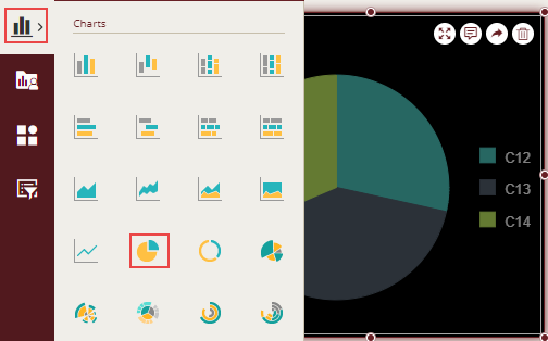
From the Dashboard Toolbox, open the Data Visualization node and drag-drop the Pie Chart scenario onto the design area.
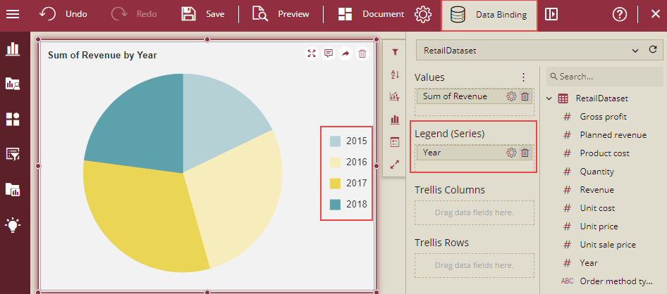
Bind Dataset to Chart Scenario
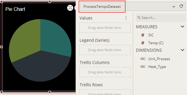
With the scenario selected, from the Data Binding tab, select the dataset. Once the dataset is successfully loaded in the designer, the data binding panel automatically expands and displays the data attributes available in the dataset.
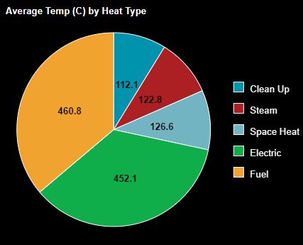
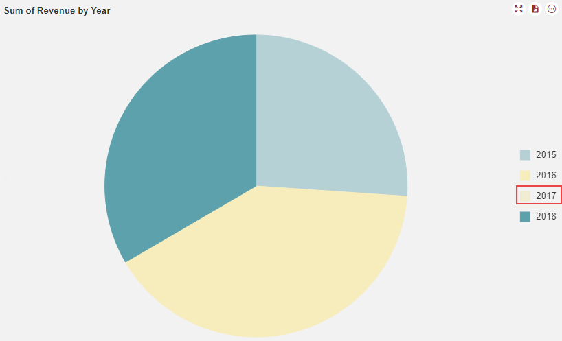
The following image shows the chart scenario bound to the 'ProcessTempsDataset' dataset.
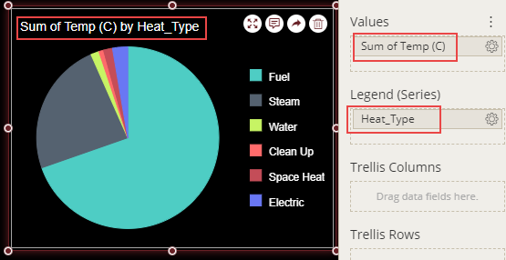
On dragging and dropping the data attributes to the data binding area of the scenario, the chart is plotted accordingly, with a default chart title on the design area.
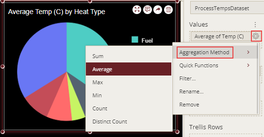
Format Data Attributes
To format the data attributes and control the display of data, you can perform a variety of operations such as modifying data format and display unit, creating a hierarchy field, applying an aggregation method, etc.
For more information about these operations, see Data Attributes
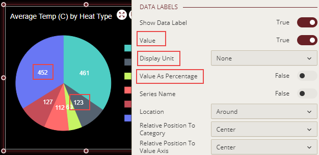
In the following chart scenario, average aggregation is applied to temperature attribute to show the average temperature.
Analyze Data
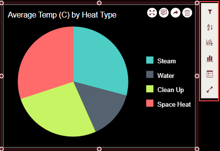
Wyn Dashboards scenarios support rich data analysis and exploration capabilities that can help analyze massive amounts of information and make data-driven decisions. For example, adding filters to scenarios, sorting data, reference lines, trend lines, etc. These operations are available in the Action Bar corresponding to each scenario in the designer.
For more information, see Data Analysis and Interactivity in Dashboards
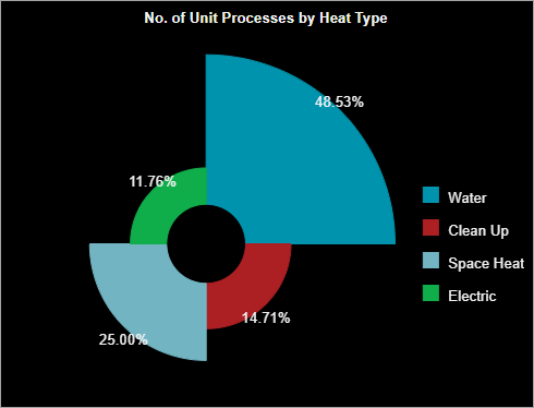
In the following chart scenario, the filter is applied to show data only for the selected heat types, that is, steam, water, clean up, and space heat.
Customize Appearance
To customize the chart appearance, set the properties in the Inspector tab of the scenario; add a border, modify data labels, change chart style, rename the chart title, set the corner radius, etc.
General Settings
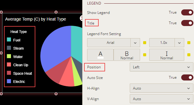
Change Legend Position
By default, Wyn Dashboards display a legend to the right of your chart scenario. To change the legend position, set the Position property of the legend to Top, Bottom, or Left. You can also display the legend title by setting the Title property to 'True'. When you enable the legend title in a scenario, Wyn Dashboards sets the data attribute name as the title. To provide a custom name to the legend title, rename the attribute in the data binding area. For more information on renaming a data attribute, see Rename an Attribute.
Show/Hide Legend Items
You can show, hide, highlight, and make the legend items inactive by just clicking the particular legend item on the preview. This is applicable in the case of multiple legend series as well.
Perform the following steps to Show/Hide the Legend items:
Add data binding to the Legend item.
On the Inspector tab, under the Legend section, click the dropdown list Click Action. There are two options: Select/Unselect and Hide/Show. By default, the legend click action property is set to Select/Unselect.
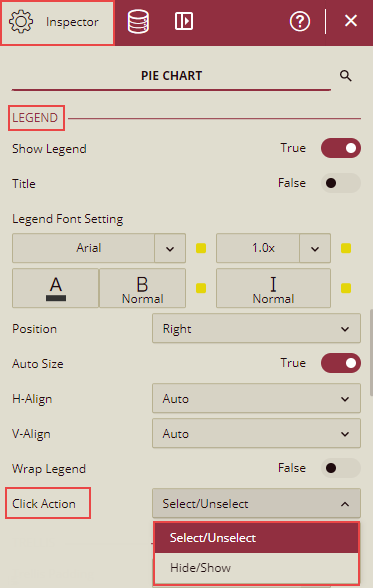
If the option Select/Unselect is selected, then initially on preview, the data is displayed for all the legend items. If any particular legend item is selected, then that legend item is highlighted, and the rest will be greyed out. You can click that legend item again, to display all the legend items again.
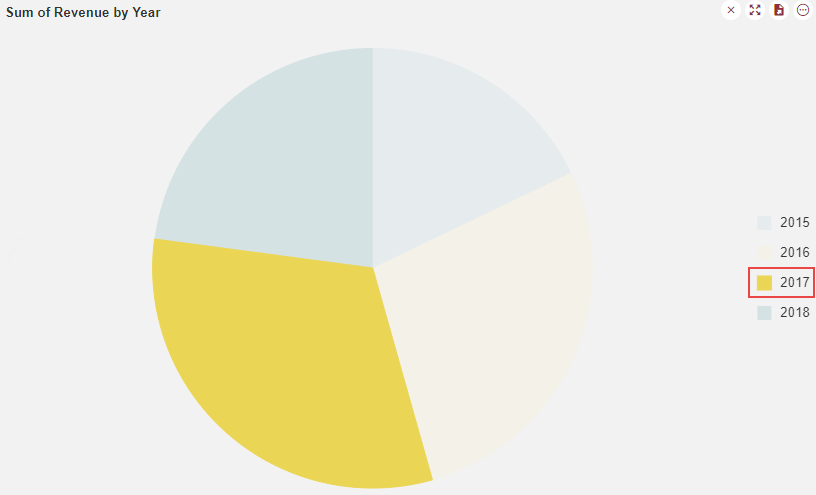
There is cross-filtering for other charts in this scenario.
If the option Hide/Show is selected, then initially on preview, the data is displayed for all the legend items. If any particular legend item is selected, then it will be hidden. You can click that legend item again to display all the legend items again.
There is no cross-filtering for other charts in this scenario.
Note: The Click Action for the Legend is available for
all the chart types except Card Chart.
Display Data Labels
You may want to display percent values as data labels in a pie chart to provide information about the individual slices. To display data labels, set the Show Data Labels property to 'True'. By default, Wyn Dashboards display values as percentages. You can format data labels by setting the Value property to 'True' and choosing an appropriate display unit from the drop-down.
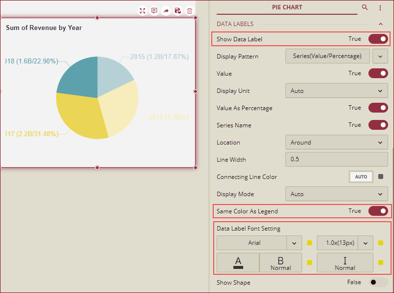
Format Data Labels
You can show or hide data labels in a chart using the Show Data Label property. When you set the Show Data Label property to True, the data labels are enabled. You can customize the data label's appearance using the Same Color As Legend and Data Label Font Setting properties. When you set the Same Color As Legend property to True, the color of the data labels changes to the same as the data points. However, Data Label Font Setting allows you to set font style and color as per your choice.
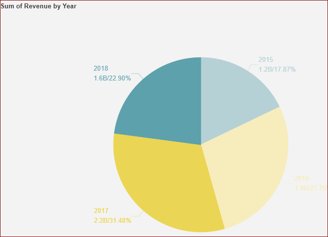
Data Labels - Display Pattern
The pie chart supports the line break in the data label, and you can add a line break between Series and Value, by using the Display Pattern property for the data labels as shown below.
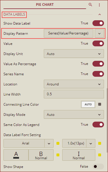
You can select any pattern from the dropdown list.
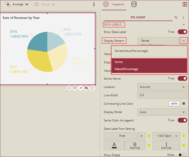
Preview the chart, the data labels will be shown as per the display pattern selected in the designer.
Note: The display patterns displayed in the dropdown list here, apply to the following pie charts: Pie Chart, Donut Chart, and Rose Chart.
Advanced Settings
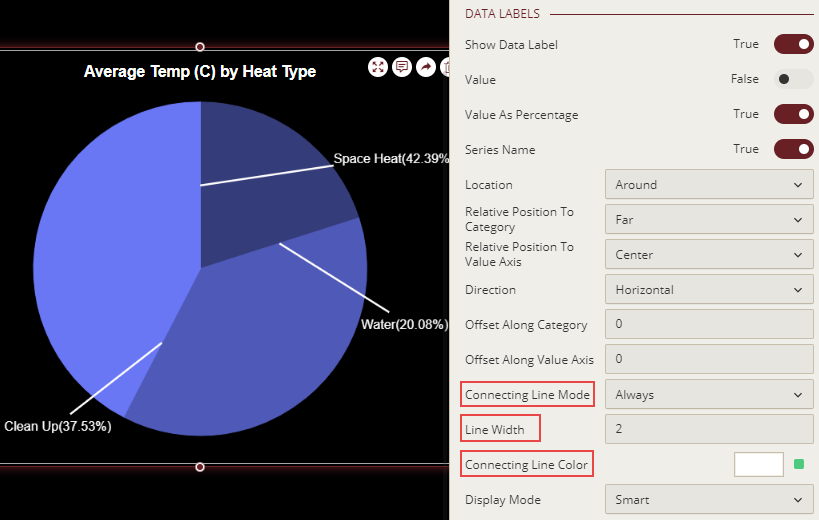
Display Connecting Lines
Connecting lines are the lines that connect the data labels with the associated data points. They make it easier to locate the data labels in a chart associated with each slice. You can display connecting lines by setting the Connecting Line Mode property to a suitable option from the drop-down. You can also specify the color and width for the connecting lines by using the Connecting Line Color and Line Width properties.
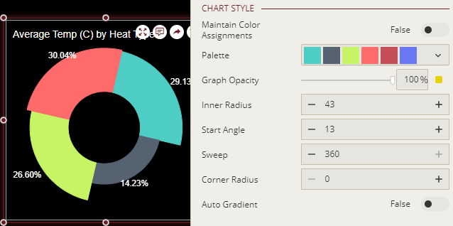
Set Inner Radius
To specify the value for the inner radius in a pie chart, you can use the Inner Radius property. By default, this property is set to 70.
Note that you can specify the inner radius value only in the Donut and Rose charts.
Set Corner Radius
Round corners make the charts look more modern and appealing. For rounded corners, you just need to specify the value of the radius in the Corner Radius property. The Corner Radius property lets you change the default square-shaped corners in a chart to rounded corners. With the release version v7.0, the Corner Radius property has been enhanced and you can now set the radius of each corner (top-left, top-right, bottom-left, and bottom-right) of the slices as shown in the image below.
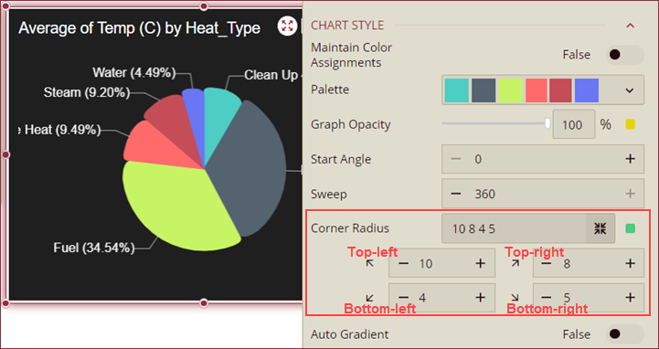
Note: The Corner Radius property is applicable to the Pie, Donut, Rose, Radial Stacked Bar, Bar In Polar Coordinates, and Stack Bar In Polar Coordinates charts only.