- Getting Started
- Administration Guide
-
User Guide
- An Introduction to Wyn Enterprise
- Document Portal for End Users
- Data Governance and Modeling
- Working with Resources
- Working with Reports
-
Working with Dashboards
- Dashboard Designer
- Selecting a Dataset
- Data Attributes
- Dashboard Scenarios
- Dashboard Templates
- Component Templates
- 3D Scene
- Explorer
- Visualization Wizard
- Data Analysis and Interactivity
- Dashboard Appearance
- Preview Dashboard
- Export Dashboard
- Dashboard Lite Viewer
- Using Dashboard Designer
- Animating Dashboard Components
- Document Binder
- Dashboard Insights
- Add a New Page in Dashboard Designer
- View and Manage Documents
- Understanding Wyn Analytical Expressions
- Section 508 Compliance
- Subscribe to RSS Feed for Wyn Builds Site
- Developer Guide
Card Chart
Card Charts are used to display related or group data through a variety of data visualization scenarios, custom visuals, and components. These charts are useful in highlighting the key information in a thumbnail view, obtained from the bound dataset or model. Such charts resemble the playing cards in size and shape and are best suitable in scenarios where you want to show repetitive data in a certain layout and style. A card chart repeats itself for each new record in the dataset or model.
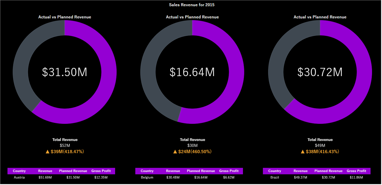
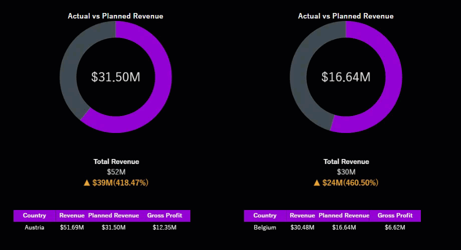
For example, the card chart scenario in the below dashboard displays the sales revenue, planned revenue, and gross profit for different countries. For each new value of the country in the dataset, a new card instance is generated.
Design a Card Chart in Wyn Enterprise
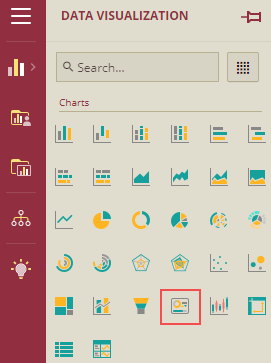
From the Dashboard Toolbox, open the Data Visualization node and drag-drop the Card Chart scenario onto the design area.
Bind Data to Chart Scenario
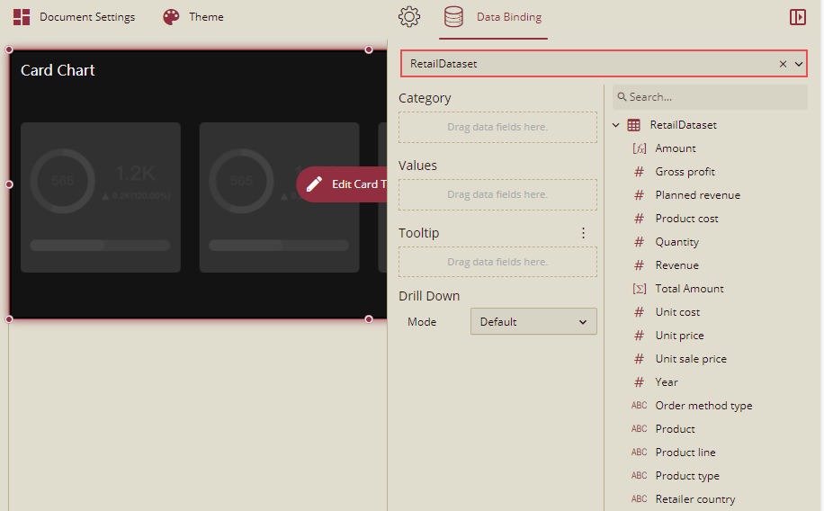
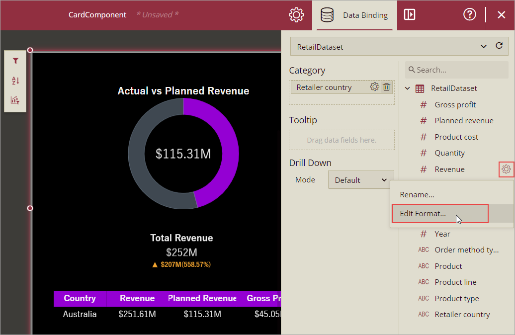
With the scenario selected, from the Data Binding tab, select the dataset or model. Once the dataset or model is successfully loaded in the designer, the data binding panel automatically expands and displays the data attributes available in it.
The following image shows the chart scenario bound to the 'RetailDataset' dataset.
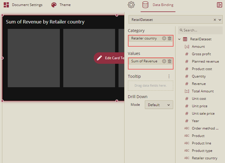
Drag and drop a data attribute to the Category field. This field in the data binding area determines how many instances of the card chart scenario will be generated based on the attribute values. Since we want to display the sales information for each country in the dataset, set the Category field to 'RetailerCountry'. This way, the card chart will repeat itself for each new value for the retailer country in the dataset.
Set the Values field to 'Revenue'.
Apply Conditional Formatting on the Card Chart
You can apply the conditional formatting on the card chart and change the background color. In the example below, we will display different background colors based on the Revenue. Follow the steps given below:
On the action bar, click the Conditional Format option.
Now click the Add Conditional Format button.
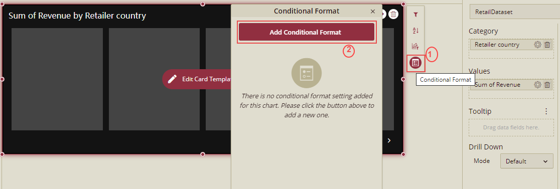
A conditional Format dialog box is displayed.
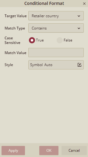
Select one value from the Target Value and add the conditions. And click the edit icon for the Style, to add the background and border style in the Card's conditional format.
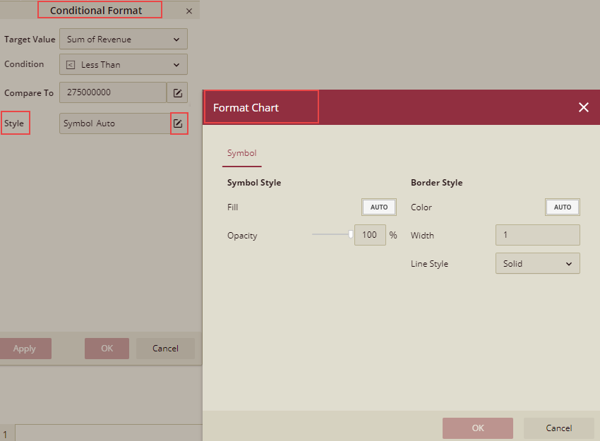
On the Format Chart dialog box, select the background color, border color, border thickness, etc., and click OK.
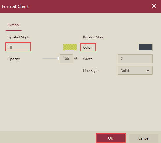
Click Apply and OK.
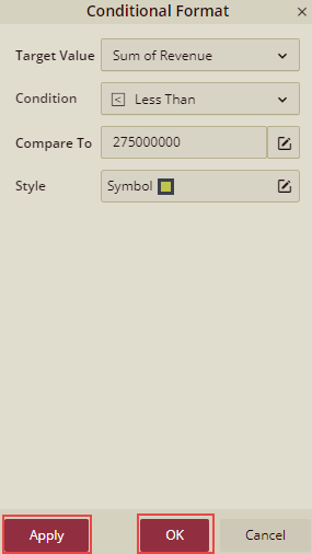
Conditional format will be saved and applied.
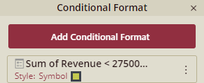
Similarly, you can add more conditional formatting and preview the dashboard.
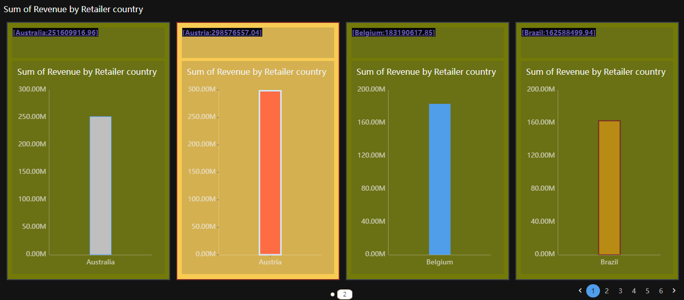
In this example, in the preview, where the Revenue is less than 275M, data is displayed with the background color as Green and where the Revenue is greater than 275M, data is displayed with the background color as Yellow.
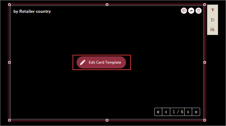
Design Card Template
Unlike other dashboard scenarios, a card chart is a free form, where you can arrange and design the elements added to the scenario in the card template designer. You can add charts, tables, maps, custom visuals, containers, images, and rich text to the card chart and organize them in any configuration you like. For example, to analyze the sales of multiple stores of a retail brand, you can add a pie chart to the card template and use the rich text editor to add a dynamic field to display the multiple stores in the card chart as explained below,
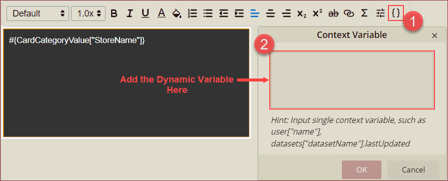
Add a pie chart and a rich text box in the edit template mode of the card template.
Use the rich text editor to add a dynamic field as the store name using the Context Variable option from the editor toolbar. For the instructions on viewing the above-mentioned scenario, see the Analyze Data section of this help article.
Note: Card chart does not support card chart, calc chart, multi-source chart, slicers, embedded components (both reports and dashboards), and scenarios from Visual Gallery.
To enter the card template designer, use the Edit Card Template button present in the scenario.
In the card template designer, drag and drop the elements from the Dashboard Toolbox onto the design area, and bound these scenarios to the required data attributes. You can also modify the format of bound data attributes, perform various operations on the data, and style each element in the card chart according to your needs.
Note: Elements of the card chart scenario do not support actions like adding annotations and sharing scenarios.
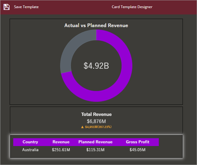
In the following image, we added an indicator, KPI matrix, and KPI chart into the card chart scenario to show the sales revenue for different countries.
Click the Save Template button to keep the changes and then the Return to Dashboard button to close the template designer.
Format Data Attributes
You can format the data attributes and control the display of data by performing a variety of operations such as renaming, modifying data format and display unit, creating a hierarchy field, applying an aggregation method, etc. Using these operations, you can control the display of data attributes in a scenario.
For more information about these operations, see Data Attributes.
In the following image, the data format for the data attributes like revenue, planned revenue, and gross profit, is modified to display the unit prices in 'currency'.
Analyze Data
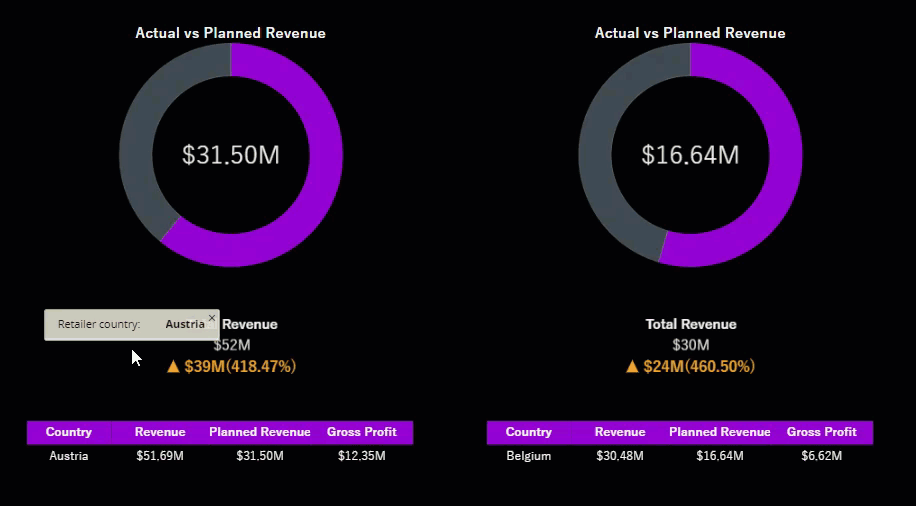
Wyn Dashboards scenarios support rich data analysis and exploration capabilities that can help analyze massive amounts of information and make data-driven decisions. For example, adding filters to scenarios, sorting data, applying conditional formatting, etc. Note that you can apply all these operations using the Action Bar corresponding to each scenario in the designer.
For more information, see Data Analysis and Interactivity in Dashboards.
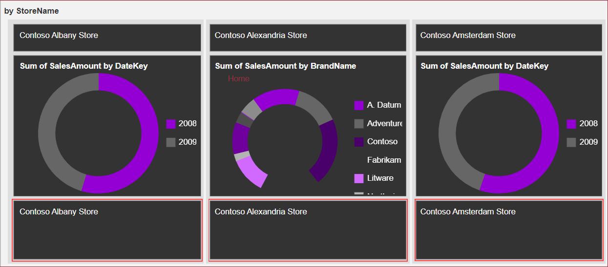
In the following chart scenario, three card items are displayed with store names as applied in the Design Card Template section of this article.
Note: The card chart scenario does not support the Focus and Export SVG Image options on the preview.
Customize Appearance
Use the properties in the Inspector tab of the scenario to customize its appearance by adding borders, renaming chart title, specifying card hover or selection color, modifying the card item layout, and more.
Specify Card Hover Color
To change the background color of the card instance on mouse hover, use the Background Color property under the Card Item Hover Style section. The hover effect makes the chart more interactive. You can also specify the background gradient, background image, and border color for the card instance on hover.
Specify Card Selection Color
To change the background color of the card instance on selection, use the Background Color property under the Card Item Selected Style section. The selection effect makes the chart more interactive. You can also specify the background gradient, background image, and border color for the card instance on hover.
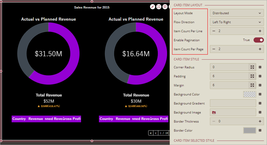
Modify Card Item Layout
Modify the layout of the card to change the arrangement of the generated instances on the published dashboard. To achieve this, use the Layout Mode property and set it to Auto, Distributed, or Fixed Size. The Auto mode uses the template ratio to render the card chart instances. The Distributed mode renders the card instances based on the item count per line and page. The Fixed Size mode renders the card instances based on the specified card dimensions. You can also use the following properties to enhance the card layout.
Flow Direction: The direction in which the card instances are displayed, i.e., Left to Right or Right to Left.
Item Count Per Line: The number of instances to be generated in each line.
Enable Pagination: Indicates whether to enable or disable pagination.
Item Count Per Page: The number of instances to be generated on each page.
Item Height: The height of the card instance. Only available in case of Fixed Size mode.
Item Width: The width of the card instance. Only available in case of Fixed Size mode.
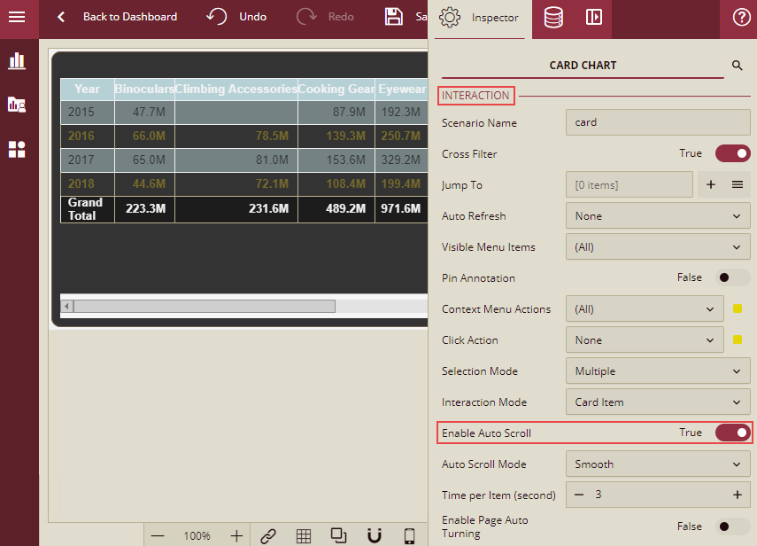
Auto Scroll
You can enable or disable auto scroll property on the card item and page. To achieve this, use the Enable Auto Scroll property under the Interaction section. To apply auto scroll on the card item and page, set Enable Auto Scroll to True. By default, this property is set to False.
After enabling auto scroll, you need to specify the following properties:
Auto Scroll Mode: This has two options: Smooth and Row/Column.
Smooth: To get the continuous scroll for all the card items, select the option Smooth. When this option is selected, the property Time Per Item (second) is displayed. You can set the scrolling time (in seconds) per card item using this property. The default value is 5 seconds and the minimum duration is 1 second.
Row/Column: To scroll card item by card item, select the option Row/Column. When this option is selected, 2 more properties are enabled: Item Interval(second) and Item Animation Duration(second).
You can set the time interval (in seconds) to scroll between two card items, by setting the Item Interval(second) property. The default value is 5 seconds and the minimum duration is 1 second.
You can set the animation duration ( in seconds) to scroll over one card item by setting the Item Animation Duration(second) property. The default value is 1 second and the minimum duration is 1 second.
Enable Page Auto Turning: By default, it is False. Set this property to True, to enable auto turning of pages during scrolling. When auto scrolling reaches the last page, then it will again go to the first page to continue to scroll card items. This property is only valid when Enable Pagination property under the Card Item Layout section is True.
Page Turning Interval (second) : This property is only visible when Enable Page Auto Turning property is set to True. By setting the Page Turning Interval, you can set the time interval (in seconds) to switch to the next page. By default, it is set to 3 seconds and the minimum duration is 1 second.
Note: When Auto Scroll is enabled, then the UI scroll bar will be hidden.
Auto Scroll workflow
Scenario 1: When Enable Auto Scroll is set to True and Enable Page Turning is set to False, the workflow will be as below:
First card item → (wait for xx seconds for the time mentioned for Time per item or Item Interval) → Next card item → … → Last card item → (wait for the time mentioned for Time per item or Item Interval xx seconds ) → First card item → …|
Scenario 2: When Enable Auto Scroll is set to True and Enable Page Turning is set to True, the workflow will be as below:
First page, first card item → (wait for xx seconds) → First page, Next card item → … → First page, Last card item → (wait for xx seconds) → Next page, First card item → … → Last page, Last card item → … → First page, First card item → …|
Scenarios and Actions that do not support auto scroll
The following scenario does not support auto scroll
Focus mode
Following actions will suspend the auto scroll
Mouse over card Item
When Scroll Mode is Smooth, then auto scroll will be suspended in time.
When Scroll Mode is Card Item, then auto scroll will be suspended when the current card item finishes scrolling.