- Getting Started
- Administration Guide
-
User Guide
- An Introduction to Wyn Enterprise
- Document Portal for End Users
- Data Governance and Modeling
- Working with Resources
- Working with Reports
- Working with Dashboards
- View and Manage Documents
- Understanding Wyn Analytical Expressions
- Section 508 Compliance
- Subscribe to RSS Feed for Wyn Builds Site
- Developer Guide
Chart
A Chart data region helps you to visualize your data graphically. It is a data visualization control primarily based on slicing data through encodings.
This article provides information about the chart elements and other aspects of charts that will help you design a chart.
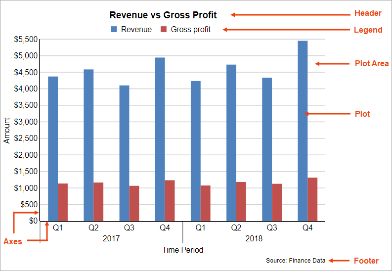
Chart Elements
The below image illustrates the elements that make up the Chart data region. These elements help you analyze the visual information and interpret numerical and relational data in a chart.
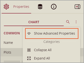
You can view all the chart elements in the Explorer and access properties through the Inspector Panel as described in the below sections.
Note: You should enable advanced properties.
Plot Area
The plot area is the area of the chart where the data is plotted graphically. It also includes the chart axes and legend.
Property | Description |
|---|---|
Common | |
Axes | Axes for the plot that constitutes the Plot area. |
Background | |
Color | Select a color for the background of the Plot area. |
Border | |
Width | Set the width of the border of the Plot area. |
Style | Select a style for the border from the following options: Dotted, Dashed, Solid, Double, Groove, Ridge, and Inset. |
Color | Select a color for the border of the Plot area. |
Layout | |
Padding | Set padding values for each side of the Plot area - Top, Left, Right, and Bottom. |
Plot
The plot is where the actual chart encodings are configured and converted to visual attributes, that is, graphs. It also includes other configuration settings such as applying Rules, adding Overlays, setting clipping mode, offset, etc.
Property | Description |
|---|---|
Common | |
Name | Enter the chart plot name. |
Values | Add values or a collection of values for the plot. |
Tooltip Template | Select the settings of the tooltip template from the list of predefined chart template tokens or enter an expression. |
Plot Template | Select a chart plot type from the available types. |
Opacity | Set the opacity of the plot; 100% opacity means that the plot is opaque and 0% opacity means that the plot is transparent. |
Action | |
Type | Select any of the following actions to perform on preview, when the user clicks the plot. Apply Parameters: Select the name of the parameter, type (Set, Reset, Toggle), and the value of the parameter to be passed. Jump to Report: For drill-through reporting, select this option and provide the name of a local report, the relative path of a report in another folder, or the full path of a report on another server. Jump to Bookmark: Select this option and provide a valid Bookmark ID to allow the user to jump to the report control with that Bookmark ID. Jump to URL: Select this option and provide a valid URL to create a hyperlink to a Web page. |
Encodings-Common | |
1Category | The Category Encoding for Column and Bar plots forms the axis of the plot across which distinct categories are arranged. |
Category Sort Expression | Specifies the sort expression on which the sorting is based. |
Category Sort Direction | Defines the ascending or descending order in which the categories should be sorted. |
Category Sorting Aggregate | The aggregate to use for sorting the categories. |
Details | The Details encoding breaks down the data values into subcategories and produces additional groups. The Details property is the collection of items and each item includes the following properties that define the Details encoding: Values: The Values property is the collection and takes the field as a subcategory. Exclude Nulls: The Exclude Nulls property determines whether to exclude the null details values in the dataset field. Group: The Group property determines how the columns or bars are arranged when divided into subcategories.
Sort Expression: Defines the order in which the subcategories are displayed. Sort Direction: Defines the ascending or descending order in which the subcategories should be sorted. Sorting Aggregate: Specifies the aggregate to use for sorting the subcategories. |
Text Encodings | The Text Encoding displays additional info on the chart from a dataset field as chart labels and tooltips. When two text encodings are added, they are displayed by default with the ";" delimiter. A text encoding includes the following properties: Value A field, constant, or expression that should be displayed. Template Key A unique key that is used in the chart plot's Labels > Template and Tooltip Template to access the text encoding value. Target Specifies whether this text is for a Label or a Tooltip Label. The label format is controlled with the chart's Labels > Template property or Tooltip Template property. Aggregate Aggregates the value of the Text expression. |
Encodings-Color The Colors Encoding enables the color legend of the Details or Category Encoding. | |
Show Values Names in Legend | If set to True, the legend is displayed based on the value specified in Details encoding or Color encoding. |
Color | It is the collection where the value of the Color expression is specified. |
Color Aggregate | Aggregates the value of the Color expression. |
Action Type | The action to take out of the following on preview, when the color legend is clicked. Apply Parameters: Select the name of the parameter, type (Set, Reset, Toggle), and the value of the parameter to be passed. Jump to Report: For drill-through reporting, select this option and provide the name of a local report, the relative path of a report in another folder, or the full path of a report on another server. Jump to Bookmark: Select this option and provide a valid Bookmark ID to allow the user to jump to the report control with that Bookmark ID. Jump to URL: Select this option and provide a valid URL to create a hyperlink to a Web page. |
2Encoding-Shape The Shape Encoding enables the shape legend of the Details or Category Encoding and includes the Aggregate function and shape expression. | |
Shape | The collection and usually takes a bound field. Most of the plots take the first item from the collection. |
Shape Aggregate | To show aggregated values such as Average, Count, and Sum instead of individual values, specify an Aggregate function. |
Action Type | |
2Encoding-Size The Colors Size enables the Aggregate function and Size expression. The Size Encoding works solely with numeric values and breaks down data values into ranges that determine the symbol size. | |
Size | It is the collection and usually takes a bound field. However, the Line plots take the first item from the collection. |
Size Aggregate | To show aggregated values such as Average, Count, and Sum instead of individual values, specify an Aggregate function. |
Action Type | The action to take when the size legend is clicked. |
1Category Encoding does not apply to Pie and Doughnut Charts.
2Size and Shape Encodings are available in Line, Scatter, Bubble, Radar Scatter/Radar Bubble, Radar Line, Polar
Axes
Typically, a chart consists of two axes that are used to plot the data - the vertical axis (also known as Y-axis) and the horizontal axis (also known as the X-axis). You can change the axis type, hide the axis label or title, customize the line appearance, etc.
Property | Description |
|---|---|
Column | |
Axis Type | Designates the type of Axis, X or Y. |
Title | Represents the title of the Axis. |
Plots | Designates the plot in which the X or Y Axis exists. |
Appearance | |
Height | Represents the height of the Axis in percentage relative to the overall chart height. This property applies to the horizontal axis. |
MaxHeight | Represents the maximum height of the Axis in percentage relative to the overall chart height. This property applies to the horizontal axis and its default value is 100%. |
MaxWidth | Represents the maximum width of the Axis in percentage relative to the overall chart width. This property applies to the vertical axis and its default value is 100%. |
Width | Represents the width of the Axis in percentage relative to the overall chart width. This property applies to the vertical axis. |
Title | |
Color, Font, Text Decoration, Padding | Use these settings to modify the color, font, etc. of the Title. |
Line | |
Width, Style, Color, Visible | Use these settings to control the appearance of the axis line, or to control its visibility. |
Labels | |
Color, Font, Text Decoration, Padding | Use these settings to modify the color, font, etc. of the Label. |
Format | Represents the formatting string used for rendering dates and numbers in Labels. |
Label Angle | Represents the rotation angle of the axis of the Labels in degrees. |
Label Field | Represents customized labels for the X-axis. |
Visible | Indicates whether to show or hide axis Labels. |
Writing Mode | The horizontal (lr-tb) or vertical direction (tb-rl) of the label text. The default value is lr-tb (left to right top to bottom). If set to tb-lr (top to bottom left to right), the chart axis labels appear vertically. |
Major/Minor Grid | |
Show Grid Lines | Indicates whether or not to show the major/minor gridlines. |
Width, Style, Color | Width, Style, and Color of the major/minor gridlines. |
Major Interval | Frequency of major/minor grid lines. |
Major/Minor Ticks | |
Tick Size | Length of the major/minor ticks. |
Width, Style, Color | Width, Style, and Color of the major/minor ticks. |
Tick Marks | Positioning of major/minor ticks: inside the plot area, outside the plot area, or across the axis. |
Scale | |
Scale Type | Represents the scale type of the axis. Linear: In the Linear scale type, the values are evenly distributed along the axis. It is the default scale type. Logarithmic: In the Logarithmic scale type, the axis uses the logarithm of values rather than the values themselves. This scale type is best suitable for displaying a wide range of numerical values compactly. When using a logarithmic scale, the axis can use a logarithmic base. Ordinal: In the Ordinal scale type, the values are evenly distributed along the axis according to their order. It applies to non-numerical values like product categories. Percentage: In the Percentage scale, the values are represented as a percentage. |
Min | Shows the minimum axis value. |
Max | Shows the maximum axis value. |
Layout | |
Position | Indicates the axis position: Far, Near, None. |
Origin | Represents the value or ordinal number at which both the axes cross each other. |
Reversed | Indicates whether the axis is reversed from top to bottom, or left to right. |
Overlapping Labels | Indicates whether the labels can be overlapped. |
Legend
The legend serves as a key to the specific colors or patterns being used to show series values in the chart. To display legends for each plot on a chart, enable Show Values Names of the plot to True.
Header/Footer
The chart header is used to display a title for the chart and appears above the plot area. The chart footer is used to add a footer for the chart and is displayed below the plot area. The text for the header and footer is set in the Caption property. Use other properties to control the text formatting, padding, background color, alignment, etc. for the chart header/footer.
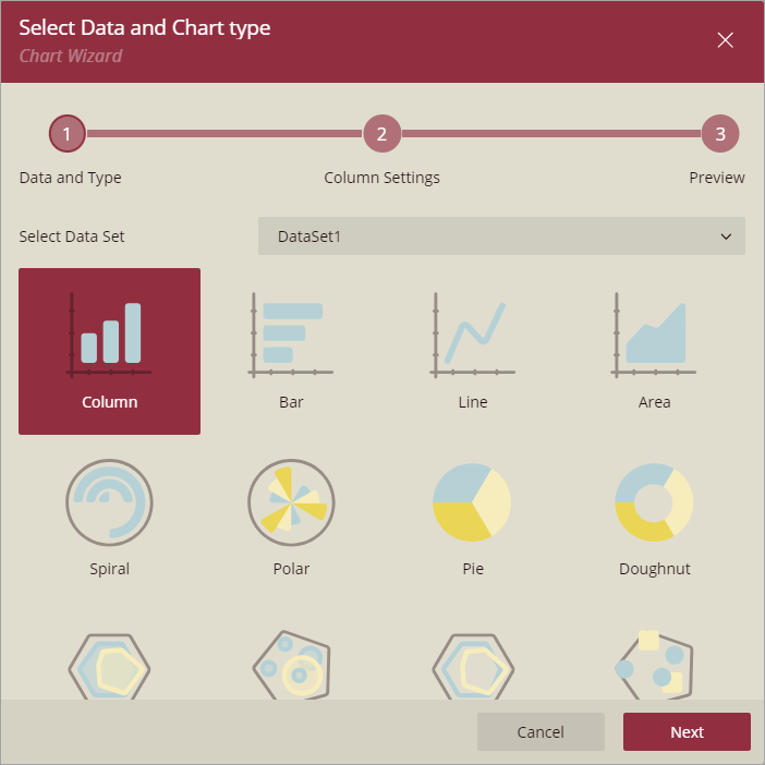
Chart Wizard
The Chart Wizard guides you through the process of creating a chart. When you drag and drop the Chart data region onto the report design surface, the Chart Wizard is displayed.
Note: The Chart Wizard is displayed only if a report is already bound to a data set.
Select data and chart type
The first screen of the Chart Wizard asks you to select a data set and a chart type.
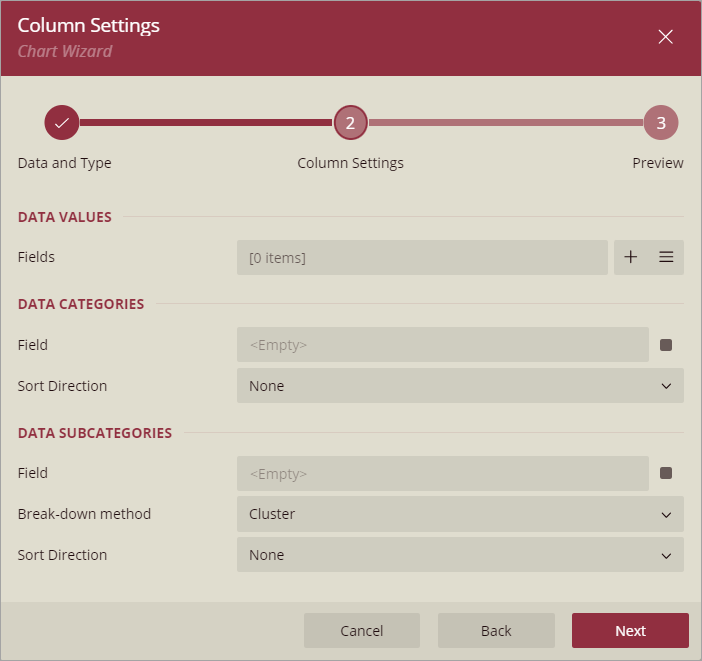
Settings
In the second screen of the Chart Wizard, specify the plot properties to configure the data values, category, detail encodings, etc., specific to the chart type.
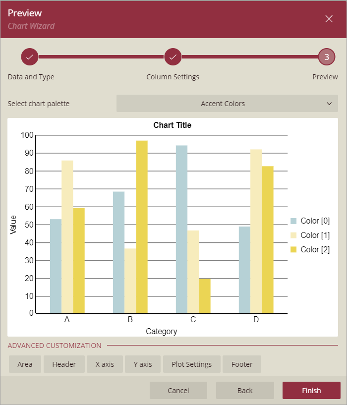
Preview
Select a chart palette from the drop-down list. Click Finish to add the chart to the report or choose any of the advanced customization options.
For information on how to create a chart, see the walkthrough Report with Chart.