- Getting Started
- Administration Guide
-
User Guide
- An Introduction to Wyn Enterprise
- Document Portal for End Users
- Data Governance and Modeling
- Working with Resources
- Working with Reports
- Working with Dashboards
- View and Manage Documents
- Understanding Wyn Analytical Expressions
- Section 508 Compliance
- Subscribe to RSS Feed for Wyn Builds Site
- Developer Guide
Report with Chart
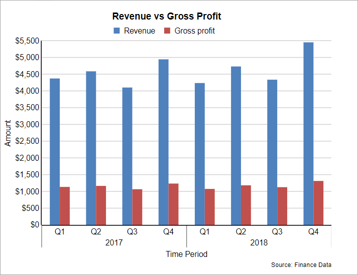
Let us see how easy it is to represent data in charts. This tutorial guides you through the steps to create a Clustered Column Chart. The chart consists of two columns (or series) comparing the 'Revenue' and ‘Gross Profit' against a certain period.
After you complete this tutorial, you will have a report that looks similar to the following.

Create Report Layout and Bind Report to Data
Create a new RDLX report and bind the report to the built-in dataset: ‘FinanceData2’.
Design Chart
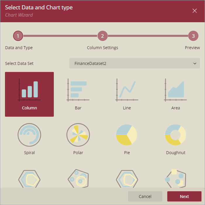
Drag-drop the Chart data region onto the design area. The Chart Wizard dialog appears with an option to select the data and the chart type.
Select the Dataset Name as ‘FinanceData2’ and the Chart Type as 'Column'.

Click Next to navigate to the Column Settings screen.

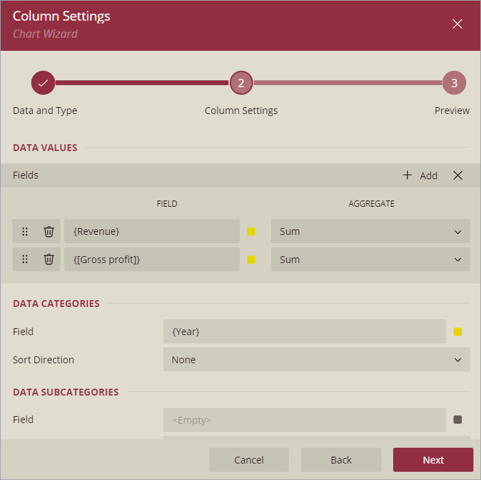
Here, we will define two series values to form a cluster (or group), one column to show the 'Revenue' and the other to show the 'Gross Profit'.
Under Data Values, add the two fields and set the corresponding aggregates as shown:
Field
Aggregate
Revenue
Sum
Gross Profit
Sum
Under Data Categories, select the field ‘Year’.
Now the chart is configured.
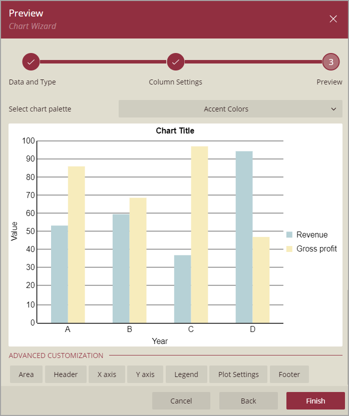
Click Next to navigate to the Preview screen.

You can modify the chart palette, say Office2010, and do advanced customizations as the last step in the process of chart creation. Or, you can exit the wizard and access the properties window to do customizations on the chart elements.
Set Advanced Customization
Open the Explorer in the Designer and pin it, and select the chart elements as instructed to perform customizations.
With Plot – Plot 1 selected, set Encoding – Color > Show Values Names in Legend property to True.
Select Global Legend and set the Position to Top and Orientation to Horizontal.
Select Header :
set Caption to ‘Revenue vs Gross Profit’ and
set Text > Font Size to '12'.
Select Footer:
set the Caption to 'Source: Finance Data' and
set the Text >Text Align to Right.
Select Y Axis - [Plot 1]:
set Major Grid > Show Grid Lines to True and Color to ‘Light Grey’, and
set Labels > Format to 'c0' to represent currency with no decimals.
Select X Axis - [Plot 1] and set Labels > Format to #### to specify the format of Year.
Save the report and preview.