- Getting Started
- Administration Guide
-
User Guide
- An Introduction to Wyn Enterprise
- Document Portal for End Users
- Data Governance and Modeling
- Working with Resources
- Working with Reports
- Working with Dashboards
- View and Manage Documents
- Understanding Wyn Analytical Expressions
- Section 508 Compliance
- Subscribe to RSS Feed for Wyn Builds Site
- Developer Guide
Overlays
You can overlay a trendline on the chart to help viewers easily interpret a trend. A trendline, for example, helps predict future prices to understand the price movement in trade.
Add Trendlines to a Chart
From the Report Explorer, expand the Chart data region node and select Plot.
From the Properties inspector tab, go to Config > Overlays property.
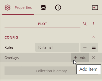
Click Add, corresponding to the Overlays property.
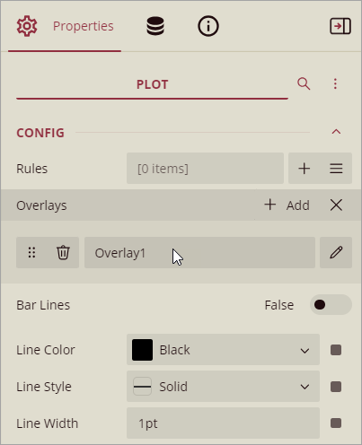
Select the trendline type in the Type property.
Set the properties specific to the selected trendline, and other properties to customize color, thickness, etc.
See the section Inspector Panel Properties.
The following types of trendlines are available:
Reference Line
Reference Band
Linear Trendline
Exponential Trendline
Power Trendline
Logarithmic Trendline
Polynomial Trendline
Fourier Trendline
MovingAverage Trendline
CumulativeMovingAverage Trendline
ExponentialMovingAverage Trendline
WeightedMovingAverage Trendline
MovingAnnualTotal Trendline
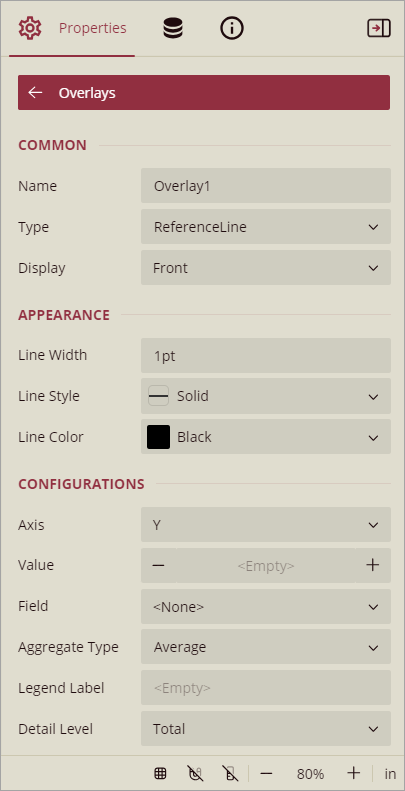
Inspector Panel Properties
Property | Description |
|---|---|
Common | |
Name | Enter the name of the trendline. |
Type | Select the type of trendline from the list of available types. |
Display | Sets the display position. Select from Front or Back. |
Appearance | |
Line Width, Style, Color | Sets the style of the line, color, and width of the trendline. |
Background Color | Select the color to use for the background of the Reference Band trendline. (Reference Band) |
Configurations | |
Axis | Specifies the axis to which the trendline belongs. Select from X or Y. (Reference Line, Reference Line) |
Start | Specifies the start position of the Reference Band trendline. (Reference Band) |
End | Specifies the end position of the Reference Band trendline. (Reference Band) |
Value | Sets the position on the Reference Line on the specified axis. (Reference Line) |
Field | Sets the field name for the reference line to use. (Reference Line) |
Aggregate Type | Sets the reference line aggregation function. Select from Sum, Count, Average, Max, Min, Median, and Percentile. (Reference Line) |
Legend Label | Sets the legend label of the reference line. |
Detail Level | Specifies if the overlay calculation should include the entire data set or each detail group. Select from Total or Group. |
Intercept | Sets the intercept value of the Y-axis. (Linear Trendline, Exponential Trendline, Power Trendline, Logarithmic Trendline, Polynomial Trendline, Fourier Trendline) |
Forward Forecast Period | Sets the number of periods that the forecast extends forward. (Linear Trendline, Exponential Trendline, Power Trendline, Logarithmic Trendline, Polynomial Trendline, Fourier Trendline) |
Backward Forecast Period | Sets the number of periods that the forecast extends backward. (Linear Trendline, Exponential Trendline, Power Trendline, Logarithmic Trendline, Polynomial Trendline, Fourier Trendline) |
Order | Sets the number of terms in the equation. A value less than 2 is treated as 2 for the Polynomial Trendline. (Polynomial Trendline, Fourier Trendline) |
Period | Specifies the number of data values used to create a line. The default value is 2. (MovingAverage Trendline, CumulativeMovingAverage Trendline, ExponentialMovingAverage Trendline, WeightedMovingAverage Trendline, MovingAnnualTotal Trendline) |
Let us learn how to overlay trendlines on a chart, taking the 'Income Statement' report as a sample and adding trendlines to the 'Revenue vs Gross Profit' chart. You should first follow the steps in the section Add Trendlines to a Chart.
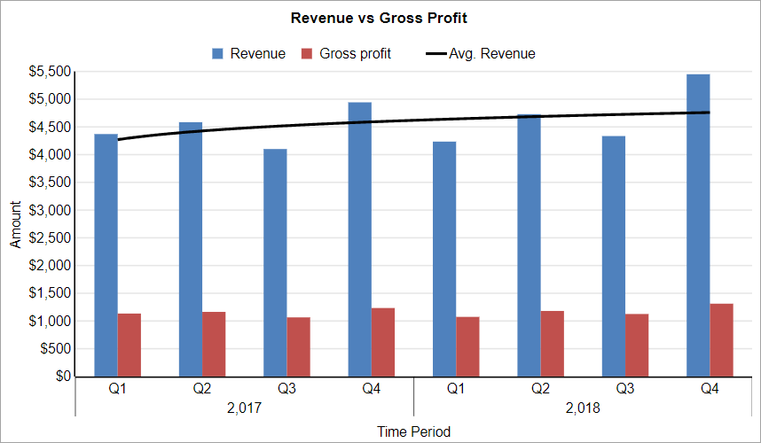
Reference Line
A Reference Line is a static line, drawn at a single point along a single axis that stretches indefinitely along the opposite axis. You can set the line's position or have it calculated by the data set. For example, you may want to add a reference line at the average value to see how each value is compared against the average.
To add the Reference Line to the chart, set up the properties as described next.
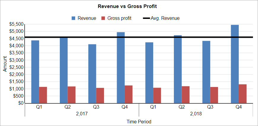
Type: ReferenceLine
Display: Front
Line Width: 3pt
Line Color: Black
Line Style: Solid
Axis: Y
Field:
{Revenue}Aggregate Type: Average
Detail Level: Group
Legend Label: Avg. Revenue
Reference Band
A Reference Band is a shaded area, which is positioned along a single axis between two calculated values and extends indefinitely along the opposite axis. Each band has a start and end position that you set in the Properties.
This trendline is not available for Candlestick, High Low Close, and High Low Open Close type charts.
To add the Reference Band to the chart, set up the properties as described next.
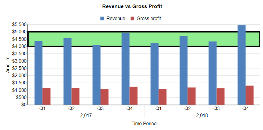
Type: ReferenceBand
Display: Back
Line Width: 3pt
Line Color: Black
Line Style: Solid
Axis: Y
Start: 4000
Linear Trendline
A Linear trendline creates a best fit straight line that shows how values in a data series increase or decrease at a steady rate. This trendline uses the following equation:
y = mx + bwhere "m" is the slope and "b" is the intercept.
To add the Linear Trendline to the chart, set up the properties as described next.
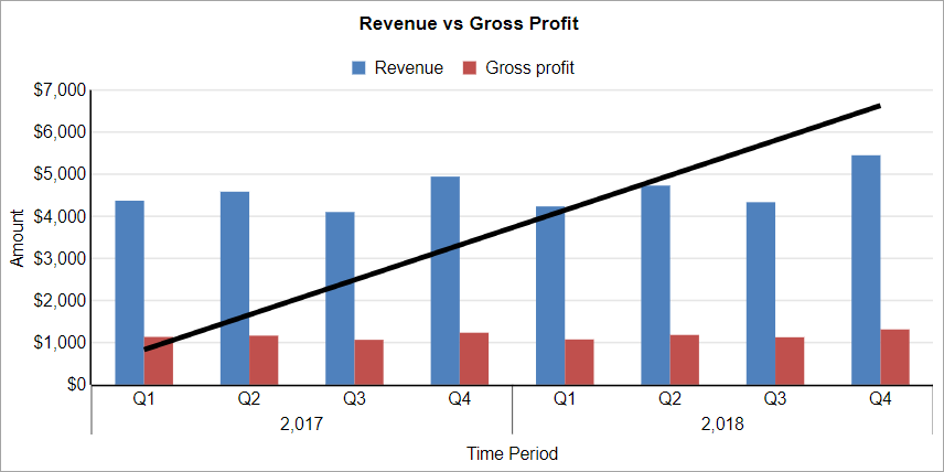
Type: LinearTrendline
Display: Front
Line Width: 3pt
Line Style: Solid
Line Color: Black
Intercept:1
Forward Forecast Period: 0
Backward Forecast Period: 0
Field:
{Revenue}Legend Label: Avg. Revenue
Detail Level: Total
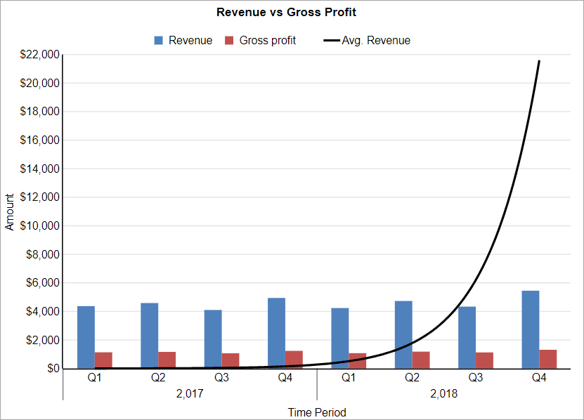
Exponential Trendline
An Exponential trendline creates a best-fit curved line that illustrates how data values increase or decrease and then level out. You can use this trendline only with positive numbers. If the data series contains any zero or negative numbers, then this trendline is not available. This trendline uses the following equation:
y = cebx
where "c" and "b" are constants, and "e" is the base of the natural logarithm.
To add the Exponential trendline to the chart, set up the properties similar to the Linear Trendline, with the Type property 'ExponentialTrendline'.
Power Trendline
A Power trendline creates a curved line to compare measurements that increase at a specific rate. You can use this trendline only with positive numbers. If the data series contains any zero or negative numbers, then this trendline is not available.
This trendline uses the following equation:
y = axb
where "a" and "b" are constants.
To add the Power trendline to the chart, set up the properties similar to the Linear Trendline, with the Type property 'PowerTrendline'.
Logarithmic Trendline
A Logarithmic trendline creates a best-fit curved line that illustrates how data values increase or decrease and then level out. This trendline uses the following equation:
y = c ln(x) + b
where "c" and "b" are constants, and "ln" is the natural logarithm function.
To add the Logarithmic trendline to the chart, set up the properties similar to the Linear Trendline, with the Type property 'LogarithmicTrendline'.
Polynomial Trendline
A Polynomial trendline creates a curved line, illustrating fluctuations in the data values. The trendline uses the following equation:
y = b + c1x + c2x2 + c3x3 + ...
where c1, c2, c3 are constants.
To add the Polynomial trendline to the chart, set up the properties similar to the Linear Trendline, with the Type property 'Polynomial Trendline' and Order value ranging from '2' to '6'.
Fourier Trendline
A Fourier trendline creates a trendline, based on the Fourier Series. It identifies patterns or cycles in a series data set, and removes the effects of trends or other complicating factors from the data set, thereby providing a good estimate of the direction that the data under analysis will take in the future.
y = C0 + C1 cos(x) + C2 sin(x) + C3 cos(2x) + C4 sin(2x) + ...
To add the FourierTrendline trendline to the chart, set up the properties similar to the Linear Trendline, with the Type property 'FourierTrendline' and Order value ranging from '2' to '6'.
MovingAverage Trendline
A MovingAverage trendline reduces the fluctuations in the trendline to show a smoother pattern. This trendline uses the following equation:
Ft = (At + At-1 + At-2 ) / n
To add the MovingAverage trendline to the chart, set the Type property to 'MovingAverage' and Period to a value that you want to specify as data points.
CumulativeMovingAverage Trendline
In a CumulativeMovingAverage trendline, the data arrive in an ordered datum stream, and you get the average of all data up until the current datum point.
To add the CumulativeMovingAverage trendline to the chart, set the Type property to 'CumulativeMovingAverage ' and Period to a value that you want to specify as data points.
ExponentialMovingAverage Trendline
An ExponentialMovingAverage (EMA), also known as an exponentially weighted moving average (EWMA), is a first-order infinite impulse response filter that applies weighting factors, which decrease exponentially. The weighting for each older datum decreases exponentially, never reaching zero.
To add the ExponentialMovingAverage trendline to the chart, set the Type property to 'ExponentialMovingAverage ' and Period to a value that you want to specify as data points.
WeightedMovingAverage trendline
A WeightedMovingAverage trendline is an average that has multiplying factors to give different weights to data at different positions. Mathematically, the moving average is the convolution of the datum points with a fixed weighting function.
To add the WeightedMovingAverage trendline to the chart, set the Type property to 'WeightedMovingAverage' and Period to a value that you want to specify as data points.
MovingAnnualTotal trendline
A MovingAnnualTotal trendline is a moving total of the prior 'n' points at an abstract level.
To add the MovingAnnualTotal trendline to the chart, set the Type property to 'MovingAverageTotal' and Period to a value that you want to specify as data points.