[]
        
(Showing Draft Content)

TextBox

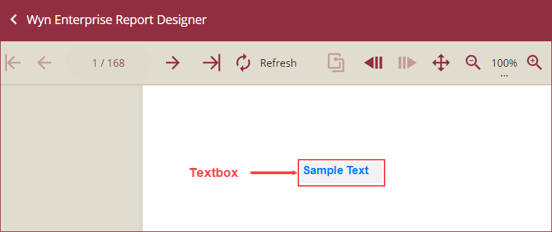
TextBox control is the most extensively used report control by the users. It is an input box that can be used to write any text in a report or display any textual data. For example, you can use a textbox to write the title of the report or to display any data.


Textbox Control


By default, all the cells of the Table and Tablix report control have textboxes. Also, when you drag and drop the fields from a dataset onto the report designer, text boxes are created automatically. You can edit and format the text in the textbox as well.

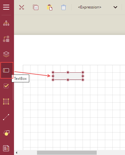
To add a TextBox in a Report Designer

Follow the below steps to add a textbox.

  1. From the Report Toolbox on the left, drag and drop the TextBox control onto the design area.


    Select expression

  2. Now add the content. You can either type the text directly into the textbox or you can select the fields and bind the fields to the dataset.

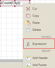
  3. You can also use expressions in the textbox. Right-click the textbox and select the option Expression.


    Select expression

Binding data to a TextBox

Follow the below steps to bind data to a textbox.


Method 1

  1. From the Report Toolbox on the left, drag and drop the TextBox control onto the design area.

  2. Select the textbox and from the fields selection adorner Field  Selection Adorner 
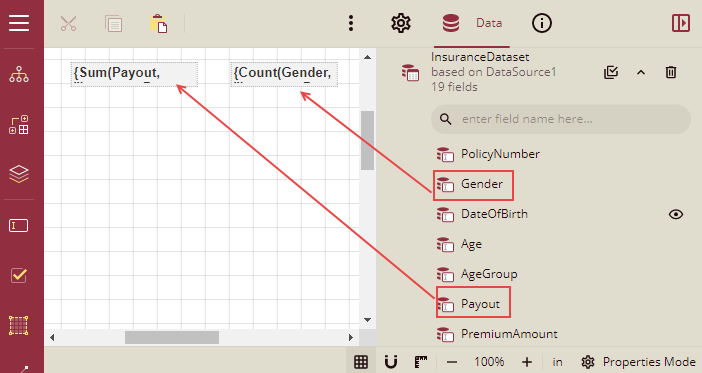
, select a field from the list. If a numeric field is selected, then by default the Sum of the numeric field is taken. If the field selected is non-numeric, then the count of the field is taken. In the image below, we have taken two textboxes, one has a numeric field and another has a non-numeric field.
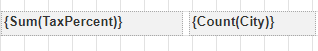

    Field-Selected-From-Adorner

Method 2

  1. From the Report Toolbox on the left, drag and drop the TextBox control onto the design area.

  2. From the Data Binding tab on the right, expand the dataset and drag-drop the desired field(s) onto the textbox. In this example, the report uses the InsuranceDataSet and we have dragged and dropped the Payout and Gender fields.


    Textbox Databinding

Method 3

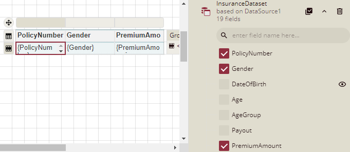
  1. From the Data tab on the right, click the Select Fields button Select Fields Button next to the bound dataset and select the desired fields.

  2. Drag-drop the selected fields onto the design area. A table with its column bound to the fields is created and the cells in the table have a textbox.


    Textbox in a Table

You can double-click in the table cell and the textbox will become editable and you can edit the font, size, color, etc. of the text.

Properties Tab

You can customize the default textbox appearance by setting properties in the Properties tab of the TextBox control. Properties like adding a border, editing font size, font type, background color, etc. can be customized.


Listed below are the common properties.

Property Section

Property Description

Common

  • Name: Sets the name of the selected textbox.

  • Value: Sets the data to be displayed in the textbox. You can enter text directly, or click to select a field, add an expression, and so on.

Action

  • Type: This sets the action to be taken when clicking on the text in the textbox. The dropdown list has four options.

    • None: This option means no action is to be taken.

    • Apply Parameters: This option is used to re-render the report with new parameters. Choose the Apply Parameters option from the dropdown, click + Add, select a parameter, and action type, and name the action. The action types are explained below,

      • Set: Used to set a specific value to a specific parameter.

      • Toggle: Used to add or remove value to the multi-value parameter collection.

      • Reset: Used to reset the parameter to its default value. See the Apply Parameters section for more information.

    • Jump to Report: This option allows you to jump from the current report to another report. You can link any text in the report. When a user clicks the linked text, it will jump to the report linked with that text.

    • Jump to Bookmark: This option is used for jumping within the current report. You can define the bookmark and then select the jump to bookmark settings, to make it easier to jump between report content. You can bookmark any element in the report to make it a destination anchor for the jump.

    • Jump to URL: This option is used to jump to an external web page.

Background

This sets the background of the textbox.

  • Color: This option sets the background color of the textbox. You can select the color by clicking the dropdown list.

  • Image: This option sets the background image of the textbox. Click the dropdown list to select the image source.

  • Shared refers to the images that are uploaded on the portal, Embedded refers to the new images that you can select and upload here, and Database refers to the database graphics field. Click the Expand icon Image Expand Icon to display more image properties.

    • Source: This is the source from which the image comes.

    • Value: This refers to the image selected from the source. Example: If the image source is "Shared", then you need to select the specific shared image here.

    • MIME Type: This refers to the image format like png, gif, etc.

    • Repeat: This defines how the image is covering the textbox. It has four options.

      • Repeat: This option repeats the image both height-wise and width-wise until the background area is covered.

      • NoRepeat: When this option is selected, then the image is not repeated and is displayed only once.

      • RepeatX: This option repeats the picture horizontally ( width-wise).

      • RepeatY: This option repeats the picture vertically( height-wise).

Border

This option sets the border of the textbox.

  • Width: You can set the width of the textbox border using this option. By clicking the Expand icon Image Expand Icon, you can set the width of the border of all the sides of the textbox in case required.

  • Style: Select the border style from the dropdown list. By clicking the Expand icon Image Expand Icon, you can set the style of the border of all the sides of the textbox in case required.

  • Color: Select the border color from the dropdown list. By clicking the Expand icon Image Expand Icon, you can set the color of the border of all the sides of the textbox in case required.

Text

This sets the text formatting in the textbox. You can set the font Color, Family, Size, Style, Weight, Decoration, Alignment, Justification, Vertical Align, word WrapMode, Line Spacing, Character Spacing, Data Format, Rotation Angle, Font adaptation, and font-weight ratio.

Dimensions

This sets the location and size of the textbox.

  • Left: This option sets the distance to be maintained from the upper left side of the textbox horizontally.

  • Top: This option sets the distance to be maintained from the top of the textbox vertically.

  • Width: This option sets the width of the text box.

  • Height: This option sets the height of the text box.

Layout

This sets the textbox layout in a report as a whole.

  • Style: This option sets the theme of the textbox in the report.

  • Padding: Padding refers to the space between the textbox content and the border. You can set the padding from -

    • Top: Sets the top padding in points,

    • Left: Sets the left padding in points,

    • Right: Sets the right padding in points,

    • Bottom: Sets the bottom padding in points.

  • Layer Name: Sets the report layer.

  • Keep Together: This option ensures that the textbox will appear on the same page or not when there is a lot of content.

  • Can Grow: Determines whether the report should increase the height of the textbox control based on its content.

  • Can Shrink: Determines whether the text box height should automatically shrink when there is less content.

  • Z-Index: This property sets the position of the textbox when multiple textboxes are stacked together. The textbox with a greater Z-Index value will always be in front of the textbox that has a lower Z-Index value.

Visibility

This sets the visibility of the textbox control on the report preview.

  • Hidden: This option sets whether to hide the textbox or not on the preview.

  • Toggle Item: Visibility can be toggled by another report item. This option sets another item, such as another text box, as a toggle button to display the current text box or not.

  • Initial Toggle State: This option sets the display state of the textbox (that can be used as a toggle button) when the report is first loaded. If it is Collapsed, then the toggle element shows as a plus sign, and all the content of the current textbox is hidden. If it is Expanded, then the toggle element shows as a minus sign, and all the content of the current textbox is displayed.

Data

  • Element Name: You can enter a name to be used in the XML output for this textbox.

  • Element Output: You can select Auto, Output, or NoOutput to decide whether to include this textbox in the XML output. Auto exports the contents of the textbox only when the value is not a constant.

  • Element Style: You can select Auto, AttributeNormal, or ElementNormal to decide whether to render textboxes as Attributes or Elements in the exported XML file. Auto uses the report's setting for this property.

User Sort

  • Sort Expression: You can enter an expression to sort the data.

  • Sort Target: You need to select the data region within the report on which to apply the sorting. The default value is the current scope, but you can choose an alternate data region.

International

This section is used to set the calendar fields to the international formats. You can select the international Calendar styles, writing direction (rtl or ltr), language, writing mode, etc.

Misc Options

  • Tooltip: Sets the textual label of the textbox when the mouse is moved over the cell.

  • Label: Sets a textual content that is used as the display text for report catalog items. The report catalog is made using the Table of Contents element in the toolbox, and the table of contents is used for quick positioning jumps in multi-page reports.

  • Bookmark: Enter text or an expression to use as a positioning identifier to jump to this element. You can define the bookmark and then select the "jump to bookmark" setting, to make it easier to jump between report content. You can bookmark any element in the report to make it a destination anchor for the jump.

  • Heading Level: Sets the heading levels in the TOC

Apply Parameters

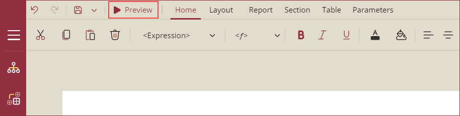
After setting the action type to Apply Parameters and adding the parameters to the report, you can preview the report using the Preview button.

ApplyPara-Previewbutton

On previewing the report, you will be prompted to enter the parameters. Add parameters and click the Preview button.

ApplyPara-Preview

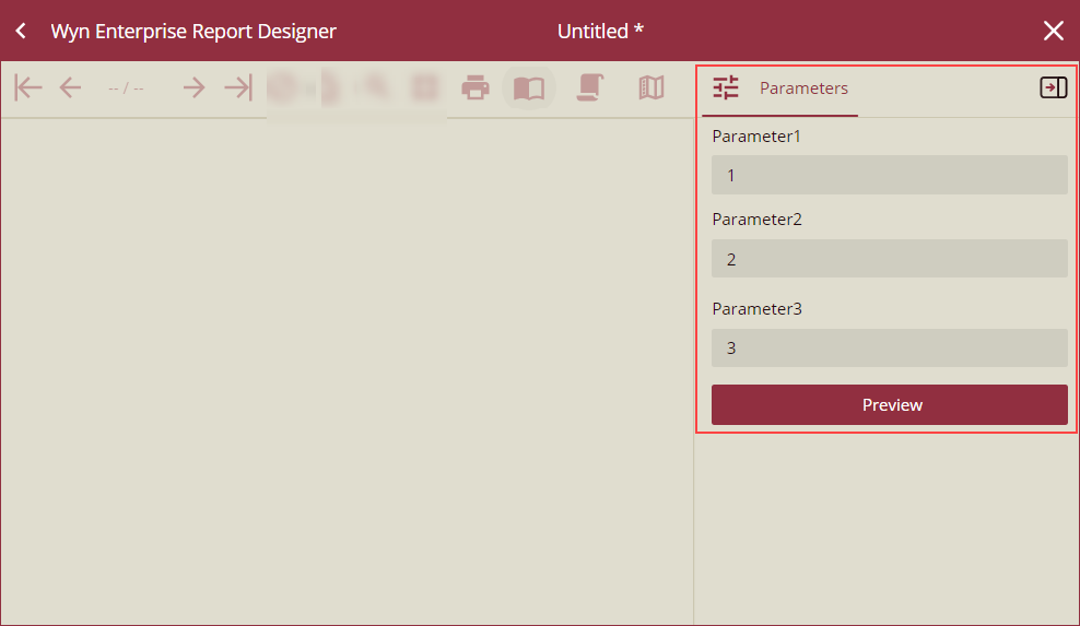
A preview of the report will appear on your screen. You can now apply the parameters linked to the textbox control by simply clicking on the text of the textbox.

ApplyPara-textBoxApply