- Getting Started
- Administration Guide
-
User Guide
- An Introduction to Wyn Enterprise
- Document Portal for End Users
- Data Governance and Modeling
- Working with Resources
- Working with Reports
-
Working with Dashboards
- Dashboard Designer
- Selecting a Dataset
- Data Attributes
- Dashboard Scenarios
- Dashboard Templates
- Component Templates
- 3D Scene
- Explorer
- Visualization Wizard
- Data Analysis and Interactivity
- Dashboard Appearance
- Preview Dashboard
- Export Dashboard
- Dashboard Lite Viewer
- Using Dashboard Designer
- Animating Dashboard Components
- Document Binder
- Dashboard Insights
- View and Manage Documents
- Understanding Wyn Analytical Expressions
- Section 508 Compliance
- Subscribe to RSS Feed for Wyn Builds Site
- Developer Guide
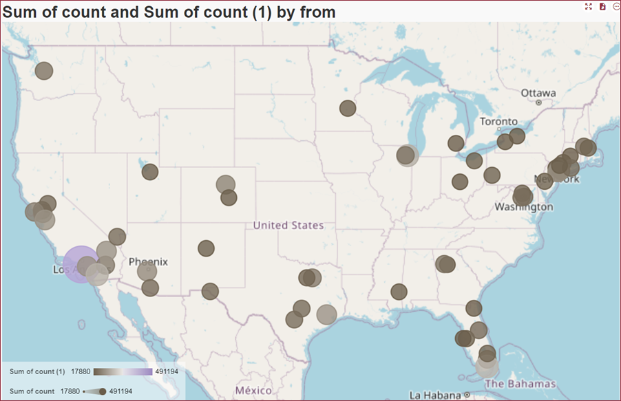
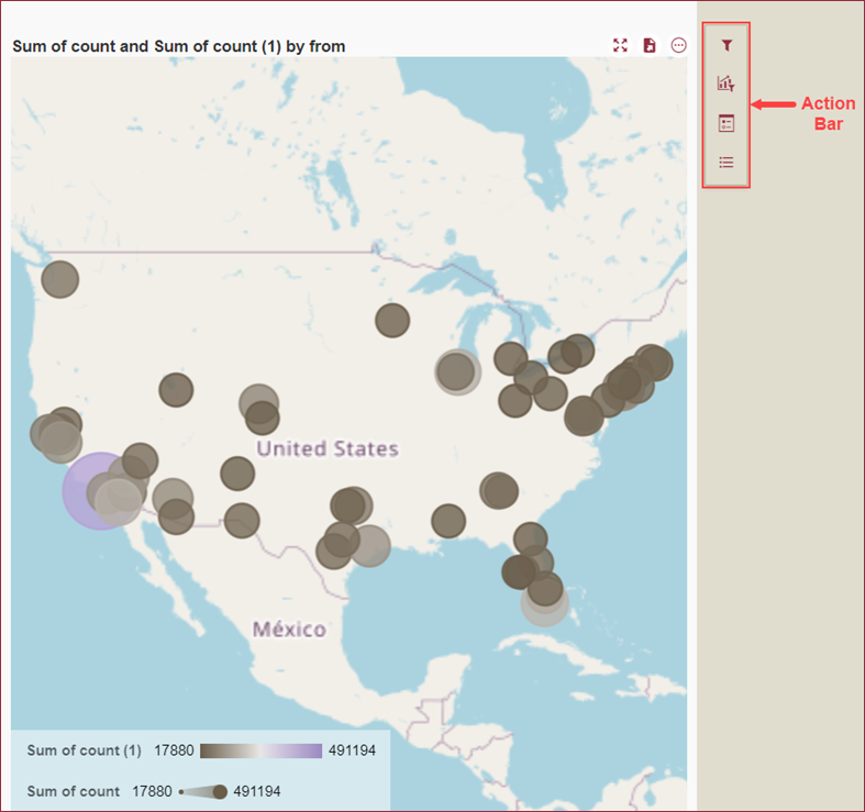
Bubble Map
Bubble Map is used to visually represent geographical data using bubbles or circles to display a numeric value on a territory. In a bubble map, a bubble's size, color, and other attributes can be used to represent different characteristics or data associated with the locations it represents.
Bubble maps in OpenStreetMap are interactive and can be used to zoom in and out or see detailed information using the drill-down feature.
There are two types of bubble maps,
Map with Geographic Coordinates: uses latitude and longitude.
Map with Regions: uses relevant location with address, city, zip code, countries, etc.
Design a Bubble Map
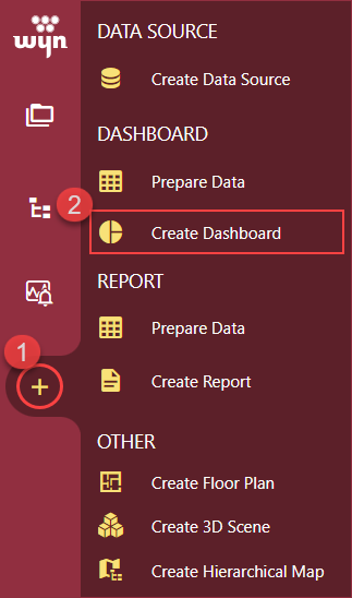
To add a Bubble Map to your dashboard scenario, switch to the Resource Portal or Document Portal and follow the below instructions,
Use the + (create button) and click the Create Dashboard option to access the dashboard designer.
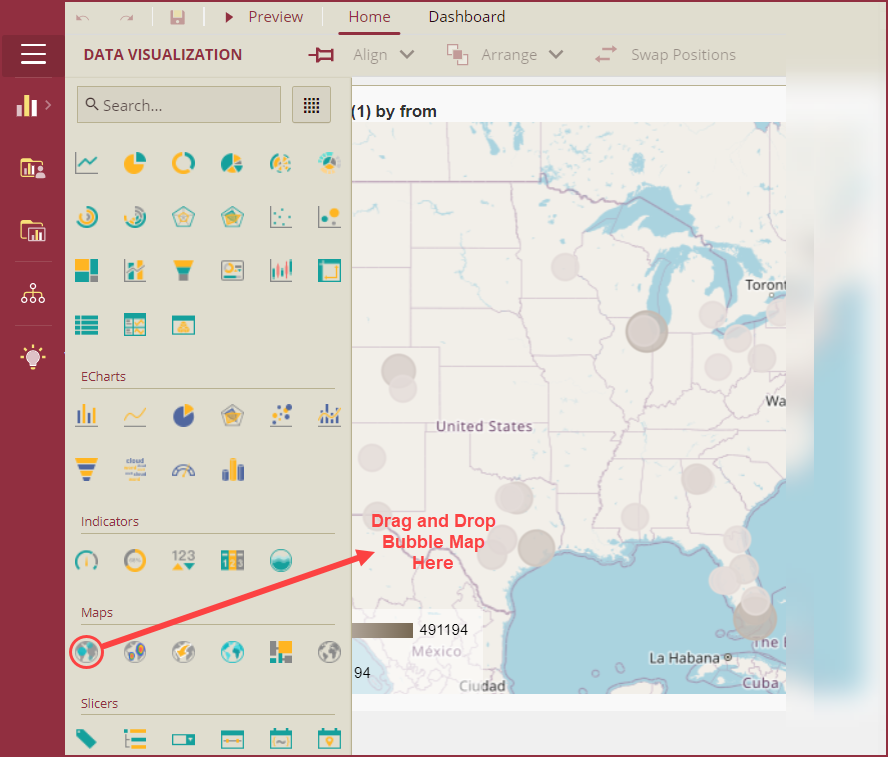
Navigate to the Data Visualization tools and drag and drop the Bubble Map scenario onto the dashboard designer area.
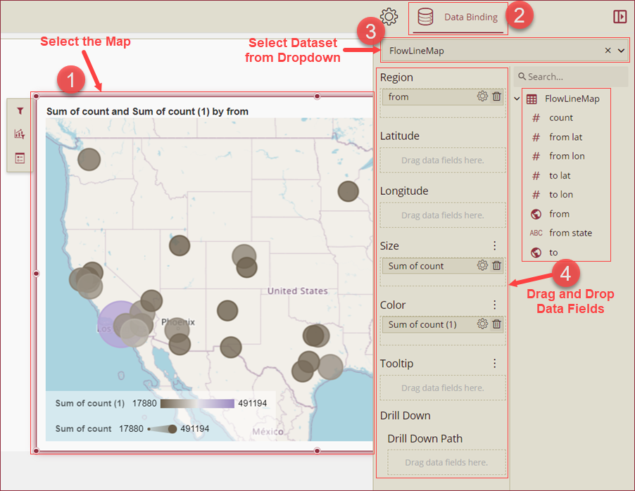
Bind Dataset to the Bubble Map
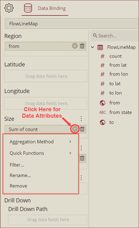
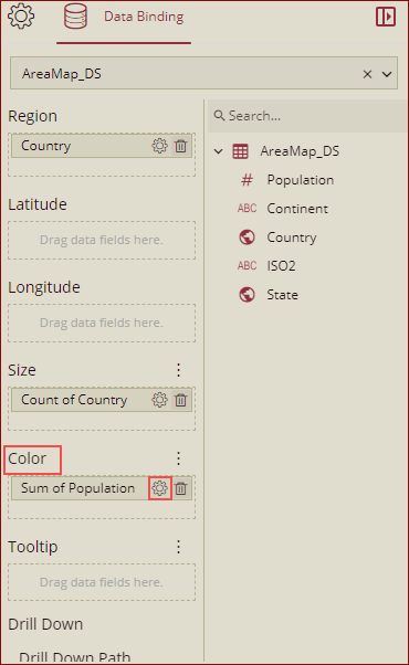
Select a dataset from the Data Binding tab with the bubble map scenario selected to bind to the scenario. When the dataset loads successfully, the data binding panel automatically expands and displays the data attributes available for data binding. Drag and drop the appropriate data fields in the Region or Latitude and Longitude data containers. Drag and drop other appropriate fields in the Size, Color, Tooltip, and Drill Down data fields as well. See the help article on the Drill Down feature for more information on drilling into hierarchical data.
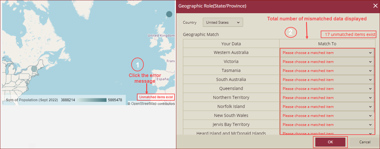
Please note that in some cases, after you bind the city, state, county, country, etc. to the Map, the data may not be matched exactly. In this case, you will get the data mismatch error message Unmatched items exist on the map in the designer. Once you click the error message, it will display the total number of mismatched data as shown below.
Format Data Attributes
You can perform various operations to format the data attributes on a bubble map and control the display of data. Use the settings icon in the data field containers to format the data attributes. The following operations are included in the Bubble Map scenario,
Aggregation Method: Use the Aggregation Method option to display a summarized value by aggregating multiple values of a data attribute. Aggregation Method supports Sum, Average, Min, Max, Count, Distinct Count, and First methods. See the Aggregation Method help topic for more information.
Quick Functions: Use the Quick Functions option to highlight key indicators in your scenario by applying powerful calculations on measures. Quick Functions in KPI Kanban support Ranking Calculation, Percentile Calculation, Running Calculation, Moving Calculation, and Original Value. See the Quick Functions help article for more information.
Filter: The Filter option displays relevant data in your chart scenario. See the Filter Data help article for more information.
Rename: Use the Rename option to change the name of a data attribute to make it comprehensible and meaningful. See the Rename a Data Attribute help article for more information.
Remove: Use the Remove option to remove a data attribute from the chart scenario.
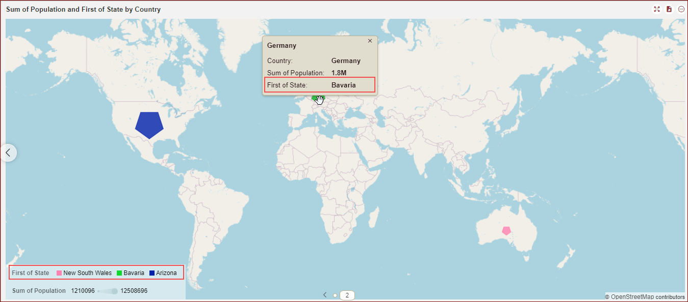
Aggregation Method (First) for Color Data Attribute
The First aggregation method is added for the Color data attribute. You can use it with both String and numeric values in the Color data attribute.
Example - 1: String Value in Color Data Attribute
Drag the fields as shown below.
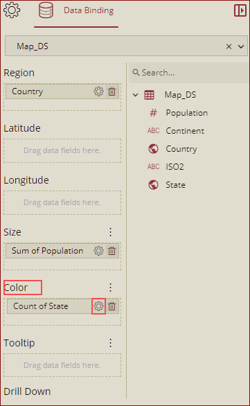
Under the Color section, go to the attribute's settings
 and select Aggregation Method. Select an aggregation method First to apply to the bound attribute.
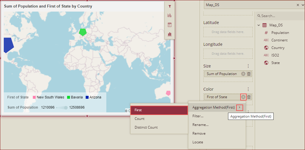
Preview the dashboard.
Example - 2: Numeric Value in Color Data Attribute
Drag the fields as shown below.
Under the Color section, go to the attribute's settings
 and select Aggregation Method. Select an aggregation method First to apply to the bound attribute.
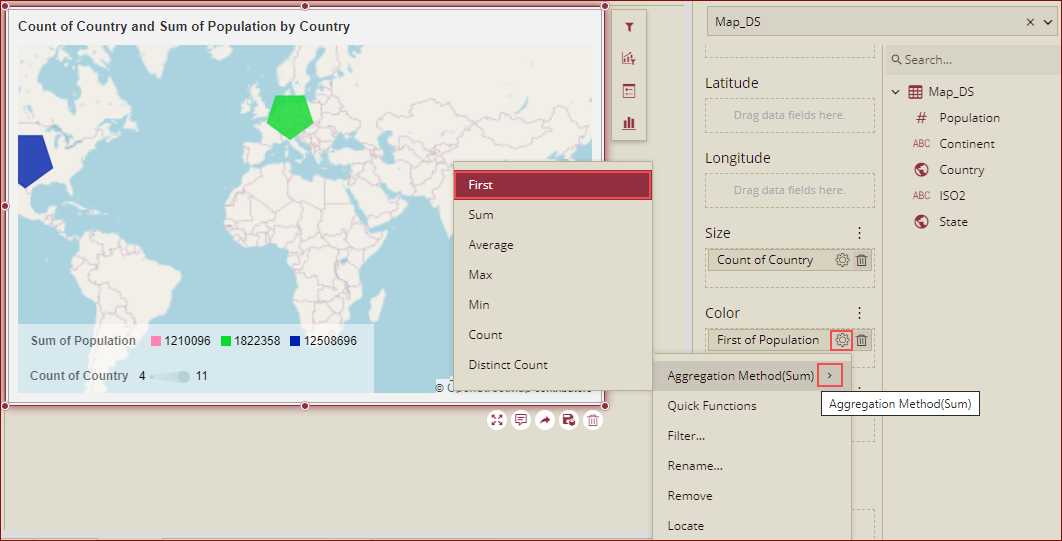
Preview the dashboard.
Note: The aggregation method First is only applicable for the Color data attribute.
Analyze Data
Wyn Dashboards scenarios support rich data analysis and exploration capabilities to help you analyze massive amounts of information and make data-driven decisions. Following analysis operations are available in the Action Bar corresponding to each scenario in the designer,
Filter: To filter out relevant data in your chart scenario. See the Filter Data help article, for information on using the filter options in a dashboard scenario.
Conditional Visualization: To filter, compare, and rant the data in a dashboard scenario. See the Conditional Visualization help article for information on using various visualization options.
Conditional Format: To highlight specific values or emphasize specific information. See the Conditional Formatting help article for information on using various formatting options.
Analysis Path:
Customize Appearance
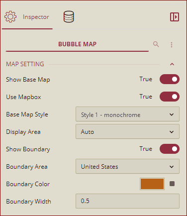
You can customize the appearance of a Bubble Map scenario using the Inspector Panel properties on the right side of the dashboard designer window. The properties are listed and described in the following tables,
MAP SETTING
Option | Description |
|---|---|
Show Base Map | To enable or disable the reference map use the Show Base Map property. In Wyn Enterprise, Mapbox GIS is used as a base map. By default, the value of this property is set to True. |
Use Mapbox | To use the Mapbox styles in your map, set the Use Mapbox property toTrue. If the Use Mapbox property is set to True in the Admin portal under the Dashboard Settings, only then you will see this property in the Dashboards. |
Base Map Style | You can select the default (Normal, Dark, Light) or any custom mapbox style. The custom mapbox style added in the Admin portal under the Dashboard Settings will be displayed here. |
Display Area | Select an option from the dropdown, Auto: Automatically controls the map range that displays all data points. By Area: Displays the area selector on the map. When you click on a bubble, the map boundary range will display the selected area bubble.By Longitude & Latitude: You can manually set the zoom level, longitude, and latitude of the area bubbles. When the By Longitude & Latitude option is selected the Zoom Level, Longitude, and Latitude options will appear in the Inspector Panel.Zoom Level: Set the default zoom level for the map ranging between 2 to 16. Longitude: Set a longitude value using the slider or the input box.Latitude: Set a latitude value using the slider or the input box. |
Show Boundary | Set this property to True, to show the map boundary. When this property is set to True, then you can see 3 more boundary properties: Boundary Area - the area where you want to show the boundary. Boundary Color - Select the color in which you want to show the boundary. Boundary Width- Select the boundary width from here. |
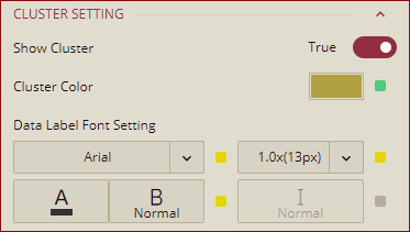
CLUSTER SETTING
Option | Description |
|---|---|
Show Cluster | You can use the Show Cluster property, to show groups of points at zoomed-out levels. You can expand the groups to individual points by zooming in on the map area. By default, this property is set to False. When this property is set to True, the bubble size represents the group's points number, and it can show the points number label for the cluster point. Zoom in the map, the cluster point can be split into several smaller cluster points. When this property is set to True, then you can see 2 more cluster properties: Cluster Color - Select the color in which you want to show the clusters. Data Label Font Setting - You can select the Font Type and Font Size from here. Please note, here the Font Style is disabled. For details refer to the topic Cluster Setting. |
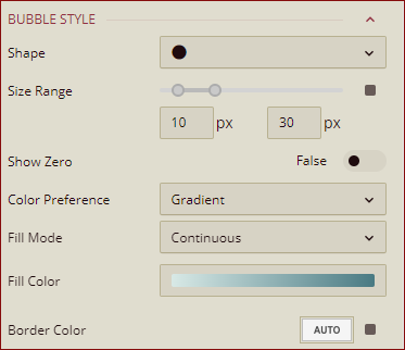
BUBBLE STYLE
Option | Description |
|---|---|
Shape | Select a shape of the bubble using the dropdown. |
Size Range | Select a size range of the bubble using the range indicator. Size Range represents the maximum and minimum values of the aggregated data of the Size data field in the Data Binding panel. By default, the minimum value is set at 10px and the maximum value is set at 30px. However, you can set the minimum value up to 1px and the maximum value up to 100px. |
Show Zero | To enable or disable the display of a bubble for zero values use the Show Zero property. By default, the value of the Show Zero property is set to False. |
Color Preference | Select an option from the dropdown to set the color preference. -Gradient: If you select this option then you get the option to specify the Fill Mode and Fill Color. -Palette: If you select this option, then you get the option to specify the Maintain Color Assignment and Palette. |
Fill Mode | Select an option from the dropdown to set the bubble fill type. - Continuous: Select the Continuous option to set a continuous flow of the bubble fill. - Grouped: Select the Grouped option to divide the bubbles into groups and set the fill color. |
Fill Color | Select a fill color from the color gradient. You can choose 2 color fills or 3 color fills from the color gradient for the bubbles. |
Border Color | Select the border color for the bubble style. |
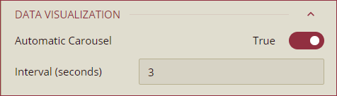
DATA VISUALIZATION
Option | Description |
|---|---|
Automatic Carousel | To highlight a bubble in the bubble map and display the tooltip, set the Automatic Carousel property to True. By default, this property is set to False. |
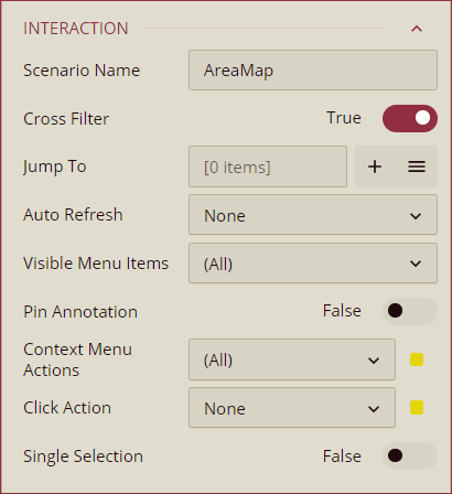
INTERACTION
Option | Description |
|---|---|
Scenario Name | Add a name to the map scenario using this property. |
Cross Filter | To disable the filtered data throughout the dashboard, set this property to False. Cross filters provide a simplified and deeper analysis of what you want to observe. By default, the value of the Cross Filter property is set to True. |
Jump To | To create a shortcut to another dashboard scenario, report, or URL use this property. See the Jump To help article for more information. |
Auto Refresh | Select None, Polling, or Real Time option from the dropdown to set the refresh rate of the map data. Dropdown options are described below, - None: Select None to disable auto-refresh of the map data. - Polling: Select Polling to enable auto refresh and set an interval to refresh map data in the Refresh Interval property. - Real-time: Select Real-time to display the data in real time. |
Visible Menu Items | Select the filtering and sorting options you wish to display on the map scenario from the dropdown. |
Pin Annotation | To pin the annotation to the map scenario, set this property to True. By default, this property is set as False. |
Context Menu Actions | Select multiple Context Menu Options from the dropdown. Context Menu Options include - Keep, Exclude, Drill Down, Jump, and Add Data Monitoring. |
Click Action | Select None, Keep, Exclude, or Jump option from the dropdown to perform an action on click. |
Single Selection | To allow a single selection of map items, set this property to True. By default, this property is set to False. |
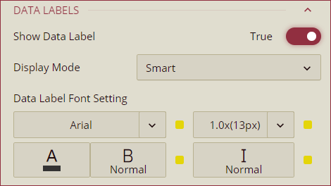
DATA LABELS
Option | Description |
|---|---|
Show Data Label | To display data labels set the Show Data Label property to True. On enabling the Show Data Labels property Show Location, Show Measure, Display Mode, and Data Label Font Setting properties appear in the Inspector Panel. By default, the value of the Show Data Label property is set to False. |
Show Location | To disable the region or latitude and longitude display on the map, set the Show Location property to False. By default, the value of the Show Location property is set as True. |
Show Measure | To disable the measure of the heat map value, set the Show Measure property to False. By default, the value of the Show Measure property is set as True. |
Display Mode | Select an option from the dropdown to display the data labels. TheSmart option displays the maximum value and the All option displays all data labels in the region. |
Data Label Font Setting | Set the font family, font size, font color, font weight, and font style of the data labels using this property. |
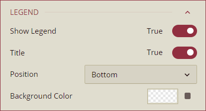
LEGEND
Option | Description |
|---|---|
Show Legend | To enable or disable the legend items on the map scenario use the Show Legend property. By default, the value of the Show Legend property is set to True. |
Title | To disable the title of the legend in the map scenario, set the Title property to False. By default, the Title property is set to True. |
Position | Select a position of the legend to be displayed in the map scenario from the dropdown. The available options are Top, Right, Bottom, and Left. |
Background Color | Select the background color of the legend bar using the color picker. |
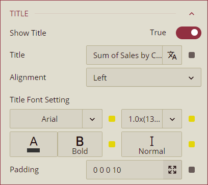
TITLE
Option | Description |
|---|---|
Show Title | To hide the title of the map scenario set this property to False. By default, this property is set to True. |
Title | Add or edit the title of the map scenario using the Title property. |
Alignment | Select the Left, Center, or Right alignment option of the title from the dropdown. |
Title Font Setting | Set the font family, size, color, weight, and style of the title using the Title Font Setting options. |
Padding | To create space around the title of the map scenario use the Padding property. You can set the following: Padding Left, Padding Top, Padding Right, and Padding Bottom. |
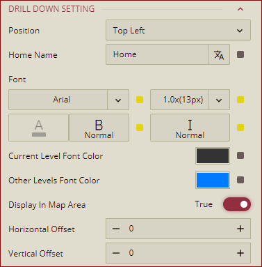
DRILL DOWN SETTING
Property | Description |
|---|---|
Position | You can set the display position for the drill-down bar using this property. The dropdown list has the following options: Top Left, Top Center, Top Right, Bottom Left, Bottom Center, and Bottom Right. By default, the Top left is selected. |
Home Name | You can select the initialized text for drill down path to be displayed on the preview from here. By default, the value is Home. |
Font | You can set the font for the drill down path from the font settings. |
Current Level Font Color | You can pick the color for the current level text in the drill down path by using this property. |
Other Levels Font Color | You can pick the color for the other level text in the drill down path by using this property. |
Display In Map Area | Set this property to True, to display the drill down in the map area. By default, it is set to False. |
Horizontal Offset | Sets the value of the horizontal distance between the start of the map area and the drill down path display. |
Vertical Offset | Sets the value of the vertical distance between the start of the map area and the drill down path display. |
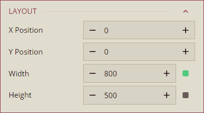
LAYOUT
Option | Description |
|---|---|
X Position | Set the horizontal position of the map scenario on the dashboard using the X Position property. |
Y Position | Set the vertical position of the map scenario on the dashboard using the Y Position property. |
Width | Set the width of the map scenario using the Width property. You can set the minimum width up to 8. |
Height | Set the height of the map scenario using the Height property. You can set the minimum height up to 8. |
APPEARANCE
Option | Description |
|---|---|
Style Template | Select a template from the dropdown to apply a style to the map scenario. |
Background Color | Set a background color of the map scenario using this property. |
Padding | To create space around the map scenario, set a padding value. |
Margin | Set the margin value for the map scenario using this property. |
Visibility | To hide the map from the dashboard, set this property to False. By default, the Visibility property is set as True. |
Background Image | Add an embedded, shared, or external image as a background image to the map scenario. |
Border | Set the border type, border color, and thickness using this property. |
Shadow | Create a shadow of the map scenario by setting the Shadow Type, Shadow Color, and Thickness. |
Entrance Animation | Select an option from the dropdown to set the animation style of the appearance of the map scenario on the dashboard. After selecting an option from the dropdown, set the delay and duration of the animation using the Delay(s) and Duration(s) properties respectively. |
