- Getting Started
- Administration Guide
-
User Guide
- An Introduction to Wyn Enterprise
- Document Portal for End Users
- Data Governance and Modeling
- Working with Resources
- Working with Reports
-
Working with Dashboards
- Dashboard Designer
- Selecting a Dataset
- Data Attributes
- Dashboard Scenarios
- Dashboard Templates
- Component Templates
- 3D Scene
- Explorer
- Visualization Wizard
- Data Analysis and Interactivity
- Dashboard Appearance
- Preview Dashboard
- Export Dashboard
- Dashboard Lite Viewer
- Using Dashboard Designer
- Animating Dashboard Components
- Document Binder
- Dashboard Insights
- View and Manage Documents
- Understanding Wyn Analytical Expressions
- Section 508 Compliance
- Subscribe to RSS Feed for Wyn Builds Site
- Developer Guide
Map
Map scenarios are extremely helpful in visualizing your business data against a geographical background, that can either be a built-in or a custom map. It enables the user to see how the data points are plotted graphically across the different geographical areas on the map.
When you add a map scenario to a dashboard, you must use a data set that contains data attributes with either region types or degrees of latitute and longitute that can be located on a map. Depending on your visualization requirements in the dashboard, drag the data points to either 'Regions' or 'Points' in the Data Binding area. This way, you can visualize your geographical data as:
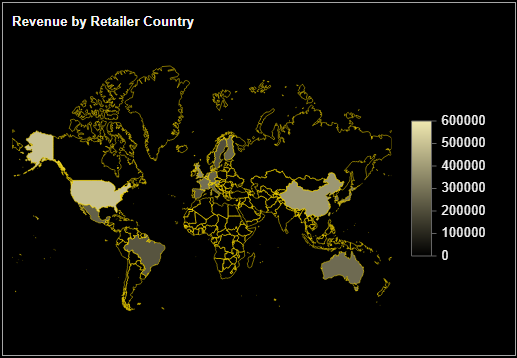
regions (color scale map),
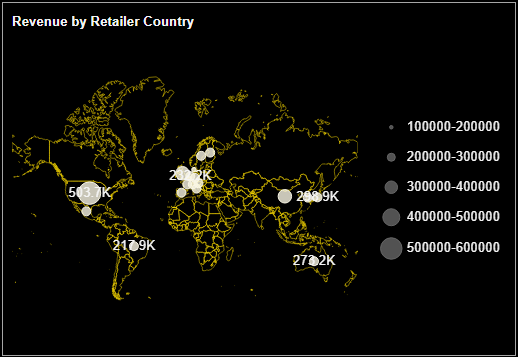
data points (scatter map), or
both regions and data points (combined map).
Color Scale Map
It fills colors for the different regions or locations in a map depending on the data values they represent. For example, the below map uses specific shades to highlight the countries based on their total sales.
Scatter Map
It uses bubbles of varying sizes over the different geographical regions in a map. The size of the bubble depends on the data values each region represents.
Combined Map
It is a combination of both the color scale and scatter maps where you can use colors and bubbles to highlight the differences between the different geographical areas depending on the data values they represent.
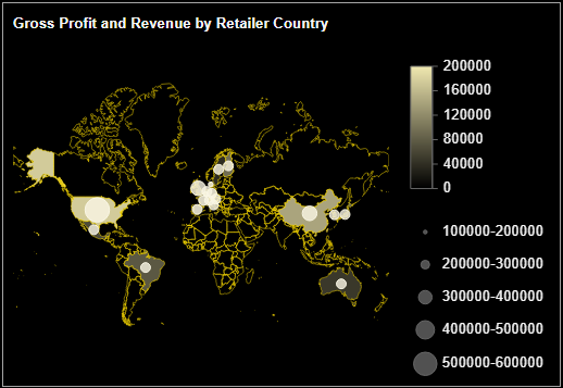
Let us create a map scenario that uses colors to highlight the different geographical regions in the map based on their gross profit margin and bubbles to represent their sales revenue in those regions.
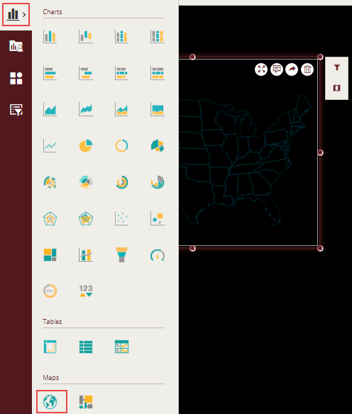
Design a Map Scenario in Wyn Enterprise
From the Dashboard Toolbox, open the Data Visualization node and drag-drop the Map scenario onto the design area. Observe that the scenario uses a built-in map for 'United States'.
Change the default map with the 'World' map since the data attribute contains the regions all over the globe. To do this, use the Select Map option on the Action Bar or the Map property in the Inspector tab.
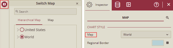
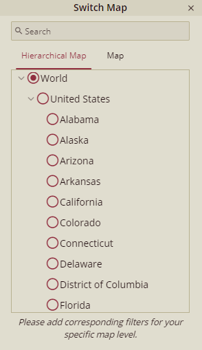
Hierarchical Map tab includes, all the custom hierarchical maps created by the users and built-in 'World->USA->State' hierarchy. To create a custom hierarchical map, refer Create Hierarchical Map section. The custom hierarchical maps can also drill down, and drill up as shown below in the figure.
Map tab includes all the GeoJson maps. You can use your own maps as the geographical background for the map scenario; you just need to upload the map to Wyn Enterprise using the Resource Portal. For more information, see Upload Resources.
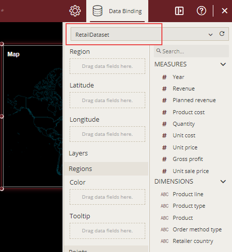
Bind Dataset to Map Scenario
With the scenario selected, from the Data Binding tab, select the dataset. Once the dataset is successfully loaded in the designer, the data binding panel automatically expands and displays the data attributes available in the dataset.
The following image shows the map scenario bound to the 'RetailDataset' dataset.
Drag and drop the location-related data attributes in the data binding area of the scenario as shown in the below image. The map is drawn according to the bound attributes with a default title on the design area.
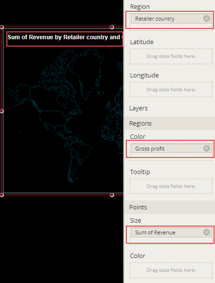
Note that the designer may show errors if no aggregation method is applied on the bound attributes in 'Regions' > 'Color' area.
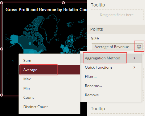
Format Data Attributes
You can format the data attributes in a dataset by performing a variety of operations on them such as such as renaming, modifying data format and display unit, creating a hierarchy field, applying an aggregation method, etc. Using these operations, you can control the display of data attributes in the scenario.
For more information about these operations, refer to Data Attributes.
In the following map scenario, average aggregation is applied to the 'Revenue' attribute to show the average sales revenue.
Analyze Data
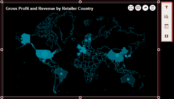
Wyn Dashboards scenarios support rich data analysis and exploration capabilities that can help analyze massive amounts of information and make data-driven decisions. For example, adding filters to scenarios, applying conditional formatting, switching map, etc. You can apply all these operations using the Action Bar corresponding to each scenario in the designer.
For more information, see Data Analysis and Interactivity in Dashboards.
The following image shows the filtered data in the map scenario to show sales revenue for retailers in all countries except - Canada and Singapore.
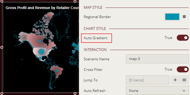
Customize Appearance
You can customize the default map appearance by setting properties in the Inspector tab of the scenario such as adding a border, modifying legends, changing map title, applying auto gradient, etc.
Apply Auto Gradient
Apply automatic gradient on the map scenario using the Auto Gradient property to create an interactive and engaging dashboard. The gradient colors displayed on the map depend on the color palette you have chosen in the Palette property.
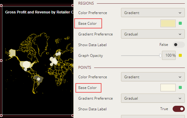
Change Base Color
To customize the regional border and base color for the regions and data points in the map scenario, use the Regional Border and Base Color properties in the Inspector tab and set them to a suitable color from the color picker.