- Getting Started
- Administration Guide
-
User Guide
- An Introduction to Wyn Enterprise
- Document Portal for End Users
- Data Governance and Modeling
- Working with Resources
- Working with Reports
-
Working with Dashboards
- Dashboard Designer
- Selecting a Dataset
- Data Attributes
- Dashboard Scenarios
- Dashboard Templates
- Component Templates
- 3D Scene
- Explorer
- Visualization Wizard
- Data Analysis and Interactivity
- Dashboard Appearance
- Preview Dashboard
- Export Dashboard
- Dashboard Lite Viewer
- Using Dashboard Designer
- Animating Dashboard Components
- Document Binder
- Dashboard Insights
- View and Manage Documents
- Understanding Wyn Analytical Expressions
- Section 508 Compliance
- Subscribe to RSS Feed for Wyn Builds Site
- Developer Guide
Composite Slicer
Composite Slicers helps you to apply complex data filters while previewing the dashboard to meet your data analysis requirements. Unlike other filters, composite slicers allow you to add the filter conditions while using the dashboard and it is not necessary to bind the filter conditions in advance while designing the dashboard.
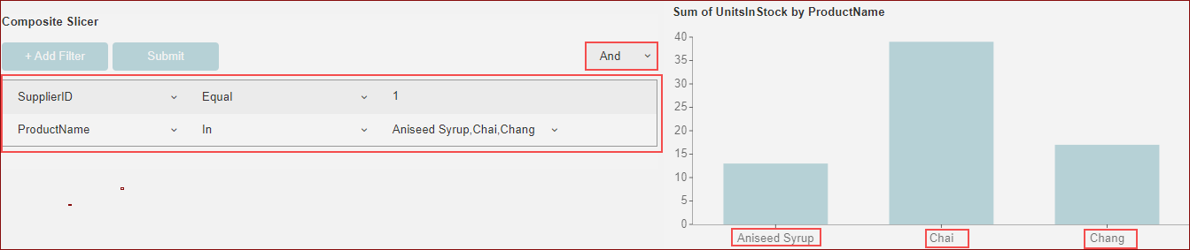
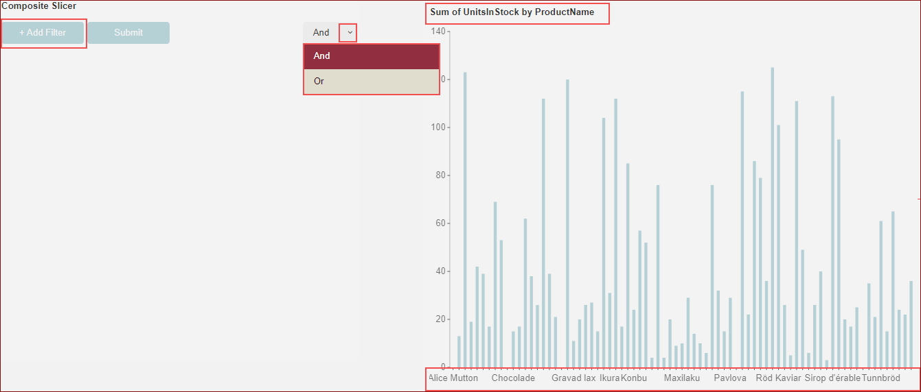
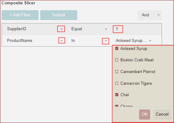
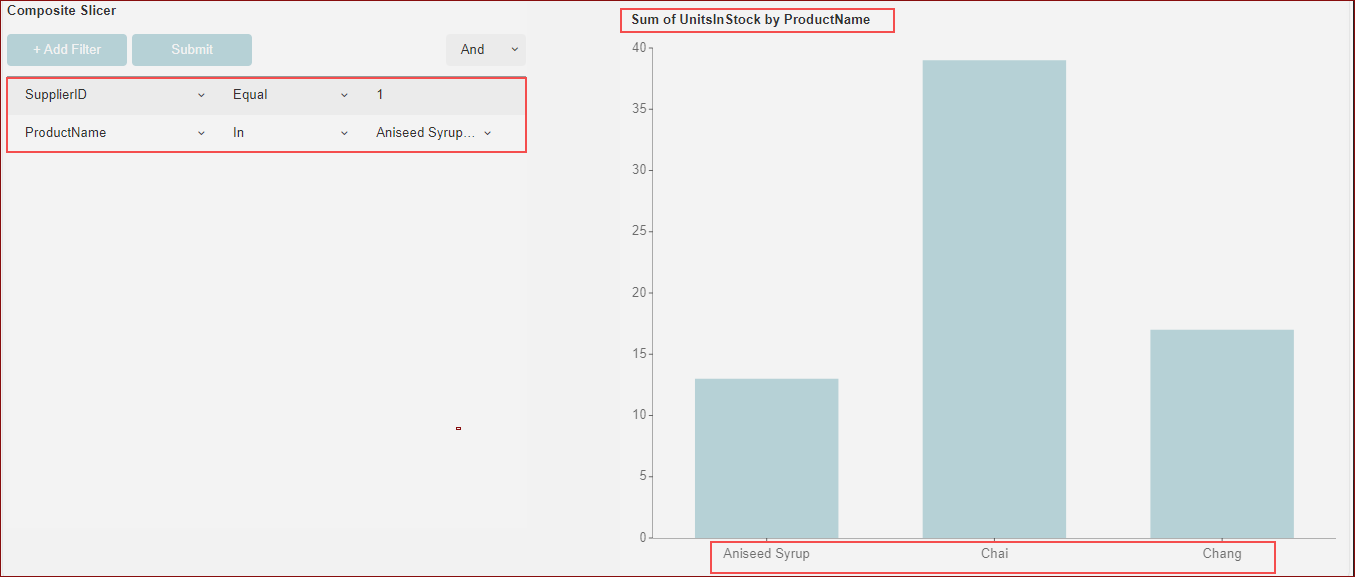
Example: In this example, a series of filter criteria were added through a combination of filters when previewing the dashboard. The dashboard below shows the sum of units in stock by product name with the following filter conditions applied while previewing the dashboard:
ProductName In Aniseed Syrup, Chai, Chang
AND
SupplierID = 1
There is a And relationship between these filter conditions, and all the data that meet the above conditions will be filtered out as shown below in the image.
Steps to add a Composite Slicer
You can add the composite slicer in the designer, but they are only available when previewing.
Follow the steps given below to add a composite slicer.
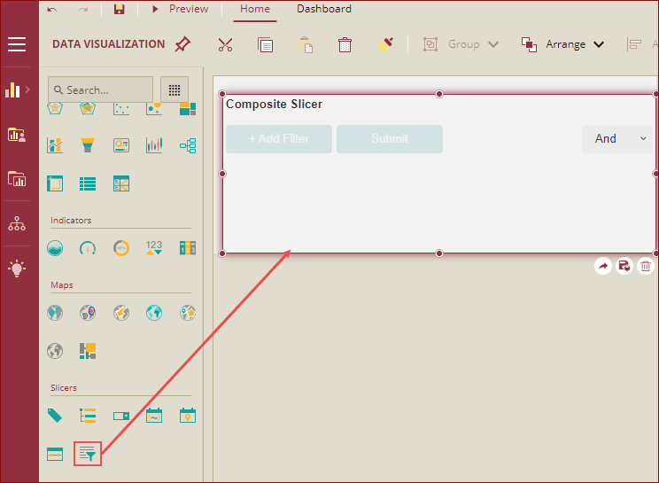
From the Slicers node, drag-drop the Composite Slicer on the design area.
On the Data Binding area, bind data to support datasets or models.
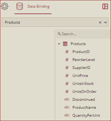
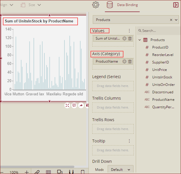
Drag a Column Chart and on the data binding area, choose an appropriate dataset and then select an attribute for the Values and Axis (Category) fields. For example, in the following image, we have selected the UnitsInStock for the Values field and ProductName for Axis(Category) field.
Preview the dashboard. The column chart will display the Sum of UnitsIn Stock for all the products. On the composite slicer, you will see the options to add the filter conditions.
To add the filters, click the +Add Filter button
 and click the Choose Field drop-down button to display the fields in the dataset or model.
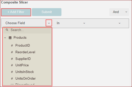
Select the condition and add the value. In this example we have applied following filter conditions:
ProductName In: Aniseed Syrup, Chai, Chang
SupplierID = 1
Based on the field type, the available conditions vary as described below in the table.
Field Type | Options Available |
|---|---|
String | Contains, Does Not Contain, Start With, Does Not Start With, End With, Does Not End With, Equal, Not Equal,In, Not In |
Numeric Value | Less Than, Less Than or Equal To, Greater Than, Greater Than or Equal To, Equal, Not Equal, In, Not In |
Date/DateTime | Earlier Than, Earlier Than or Equal, Later Than, Later Than or Equal, In, Not In |
There is an And relationship between these filter conditions, and all data that only meet the above conditions will be filtered out.
Once the settings are complete, click the Submit button for the filter to take effect.
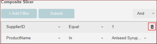
You can modify filter conditions, delete the filter entries, or adjust the item relationships. Hover over the filter to display the Delete button and click to delete the filter.
Customize Appearance
You can customize the appearance of the Composite Slicer scenario using the Inspector Panel properties on the right side of the dashboard designer window, listed and described in the following tables.
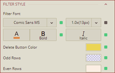
FILTER STYLE
Option | Description |
|---|---|
Filter Font | Set the family, size, color, thickness, and style of the fonts of the filter conditions on the composite slicer using this property. |
Delete Button Color | Set the color of the Delete button of the composite slicer filter. |
Odd Rows | Set the color of the odd rows in the composite slicer filter conditions. |
Even Rows | Set the color of the even rows in the composite slicer filter conditions. |
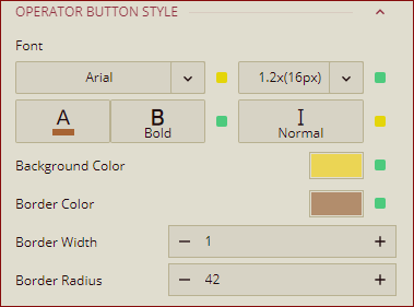
OPERATOR BUTTON STYLE
Option | Description |
|---|---|
Font | Set the family, size, color, thickness, and style of the fonts of the operator button (Add Filter, Submit) of the composite slicer using this property. |
Background Color | To set the background color of the operator buttons (Add Filter, Submit) of the composite slicer, select a color from the color palette. |
Border Color | To set the border color of the operator buttons (Add Filter, Submit) of the composite slicer, select a color from the color palette. |
Border Width | Set the width of the border of the operator buttons (Add Filter, Submit) of the composite slicer, using this property. |
Border Radius | Set a border radius of the operator buttons (Add Filter, Submit) of the composite slicer, using this property. |
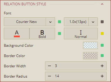
RELATION BUTTON STYLE
Option | Description |
|---|---|
Font | Set the family, size, color, thickness, and style of the fonts of the relation button (Add Filter, Submit) of the composite slicer using this property. |
Background Color | To set the background color of the relation button (And, Or) of the composite slicer, select a color from the color palette. |
Border Color | To set the border color of the relation button (And, Or) of the composite slicer, select a color from the color palette. |
Border Width | Set the width of the border of the relation button (And, Or) of the composite slicer, using this property. |
Border Radius | Set a border radius of the relation button (And, Or) of the composite slicer, using this property. |
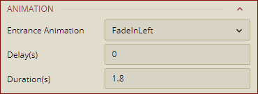
ANIMATION
Property | Description |
|---|---|
Entrance Animation | Select an option from the dropdown to set the animation style of the appearance of the composite slicer scenario. After selecting an option (SlideInDown, SlideInLeft, SlideInRight, SlideInUp, BackInDown, BackInLeft, BackInRight, BackInUp,FadeIn, FadeInDown, FadeInLeft, FadeInRight, FadeInUp,BounceIn, BounceInUp, BounceInDown, BounceInLeft, BounceInRight,LightSpeedInLeft, LightSpeedInRight, RotateIn, RotateInDownLeft, RotateInDownRight, RotateInUpLeft, RotateInUpRight, ZoomIn,ZoomInDown, ZoomInLeft, ZoomInRight, or ZoomInUp ) from the dropdown, set the delay and duration of the animation using the Delay(s) and Duration(s) properties respectively. |
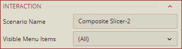
Interaction
Property | Description |
|---|---|
Scenario Name | Add a name to the composite slicer scenario using this property. |
Visible Menu Items | Select the filtering and sorting options you wish to display on the composite slicer scenario from the dropdown. |
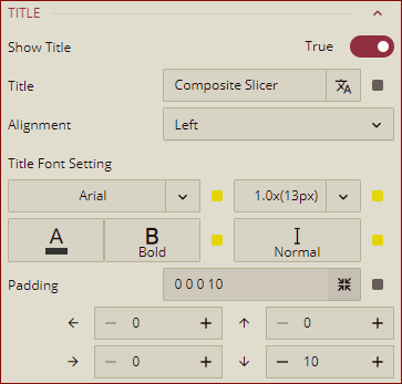
TITLE
Property | Description |
|---|---|
Show Title | To hide the title of the composite slicer scenario set this property to False. By default, this property is set as True. |
Title | Add or edit the title of the composite slicer scenario using this property. |
Alignment | Select the Left, Center, or Right alignment of the title. |
Title Font Setting | Set the font family, size, color, weight, and style of the title using the Title Font Setting options. |
Padding | To create space around the title of the composite slicer scenario use the Padding property. It supports Padding Left, Padding Top, Padding Right, and Padding Bottom. Their values can be different. |
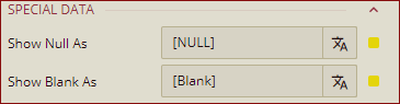
SPECIAL DATA
Property | Description |
|---|---|
Show Null As | Set the content to display in place of null data in the composite slicer scenario using this property. |
Show Blank As | Set the content to display in place of blank data in the composite slicer scenario using this property. |
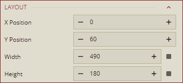
Layout
Property | Description |
|---|---|
X Position | Set the horizontal position of the composite slicer scenario using this property. |
Y Position | Set the vertical position of the composite slicer scenario using this property. |
Width | Set the width of the composite slicer scenario using this property. You can set the minimum width up to 8. |
Height | Set the height of the composite slicer scenario using this property. You can set the minimum height up to 8. |
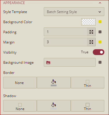
Appearance
Property | Description |
|---|---|
Style Template | Select a template from the dropdown to apply a style to the composite slicer scenario. |
Background Color | Set a background color of the composite slicer scenario using this property. |
Padding | To create space around the composite slicer scenario, set a padding value. |
Margin | Set the margin value for the composite slicer scenario using this property. |
Visibility | To hide the composite slicer from the dashboard scenario, set this property to False. By default, the Visibility property is set as True. |
Background Image | Add an embedded, shared, or external image as a background image to the composite slicer scenario. |
Border | Set the border type, border color, and thickness using this property. |
Shadow | Create a shadow of the composite slicer scenario by setting the Shadow Type, Shadow Color, and thickness. |