- Getting Started
- Administration Guide
-
User Guide
- An Introduction to Wyn Enterprise
- Document Portal for End Users
- Data Governance and Modeling
- Working with Resources
- Working with Reports
-
Working with Dashboards
- Dashboard Designer
- Selecting a Dataset
- Data Attributes
- Dashboard Scenarios
- Dashboard Templates
- Component Templates
- 3D Scene
- Explorer
- Visualization Wizard
- Data Analysis and Interactivity
- Dashboard Appearance
- Preview Dashboard
- Export Dashboard
- Dashboard Lite Viewer
- Using Dashboard Designer
- Animating Dashboard Components
- Document Binder
- Dashboard Insights
- View and Manage Documents
- Understanding Wyn Analytical Expressions
- Section 508 Compliance
- Subscribe to RSS Feed for Wyn Builds Site
- Developer Guide
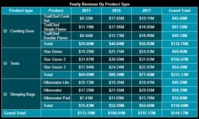
Pivot Table
Pivot Table is a powerful tool for analyzing a large amount of data. Pivot Table extensively summarizes the data and extracts significance from a detailed dataset. Pivot Table also allows you to group the data in different ways to help conclude easily. It shows the grand total at the end of each row and column. You can swap rows and columns in a pivot table to view data from different perspectives.
This video tutorial uses a pivot table to create an employee demographic dashboard. We will also cover the basic features of a pivot table, such as expanding or collapsing data, swapping columns and rows, and sorting the data.
Note: With the release of Wyn version v7.0, significant enhancements have been made to optimize the data loading performance of Pivot Tables. This update ensures efficient handling of large volumes of data, resulting in improved loading times.
Design a Pivot Table in Wyn Enterprise
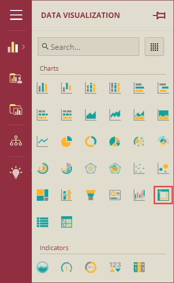
From the Dashboard Toolbox, open the Data Visualization node and drag-drop the Pivot Table scenario onto the design area.
Bind Dataset to Table Scenario
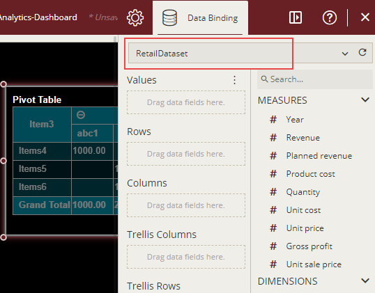
With the selected scenario, select the dataset from the Data Binding tab. Once the dataset is successfully loaded in the designer, the data binding panel automatically expands and displays the data attributes available for binding in the dataset.
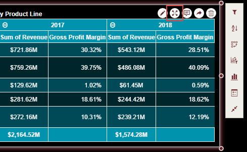
The following image shows the pivot table scenario bound to the RetailDataset dataset.
On dragging and dropping the data attributes to the data binding area of the scenario, the table is drawn accordingly, with a default table title on the design area.
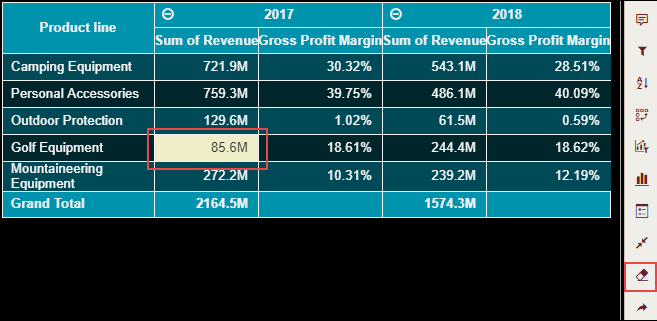
You can change the values plotted in the pivot table by entering the Focus mode. Use the Focus button on top of the scenario and edit the cell values. Note that you cannot modify the values for the table headers.
By default, the modified values in the table are highlighted with a different color as shown in the following image. To customize this default behavior, set the Highlight Custom Data property to 'False'. Also, if you want to remove the modified content from the table, use the Clear Custom Data on the Action Bar. Note that this button is available only in the Focus mode.
Format Data Attributes
You can format the data attributes in a dataset by performing a variety of operations such as renaming, modifying data format and display unit, creating a hierarchy field, applying an aggregation method, etc. Using these operations, you can control the display of data attributes in a scenario.
For more information about these operations, see Data Attributes.
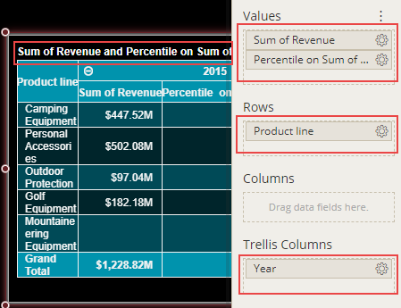
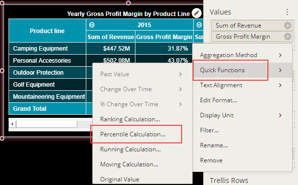
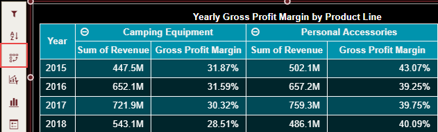
In the following pivot table scenario, the percentile quick function is applied to the gross profit attribute to show the gross profit margin.
Analyze Data
Wyn Dashboard scenarios support rich data analysis and exploration capabilities that can help analyze massive amounts of information and make data-driven decisions. For example, adding filters to scenarios, sorting data, applying conditional formatting, etc. Note that you can apply all these operations using the Action Bar corresponding to each scenario in the designer.
For more information, see Data Analysis and Interactivity in Dashboards.
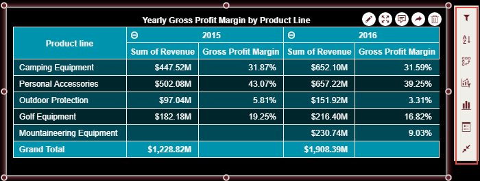
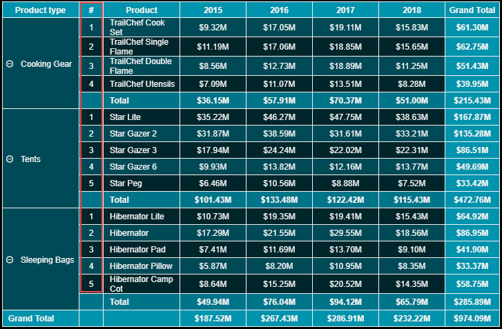
The following image shows filtered data in the pivot table scenario for the years - 2015 and 2016.
Customize Appearance
You can customize the default table appearance by setting properties in the Inspector tab of the scenario such as adding a border, hiding totals or subtotals, adjusting text alignment, renaming the table title, changing the background color, swapping rows and columns, enabling automatic scrolling, etc.
General Settings
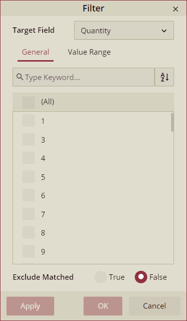
Show Quick Filter
Use the Show Quick Filter property to enable the filter button on the row headers of the pivot table. Using the quick filter option you can filter out the data on a target field.
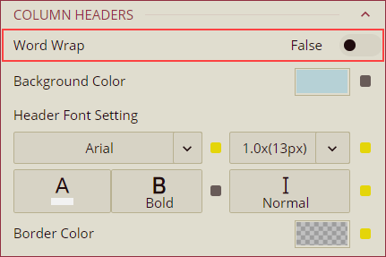
Word Wrap
To enable auto-fit of the column and row widths, set the Word Wrap property to True. By default, the value of the Word Wrap property is set to False.
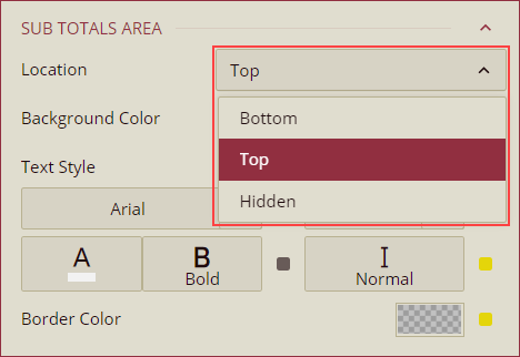
Sub Totals Position
You can manage the position of the sub-totals of the pivot table data using the Location property in the Sub Totals Area section. The available options are Top, Bottom, and Hidden. Use the Hidden option to hide the sub-totals in the pivot table.
Show/Hide Totals or SubTotals
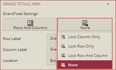
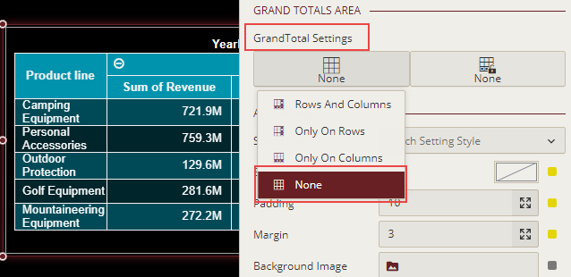
By default, Wyn Dashboards show grand totals and subtotals at the end of each row and column in pivot tables. When you show the Grand Total for rows and columns by selecting the Rows And Columns option from the GrandTotal Settings then you have the option to change the Row Label and Column Label as shown below.
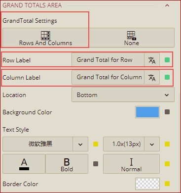
Note: The Row/Column Label option is displayed depending on the Grand Total visibility setting.
Grand Total Location: You can select the location for the Grand Total field to be displayed on the preview, from the dropdown list Location. It has two options: Top and Bottom. By default, it is set to Bottom.
Note: The Location option only works for the row Grand Total.
Lock Grand Total: You can lock the Grand Total Row or Column on the preview, using the Lock Grand Total options.
You can hide these totals or subtotals in the pivot table when they are not required in the table to get a clearer view of the data. Use the GrandTotal Settings property for Totals and set it to None; for SubTotals, use the Display Mode property and set it to Hidden.
Swap Rows and Columns
The Swap Rows and Columns button on the Action Bar lets you transform the rows in a pivot table into columns and columns into rows, respectively.
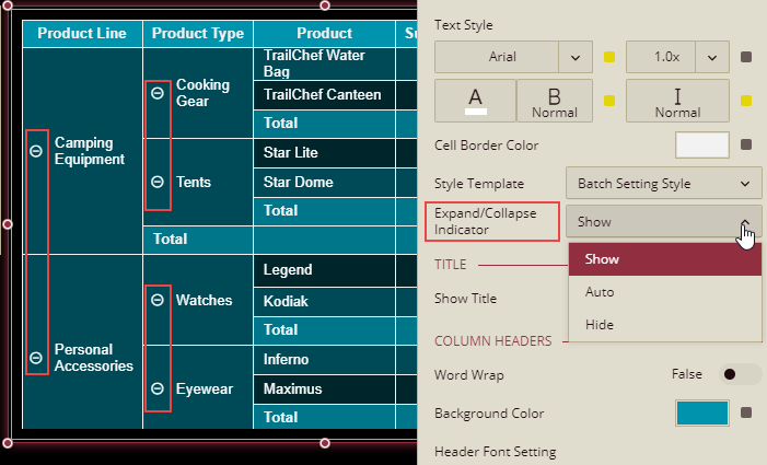
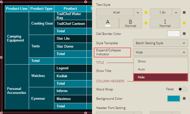
Hide Expand and Collapse Buttons
In a multidimensional pivot table, the expand (+) and collapse (-) buttons help toggle the visibility of several levels or groups of data. These buttons appear in each row and column group header cells, excluding the innermost groups. You can control the visibility of the expand and collapse buttons using the Expand/Collapse Indicator property and manage the cascading options using the Cascade Expand/Collapse property,
Expand/Collapse Indicator: This property provides you with three ways in which you can control the visibility of the toggle (+/-) buttons,
Show- Always display the expand and collapse buttons in the row/column group header cells. This is the default value for this property.
Auto- Displays the expand and collapse buttons when you hover the cursor on a row/column group header cell in a pivot table.
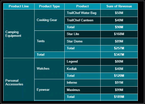
Hide- Hides the expand and collapse buttons in the row/column group header cells in a pivot table.
Cascade Expand/Collapse: This property is used to expand or collapse all categories of the Pivot Table with a single click and, provides three ways to manage the visibility of the toggle (+/-) buttons in the corner column header,
Hide - With the Hide option selected, the expand and collapse buttons on the corner header are not visible. Hide is the default value of the Cascade Expand/Collapse property.
Auto - With the Auto option, the expand and collapse buttons on the corner header appear when you hover the cursor on the corner column header.
Show - With the Show option, the expand and collapse buttons are always visible in the corner column header.
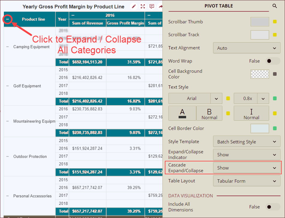
Note: One-click expand/collapse icon is not visible in the last category or the last level of the table. When the Show Row Number property is set to True, multiple categories are bound together in a row header and are not visible on the row number column header.
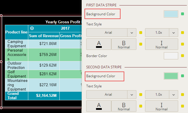
Modify Data Stripes
Wyn Enterprise uses default colors for the alternate data stripes in a table scenario. To change the default color, use the Background Color properties for the first and second data stripes and set them to a suitable color from the color palette. Also, you can disable the alternate row style in the table by setting the Use Alternate Row Style to False.
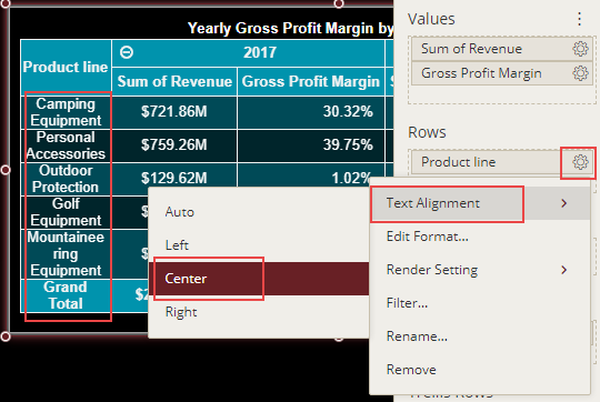
Adjust Text Alignment
In Wyn Enterprise, you can easily manage the text alignment within the pivot tables by using the Text Alignment property in the Data Binding area.
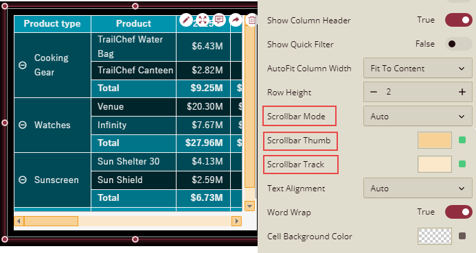
Customize Scrollbars
The default colors of the thumb and the track in a scrollbar are inherited in the following order - Document Theme > Dashboard Level Settings > Component Level Setting. You can change the default colors of the scrollbar for the pivot table scenario using the Scrollbar Thumb and Scrollbar Track properties available in the dashboard designer. The Scrollbar Thumb property specifies the color for the scrollbar thumb (i.e. the moveable part of the scrollbar along with the upward and downward scroll buttons) and the Scrollbar Track property specifies the color for the scrollbar track (i.e. the fixed part of the scrollbar). Furthermore, you can control the visibility of the scrollbars in the table scenario by setting the Scrollbar Mode property to Auto, Hidden, Visible, or Hover to Display.
Advanced Settings
Advanced Settings
Enabling Automatic Scrolling
When your pivot table contains thousands of rows or even more, it becomes difficult to scroll through the data. In such cases, you can enable automatic scrolling using the Auto Scroll property and set the scrolling speed to either Slow or Fast. By default, the scrolling speed is set to Normal.
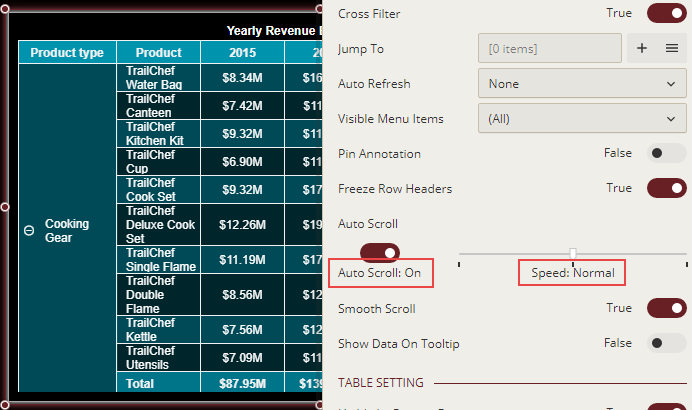
The data within the pivot table automatically starts scrolling when you preview the dashboard as shown in the following image.
Show Row Number
In pivot tables, you can use the Show Row Number property to display row numbers for each row in the table. This way, the rows in a pivot are automatically numbered, hence saving the time and effort of the users.
To enable automatic row numbering in a table, set the Show Row Number property to True and then define the following settings -
Number Rows For - Specify whether you want to insert the row numbers for the top row group, details row, or all. By default, this property is set to Top Row Group.
Row Number Scope - Specify the scope of the row number count in a table. By default, this property is set to Global.
Row Number Position - Control the position of row numbers relative to the row headers in the table, whether you want to display the row numbers before or after the row headers.
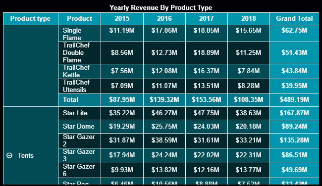
In the following pivot table, we have enabled automatic row numbering for the details row with its scope set to Row Group.
You can also apply conditional formatting to the row number column to highlight specific values in the pivot table. For example, you can use the Top/Bottom Rules style to emphasize the top three values in the table row column. Note that the data in the table is sorted by revenue in decreasing order.
