- Getting Started
- Administration Guide
- User Guide
- Developer Guide
Create Dashboard
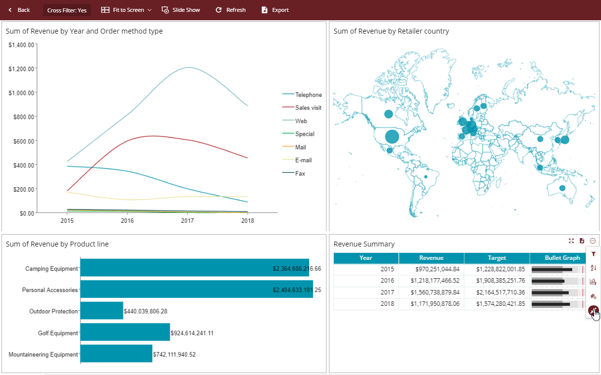
With Wyn Enterprise building high-value, interactive, and drillable dashboards is quite easy. Wyn Dashboards display information through a series of interactive tiles that contain scenarios to highlight the metrics and trends from the underlying data. The tool-tips display information for plots hovering over the charts. Also, our dashboard is highly interactive. You can drill down by simply clicking on the individual plots, or filter the dashboard data with a single click.
Let us create a dashboard in Wyn Enterprise.
On the Document Portal, go to Create (+) > Create Dashboard.
Add Line Chart Scenario
From the Data Visualization tab on the left of the dashboard designer, drag and drop a Line Chart on the design area.
From the Data Binding tab on the right, select Retail Dataset, which is already available to us. We will use this chart to analyze the revenue generated vs year.
Drag and drop the data fields as follows and see how the chart title is automatically generated.
Data Binding Property | Field |
|---|---|
Values | Revenue |
Axis (Category) | Year |
Legend (Series) | Order method type |
You can add aggregations or other functions to the field in Values, in addition to renaming or adding filters.
Perform the following customizations from the Inspector tab.
Property | Value |
|---|---|
Line Style | Spline |
Value Axis > Show Axis | True |
Format | Currency |
Display unit setting | Millions |
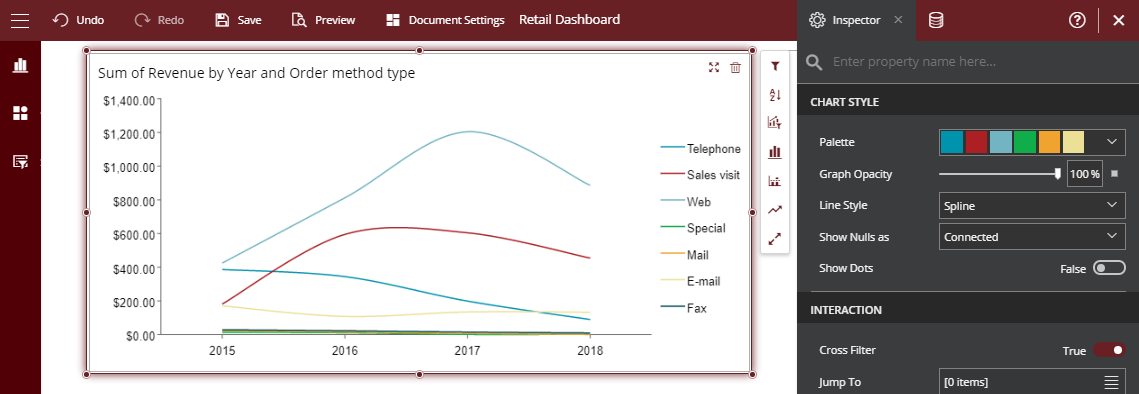
Furthermore, you can also add a sort condition on the data displayed in the chart. From the chart adorner, select Sort and set Sort Target Field, and specify other details.
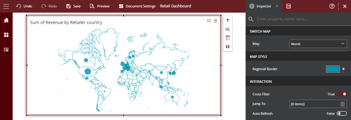
Add Map Scenario
Drag and drop a Map Scenario, snap and align with the line chart. We will use the map to plot revenue generated for each country.
Select the map and from the adorner, click Select Map adorner and select World. Depending on the data, you can also switch the map to other built-in or custom maps from the Inspector tab.
Now, add a Stacked Bar Chart to the dashboard to plot revenue versus product line. Drag Revenue field to Values and Product line field to Axis (Category).
Set Show Data Label to True.
You can also add sort conditions from the chart adorner.
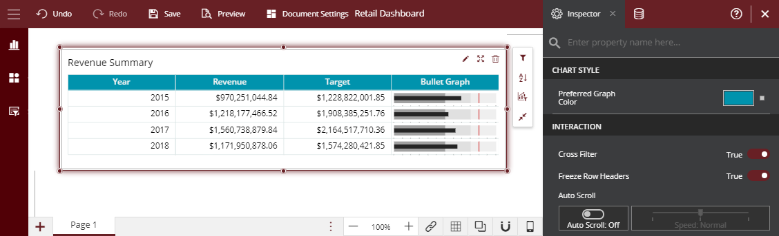
Add KPI Matrix
Now, to display the revenue summary for each year, let use KPI Matrix. Drag and drop the KPI matrix from the Data Visualization tab.
From the Data Binding tab, plot the matrix as follows:
In Rows field, drag-drop Year.
In the Number column, drag-drop the Planned Revenue field to Value. Rename the column to Revenue.
Add another column as a Number and drag-drop the Sum of Revenue field to Value. Rename the column to Target.
Add the third column as Bullet Graph, drag-drop Planned revenue as Actual Value, and Revenue as Target Value.
Customize the dashboard
You can customize the title of each scenario from the Inspector Tab - set Auto Title to False and edit the default title.
Finally, let us set the theme of the dashboard. Go to Document Settings and select a theme.
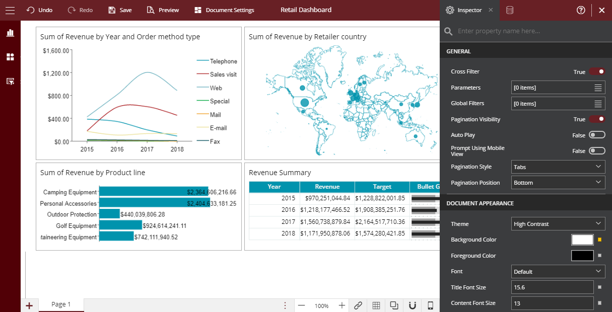
Preview the dashboard.
For more information on dashboard scenarios and overall working, see Working with Dashboards.