- Getting Started
- Administration Guide
- User Guide
- Developer Guide
Create Custom Parameters View
The Parameters View can be designed in Report Designer using the exclusive set of controls to create and define parameters and prompts quickly. The controls include input controls like text editor, number editor, heading, and plain text; range editors like date range and date-time range; and list and dropdown editors.
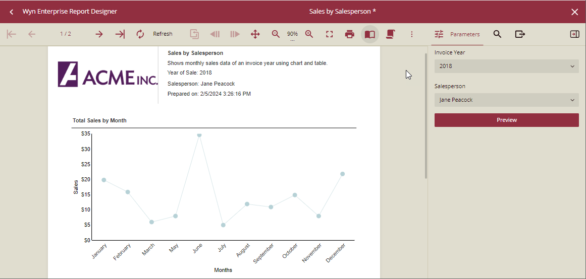
On previewing the report, the customized parameters view is shown in the Parameter Panel of the viewer.
Design a Parameters View
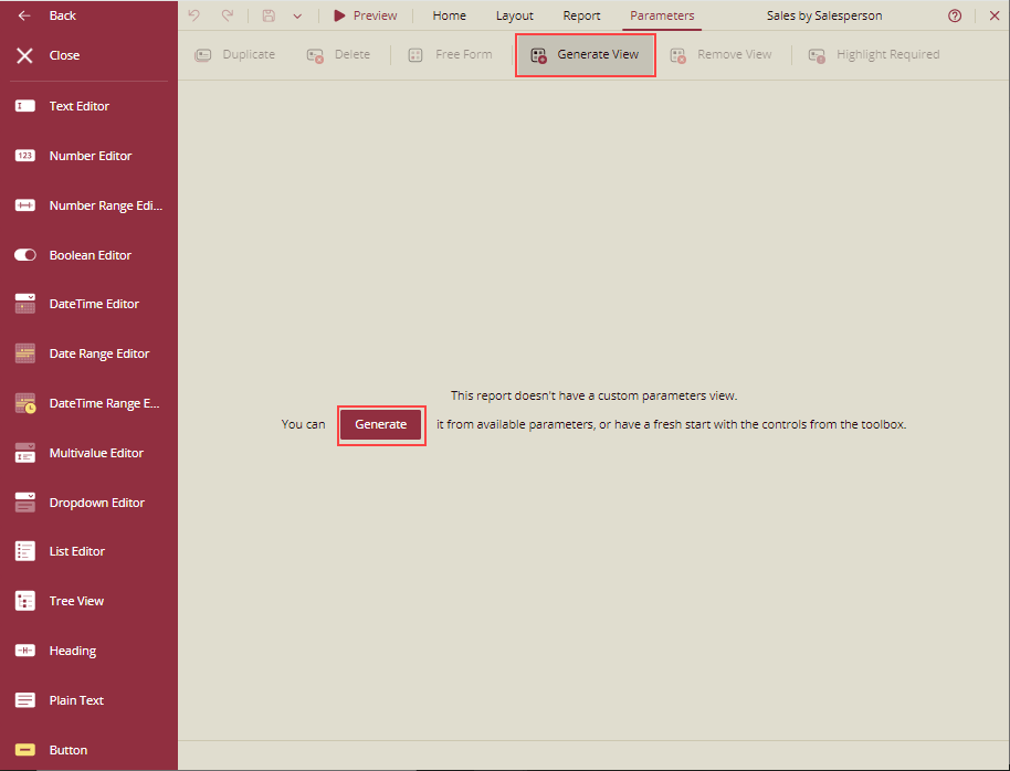
Go to the Parameters tab at the top.
Create the custom parameters view for the report by clicking the Generate View button in the toolbar or clicking the Generate button in the center of the designer.
If the report already has pre-defined report parameters, a default parameters layout is generated in the design area from these parameters. You can then build the parameters view from the default view or simply create a fresh parameter view using the controls available in the parameters designer.
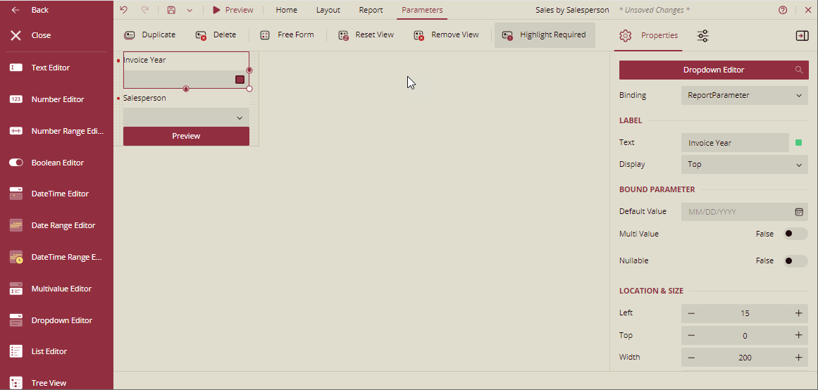
Drag-drop the controls from the toolbox that will be used to input parameters.
Set the properties of each of the controls, such as Binding, Text, Display, etc., depending on the function of each control.
Add buttons to preview the report based on selected parameters, reset the parameter selection to default, and clear the selection.
Use the Free Form/Stack switch to see how parameters will look in the preview window.
When the Free Form layout type is on, the view matches the current parameter view on the viewer's sidebar. The order of parameters can be changed by dragging the controls. You can also change the location and size of the controls.
When the Stack layout is on, the view arranges the controls vertically. The order of parameters can be changed by dragging the controls.
Use Reset View to reset to the default layout of the parameter view.
You can also choose the Highlight Required option to highlight the errors while designing the parameter view.
Preview the Report with the Custom Parameters View
The controls provide an intuitive user experience with customization possibilities. Following is the list of controls available for designing a parameters view.
Text Editor: For single-line parameters of the String type.
Number Editor: For parameters of integer or float type. Set the control's type as Up-down Editor for increasing or decreasing at specified steps, or as Slider to be able to slide the value of the parameter.
Number Range Editor: For a parameter range of integer or float type. You need to specify the range in the From and To fields in Binding.
Boolean Editor: For parameters with the Boolean value. The Boolean editor can be a Toggle, Checkbox, or a Radio button. As you change the type of the Boolean editor, the options accordingly can be filled in.
DateTime Editor: For parameters with date and date-time values.
Date Range Editor: For parameters with a date field. Specify the start date and end date in the From and To fields in Binding.
You can also add custom ranges manually using the Ranges property (Add > Edit) or select ranges from the pre-defined options in a dropdown menu (Current, Last, Next, ToDate, and LastToDate) for intervals (specified via the Unit property: Year, Quarter, Month, Week, etc.) Using the View Mode property, you can set the calendar's initial view to Default, Days, Months, or Years.
DateTime Range Editor: For parameters with a range of dates with an explicit starting and ending time.
You can also add custom ranges manually using the Ranges property (Add > Edit) or select ranges from the pre-defined options in a dropdown menu (Current, Last, Next, ToDate, and LastToDate) for intervals (specified via the Unit property: Year, Quarter, Month, Week, etc.)
Multivalue Editor: For multi-value parameters whose values are required to be entered manually. It appears with a list of multiple values in the drop-down with the search box.
Dropdown Editor: A list of fields in the parameter appears in the drop-down with a search box. Single or multiple values can be selected depending on whether the Multi Value property is enabled or not.
List Editor: Fields bound to parameters appear as a list, with checkboxes to select the field.
Tree View: For hierarchical parameters. Select the Tree View type as List or Dropdown.
Heading: For static text, e.g., entering a heading with a choice of colors for error or warning.
Plain Text: For static text, eg., entering single or multiline text.
Button: To perform actions on the preview screen, select Preview to preview a report based on the selected parameters, Reset to reset the parameter selection to default, and Clear to clear the selection, on the preview window.
Note: You can set the width and height of the control as per your choice. For control Width, the default value is 200 and the minimum value is 30. For control Height, the default and minimum value is 30.
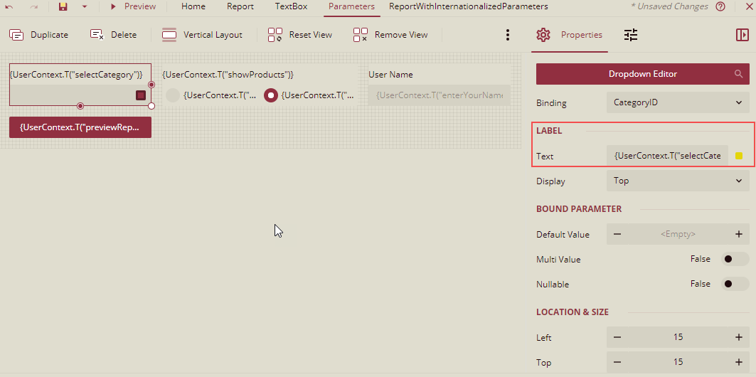
Internationalize Labels of Custom Parameter Controls
You can internationalize the custom parameter view by displaying the content according to the user's location or language. It lets you create multilingual labels for custom parameter controls. It will display the labels in different languages, like English, Polish, Chinese simplified, etc., using a language resource file and the UserContext.T() function. A language resource is a text file that defines key-value pairs for the text in a document. It is later added to the document to display the content based on the user's preferred language. For more details, refer Add Language Resource.
How to reference the language resource for internationalizing labels of custom parameter controls
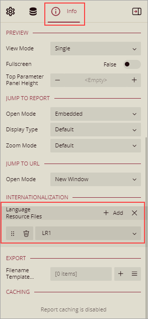
Use the Language Resource Files property in the Info panel to specify which resource documents you want to reference. In a report, you can add multiple language resources, and their order of placement denotes their priority. For example, if the first and last resource documents contain the same translation key, the key value from the last file will be used.
After referencing the resource document, use the UserContext.T() function under Miscellaneous Functions. This function can be applied to any report control property that accepts expressions such as Textbox Value, Checkbox Text, Chart Header Caption, Chart Axis Title, and so on. The UserContext.T() function displays the value for the specified translation key enclosed in double quotes.
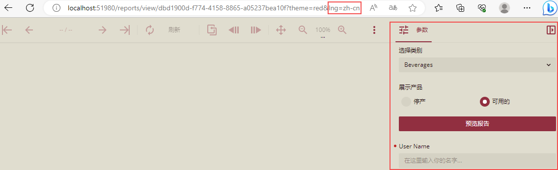
Let's consider a scenario where we want to change labels to a Chinese simplified language.
Add the language resource to the report, and then use the UserContext.T() function in the labels for the custom parameter controls.
Preview the report.
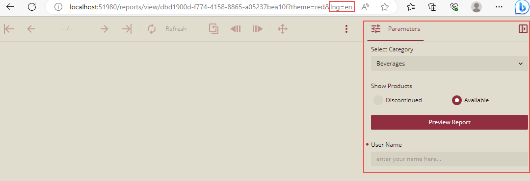
In the URL, change the language key to Chinese simplified language zh-cn as mentioned in the language resource. The labels will change to a Chinese simplified language as shown below.
Note: The language resource generates the required result only if the current user's language and translation language is the same.
For instructions on how to change the user's language, see Set Language Preference.
For instructions on how to change the language using lng parameter in the URL, see Using Integration URLs.