- Getting Started
- Administration Guide
-
User Guide
- An Introduction to Wyn Enterprise
- Document Portal for End Users
- Data Governance and Modeling
- Working with Resources
- Working with Reports
-
Working with Dashboards
- Dashboard Designer
- Selecting a Dataset
- Data Attributes
- Dashboard Scenarios
- Dashboard Templates
- Component Templates
- 3D Scene
- Explorer
- Visualization Wizard
- Data Analysis and Interactivity
- Dashboard Appearance
- Preview Dashboard
- Export Dashboard
- Dashboard Lite Viewer
- Using Dashboard Designer
- Animating Dashboard Components
- Document Binder
- Dashboard Insights
- Add a New Page in Dashboard Designer
- View and Manage Documents
- Understanding Wyn Analytical Expressions
- Section 508 Compliance
- Subscribe to RSS Feed for Wyn Builds Site
- Developer Guide
Liquid Fill Gauge
The Liquid Fill Gauge chart is a gauge that can represent the data labels in percentage values and numbers. The data is displayed with the water level along with animations. It has many liquid shapes like Circle, Ellipse, Square, and Diamond. The liquid fills up to the relevant value with water wave animation.
Design a Liquid Fill Gauge Scenario
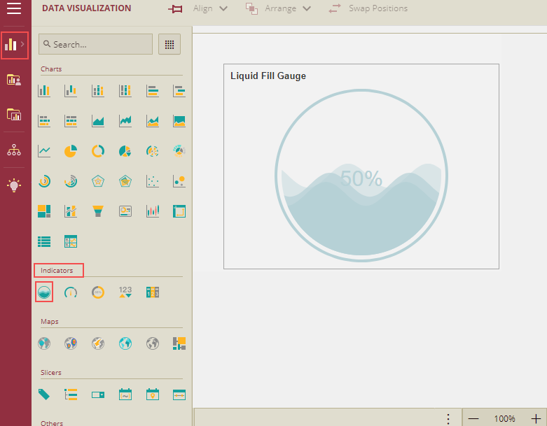
From the Dashboard Toolbox, open the Data Visualization node and drag-drop the Liquid Fill Gauge scenario under Indicators, onto the design area.
Bind Dataset to Liquid Fill Gauge Scenario
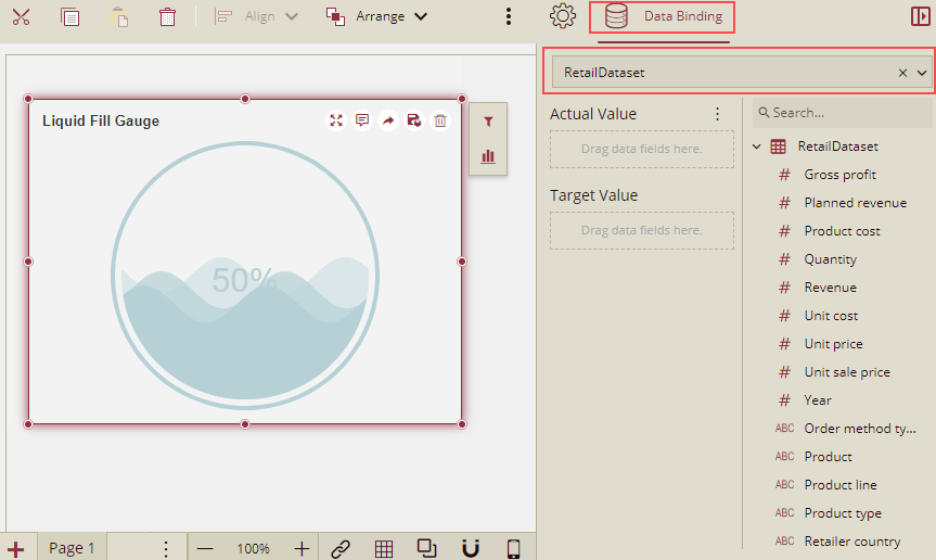
With the scenario selected, from the Data Binding tab, select the dataset. Once the dataset is successfully loaded in the designer, the data binding panel automatically expands and displays the data attributes available in the dataset.
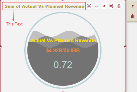
The following image shows the Liquid Fill Gauge scenario bound to the 'RetailDataset' dataset.
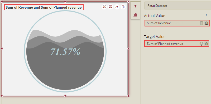
On dragging and dropping the data attributes to the data binding area of the scenario, the liquid fill gauge is plotted accordingly, with a default title on the design area.
Format Data Attributes
To format the data attributes and control the display of data, you can perform a variety of operations such as renaming, modifying data format and display unit, creating a hierarchy field, applying an aggregation method, etc.
For more information about these operations, see Data Attributes.
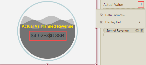
Click this icon next to the Actual Value, and you will get the following options Format Data and Display Unit. Using these options you can format the data and their display units for both the Actual Value and the Target Value.
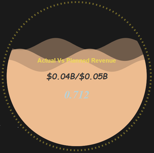
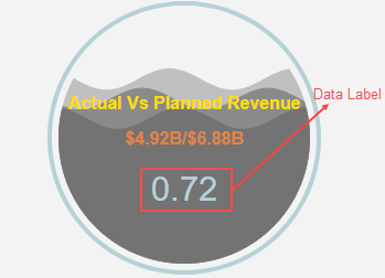
In the following image, the data format for the data attributes is modified to Currency to display the actual and planned revenue in 'currency'.
Analyze Data
Wyn Dashboards scenarios support rich data analysis and exploration capabilities that can help analyze massive amounts of information and make data-driven decisions. For example, adding filters to the scenarios, applying conditional formatting, etc. Note that you can apply all these operations using the Action Bar corresponding to each scenario in the designer.
For more information, see Data Analysis and Interactivity in Dashboards.
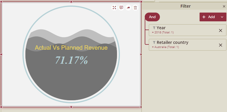
In the following image, data is filtered to show the sales revenue for the year - 2018 for Australia.
Customize Appearance
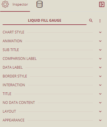
You can customize the appearance of the Liquid Fill Gauge scenario using the Inspector Panel properties on the right side of the dashboard designer window, as shown below in the figure.
You can click this icon to expand or collapse all the properties.
You can click on the particular property's arrow  to expand only that particular property.
Inspector Panel Properties are described in the following tables.
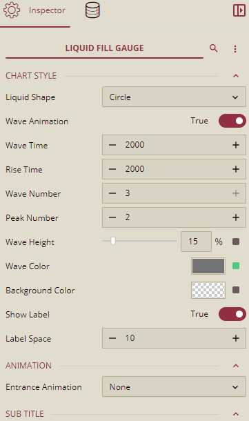
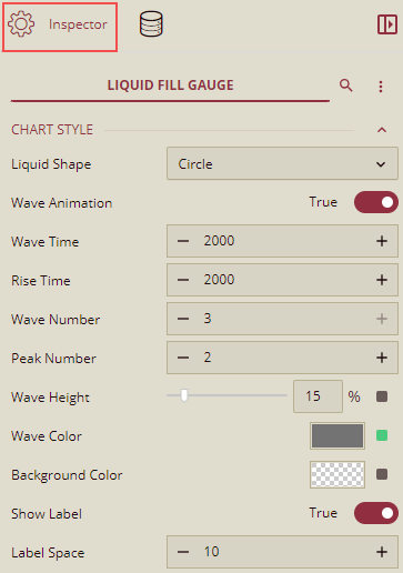
Chart Style
You can customize the following properties under the Chart Style.
Property | Description |
|---|---|
Liquid Shape | To set the liquid shape in the chart, you can select any of the following shapes: Circle, Ellipse, Square, and Diamond. The default shape is Circle. |
Wave Animation | Set this to True, to apply animation on the liquid wave. |
Wave Time | To set the duration of a wave animation. |
Rise Time | To set the wave rise time when updating the scenario. |
Wave Number | To set the wave number in the container (from 1 to 3). |
Peak Number | To set the peak number of each wave in the container (from 1 to 10). |
Wave Height | To set the proportion of wave height in the container. |
Wave Color | To set the color of the wave. |
Background Color | To set the background color of the liquid shape. |
Show Label | Set this option to True to display label text and label data value on the chart. |
Label Space | To set the label space between the label text and label value. This option is enabled, when Show Label is set to True. |
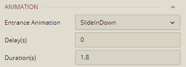
Animation
You can add the entrance animation to the Liquid Fill scenario under the Animation.
Property | Description |
|---|---|
Entrance Animation | You can set the entrance animation for the Liquid fill scenario from this dropdown list. By default, it is set to None. |
Delay(s) | This property is displayed when the entrance animation is set to other than None. By default, it is set to 0 seconds. You can set the Delay here. |
Duration(s) | This property is displayed when the entrance animation is set to other than None. By default, it is set to 1.8 seconds. You can set the loading Duration (in seconds) here. |
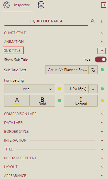
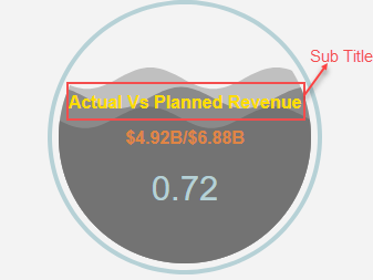
Sub Title
You can customize the following properties under the Sub Title.
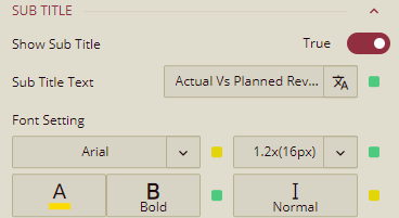
Note: Sub Title section is displayed only when the Show Label is set to True under Chart Style.
Property | Description |
|---|---|
Show Sub Title | Set this option to True to show the sub title in the liquid shape. |
Sub Title Text | Here, you can type the text for the Sub Title to be displayed, as per your requirement. |
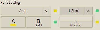
Font Setting | You can customize the font size, color, type, etc. for the Sub Title text using this property. |
You can set the font size by selecting from the dropdown list and also you can specify the units of the size as well like 'cm' as shown below.
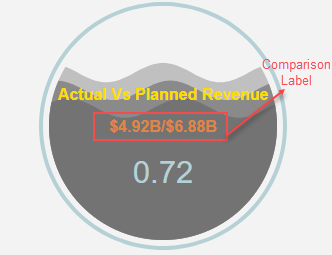
Comparison Label
This section will display the comparison between the actual and the target values. You can customize the following properties under Comparison Label.
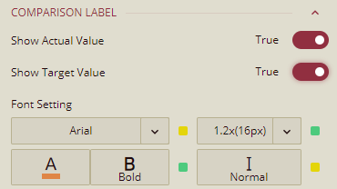
Note: This option is displayed only when the Show Label is set to True under Chart Style.
Property | Description |
|---|---|
Show Actual Value | Set this option to True to display the Actual Value (mentioned in the Databinding tab) in the liquid shape. |
Show Target Value | Set this option to True to display the Target Value (mentioned in the Databinding tab) in the liquid shape. |
Font Setting | To customize the font size, color, type, etc. for the Actual Value and Target Value text. |
Note: You can set the font size by selecting from the dropdown list and also you can specify the units of the size as well like 'cm'.
Data Label
You can customize the following properties under Data Label.
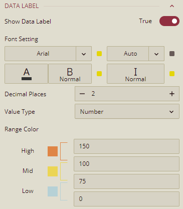
Note: This option is displayed only when the "Show Label" is set to True under Chart Style.
Property | Description |
|---|---|
Show Data Label | Set this option to True to display the data label in percentage or numbers, in the liquid shape. |
Font Setting | To customize the font size, color, type, etc. for the data label text. |
Decimal Places | You can set the decimal places for the data label. |
Value Type | To set the ratio format of data label in Percentage or Number. |
Range Color | To set the range color according to the ratio. |
Border Style
You can customize the following properties under the Border Style.
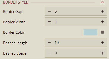
Property | Description |
|---|---|
Border Gap | To set the gap from border to inner liquid shape(circle, Ellipse, Square, Diamond). |
Border Width | To set the width of the border. |
Border Color | To set the color of the border. |
Dashed Length | To set the length of the dashed border. |
Dashed Space | To set the space between the border dashes. |
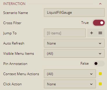
Interaction
You can customize the following properties under the Interaction.
Property | Description |
|---|---|
Scenario Name | Add a name to the Liquid Fill Gauge scenario using this property. |
Cross Filter | To reflect the filtered data throughout the dashboard scenarios when a filter is applied on the Liquid Fill Gauge scenario, set this property to True. Cross filters provide a simplified and deeper analysis to your observation. |
Jump To | To create a shortcut to another dashboard scenario, report, or URL, use this property. |
Auto Refresh | Set None, Polling, or Real Time option from the dropdown to refresh the Liquid Fill Gauge scenario data. Dropdown options are described below, None - Select None to disable auto refresh of the Liquid Fill Gauge scenario data. Polling - Select Polling to enable auto refresh and set an interval to refresh chart data in the Refresh Interval property. Real Time - Select Real-time to enable automatic refreshing of the Liquid Fill Gauge scenario in real-time. |
Visible Menu Items | Select the filtering and sorting options you wish to display on the Liquid Fill Gauge scenario from the dropdown. |
Pin Annotation | To pin the annotation to the chart scenario, set this property to True. By default, this property is set as False. |
Context Menu Actions | Select multiple Context Menu Options from the dropdown. Context Menu Options include - Keep, Exclude, Jump, and Add Data Monitoring. . |
Click Action | Select None, Keep, Exclude, or Jump options from the dropdown list to perform an action on click. |
Title
You can customize the following properties under the Title.
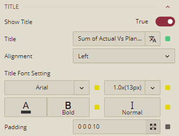
Shown below is the Title text in the liquid fill scenario.
Property | Description |
|---|---|
Show Title | To hide the title of the chart scenario set this property to False. By default, this property is set as True. |
Title | Add or edit the title of the Liquid Fill Gauge scenario using this property. |
Alignment | Select the Left, Center, or Right alignment of the title of the Liquid Fill Gauge scenario using the dropdown. |
Title Font Setting | Set the family, size, color, weight, and style of the font of the Liquid Fill scenario title using the Title Font Setting options. |
Padding | To create space around the title of the Liquid Fill Gauge scenario, use the Padding property. It supports Padding Left, Padding Top, Padding Right, and Padding Bottom. Their values can be different. |
Note: You can set the font size for the Title by selecting from the dropdown list and also you can specify the units of the size as well like 'cm'.
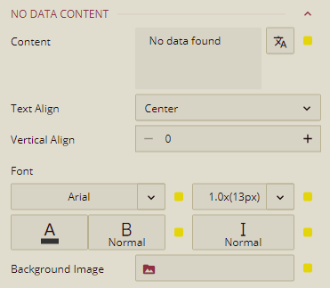
No Data Content
You can customize the following properties under the No Data Content.
Property | Description |
|---|---|
Content | Set the display content in case no data is found in the Liquid Fill Gauge scenario. |
Text Align | Select the Left, Center, or Right option from the dropdown to align the no data content text. |
Vertical Align | Set the vertical alignment of the no data content using this property. |
Font | Set the family, size, color, weight, and style of the font of no data content using this property option. |
Background Image | Add an embedded, shared, or external image as a background image for the no data content. |
Note: You can set the font size for the no data content by selecting from the dropdown list and also you can specify the units of the size as well like 'cm'.
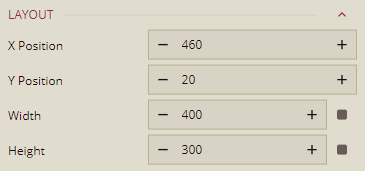
Layout
You can customize the following properties under the Layout.
Property | Description |
|---|---|
X Position | Set the horizontal position of the Liquid Fill scenario using the X Position property. |
Y Position | Set the vertical position of the Liquid Fill scenario using the Y Position property.. |
Width | Set the width of the Liquid Fill scenario using this property. |
Height | Set the height of the Liquid Fill scenario using this property. |
Appearance
You can customize the following properties under the Appearance.
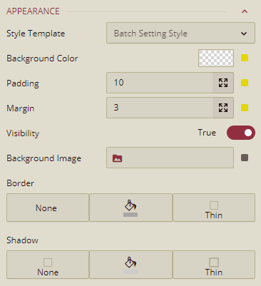
Property | Description |
|---|---|
Style Template | Select a template from the dropdown to apply a style to the Liquid Fill scenario. |
Background Color | Set a background color of the Liquid Fill scenario using this property. |
Padding | To create space around the Liquid Fill scenario, set a padding value. |
Margin | Set the margin value for the Liquid Fill scenario using this property. |
Visibility | To hide the Liquid Fill scenario from the dashboard scenario, set this property to False. By default, the Visibility property is set as True. |
Background Image | Add an embedded, shared, or external image as a background image to the Liquid Fill scenario. |
Border | Set the border type, border color, and thickness of the Liquid Fill scenario using this property. |
Shadow | Create a shadow of the Liquid Fill scenario by setting the Shadow Type, Shadow Color, and thickness. |