- Getting Started
- Administration Guide
-
User Guide
- An Introduction to Wyn Enterprise
- Document Portal for End Users
- Data Governance and Modeling
- Working with Resources
- Working with Reports
-
Working with Dashboards
- Dashboard Designer
- Selecting a Dataset
- Data Attributes
- Dashboard Scenarios
- Dashboard Templates
- Component Templates
- 3D Scene
- Explorer
- Visualization Wizard
- Data Analysis and Interactivity
- Dashboard Appearance
- Preview Dashboard
- Export Dashboard
- Dashboard Lite Viewer
- Using Dashboard Designer
- Animating Dashboard Components
- Document Binder
- Dashboard Insights
- Add a New Page in Dashboard Designer
- View and Manage Documents
- Understanding Wyn Analytical Expressions
- Section 508 Compliance
- Subscribe to RSS Feed for Wyn Builds Site
- Developer Guide
KPI Kanban
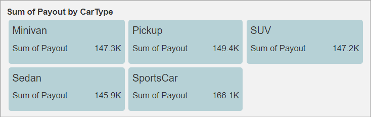
KPI Kanban is a visualization tool used to manage and track the workflow process using a Kanban board. Kanban board consists of cards (also referred to as items in Wyn Enterprise) that are used to display information using an indicator label and its values. Using KPI Kanban, you can display different KPIs in a certain dimension such as sales and profit for a region. Following scenario measures the insurance Payout for each type of car.
To design and customize a KPI Kanban in Wyn Enterprise, navigate to the dashboard designer page and follow the below instructions.
Design a KPI Kanban
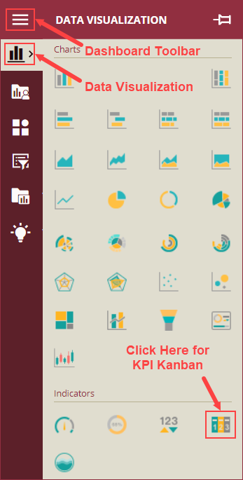
On the Dashboard Designer page, navigate to the Indicators section of Data Visualization of the Dashboard Toolbox, and drag and drop the KPI Kanban scenario onto the design area. KPI Kanban scenario is available under Indicators in the Data Visualization section.
Bind Dataset to KPI Kanban
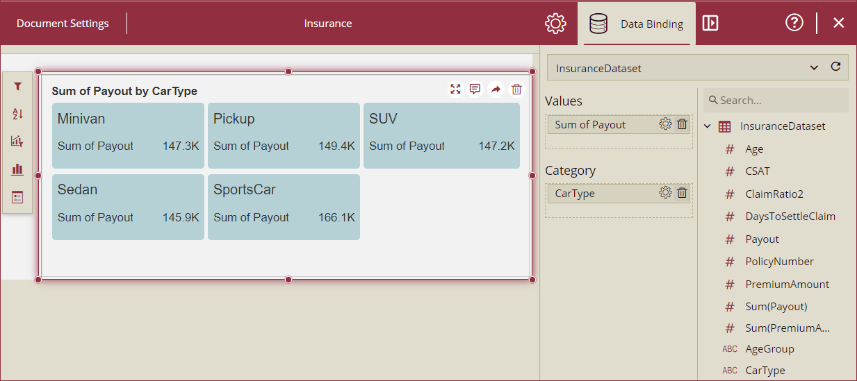
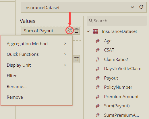
With the scenario selected, select the dataset to bind from the Data Binding tab. Once the dataset loads successfully, the data binding panel automatically expands and displays the data attributes available for data binding. Drag and drop the data fields in the Values and Category data containers.
Note: Values data container can contain one or multiple data fields and the Category data container can contain one or no data fields.
Format Data Attributes
You can perform various operations to format the data attributes on a KPI Kanban and control the data display. Use the settings icon in the Data Field containers to format data attributes. The following operations are included in the KPI Kanban scenario,
Aggregation Method: Use the Aggregation Method option to display a summarized value by aggregating multiple values of a data attribute. Aggregation Method supports Sum, Average, Min, Max, Count, and Distinct Count methods. See the Aggregation Method help topic for more information.
Quick Functions: Use the Quick Functions option to highlight key indicators in your scenario by applying powerful calculation on measures. Quick Functions in KPI Kanban support Ranking Calculation, Percentile Calculation, Running Calculation, Moving Calculation, and Original Value. See the Quick Functions help article for more information.
Display Unit: Use the Display Unit option to display unit of measure and eliminate ambiguity. See the Modify Display Unit help article for more information.
Filter: Use the Filter option to display relevant data in your chart scenario. See the Filter Data help article for more information.
Rename: Use the Rename option to change the name of a data attribute to make it comprehensible and meaningful. See the Rename a Data Attribute help article for more information.
Remove: Use the Remove option to remove a data attribute from the chart scenario.
Note: Aggregation Method, Quick Functions, and Display Unit options are available only for the Values data fields.
Analyze Data
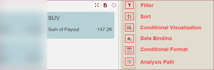
Wyn Dashboards scenarios support rich data analysis and exploration capabilities to help you analyze massive amount of information and make data-driven decisions. Following analysis operations are available in the Action Bar corresponding to each scenario in the designer,
Filter: To filter out relevant data in your chart scenario. See the Filter Data help article, for information on using the filter options in a dashboard scenario.
Sort: To arrange the chart data in a more meaningful order. See the Sort help article for information on using the sort options in a dashboard scenario.
Conditional Visualization: To filter, compare, and rant the data in a dashboard scenario. See the Conditional Visualization help article for information on using various visualization options.
Data Binding: To modify the data field binding, click this option. Data Binding window will appear as a pop-out, modify the Values and Category. You can also change the scenario type from the container panel on the top of the pop-out.
Conditional Format: To highlight specific values or emphasize specific information. See the Conditional Formatting help article for information on using various formatting options.
Focus: To expand the Kanban scenario to full screen, use this option.
Export: To export the scenario in the Kanban scenario as a PNG image, SVG image, or excel format, click the export icon and choose the appropriate option.
Customize Appearance
You can customize the appearance of the KPI Kanban scenario using the Inspector Panel properties on the right side of the dashboard designer window, listed and described in the following tables,
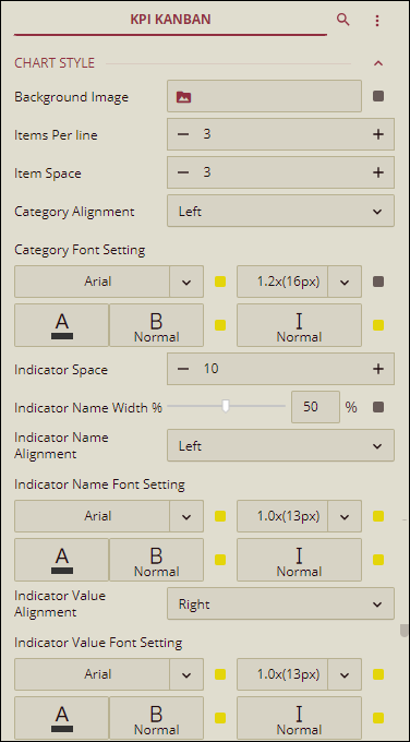
CHART STYLE
Option | Description |
|---|---|
Background Image | To add an image as background of the items of the Kanban scenario, select an image using this property. You can select images from three sources Embedded, Shared, or an External URL. |
Items Per Line | Select the number of items to display in a line using this property. |
Item Space | Set a corner radius of the items of the Kanban scenario using the Corner Radius property. |
Category Alignment | Set the alignment of the Category data fields. Choose an option from Left, Center, or Right. |
Category Font Setting | Set the family, size, color, thickness, and style of the fonts of the Category fields of the Kanban scenario using this property. |
Indicator Space | Set the indicator line spacing using this property. |
Indicator Name Width % | Set the width proportion of an indicator name in a row using this property. |
Indicator Name Alignment | Set the display position of the indicator name by choosing Left or Right option from the dropdown. |
Indicator Name Font Setting | Set the family, size, color, thickness, and style of the fonts of the indicator names of the Kanban scenario using this property. |
Indicator Value Alignment | Set the display position of the indicator value using this property. |
Indicator Value Font Setting | Set the family, size, color, thickness, and style of the fonts of the indicator values of the Kanban scenario using this property. |
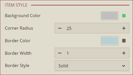
ITEM STYLE
Option | Description |
|---|---|
Background Color | To set the background color of the items of the Kanban scenario, select a color from the color palette. |
Corner Radius | Set a corner radius of the items of the Kanban scenario using the Corner Radius property. |
Border Color | To set the border color of a KPI item, select a color from the color palette. |
Border Width | Set a width of the border of items of the KPI Kanban using the Border Width property. |
Border Style | Set a border style using this property. You can choose Solid or Dashed option from the dropdown. |
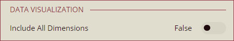
DATA VISUALIZATION
Option | Description |
|---|---|
Include All Dimensions | To include null values in the Kanban scenario, set this property to True. By default, this property is set as False. |
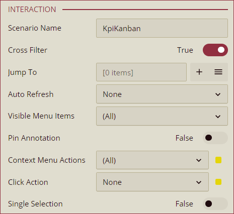
INTERACTION
Option | Description |
|---|---|
Scenario Name | Add a name to the Kanban scenario using this property. |
Cross Filter | To reflect the filtered data throughout the dashboard scenarios when a filter is applied on the Kanban scenario, set this property to True. By default, this property is set as False. Cross filters provide a simplified and deeper analysis to your observation. |
Jump To | To create a shortcut to another dashboard scenario, report, or a URL, use this property. See the Jump To help article for more information. |
Auto Refresh | Set None, Polling, or Real Time option from the dropdown to refresh the Kanban scenario data. Dropdown options are described below, None - Select None to disable auto refresh of the Kanban scenario data. Polling - Select Polling to enable auto refresh and set an interval to refresh chart data in the Refresh Interval property. Real Time - Select Real-time to enable automatic refreshing of the Kanban scenario in real-time. |
Visible Menu Items | Select the filtering and sorting options you wish to display on the Kanban scenario from the dropdown. |
Pin Annotations | To pin the annotation to the chart scenario, set this property to True. By default, this property is set as False. |
Context Menu Actions | Select multiple Context Menu Options from the dropdown. Context Menu Options include - Keep, Exclude, Jump, and Add Data Monitoring. |
Click Action | Select None, Keep, Exclude, or Jump option from the dropdown to perform an action on click. |
Single Selection | To allow single selection of Kanban items, set this property to True. By default, this property is set as False. |
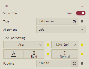
TITLE
Option | Description |
|---|---|
Show Title | To hide the title of the chart scenario set this property to False. By default, this property is set as True. |
Title | Add or edit the title of the Kanban scenario using this property. |
Alignment | Select Left, Center, or Right alignment of the title of the Kanban scenario using the dropdown. |
Title Font Setting | Set the family, size, color, weight, and style of the font of the Kanban scenario title using the Title Font Setting options. |
Padding | To create space around the title of the Kanban scenario use the Padding property. It supports Padding Left, Padding Top, Padding Right, and Padding Bottom. Their values can be different. |
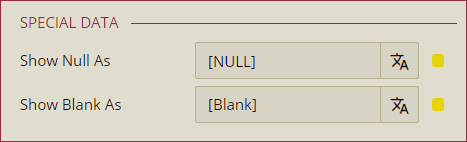
SPECIAL DATA
Option | Description |
|---|---|
Show Null As | Set the content to display in place of a null data in the Kanban scenario using this property. |
Show Blank As | Set the content to display in place of a blank data in the Kanban scenario using this property. |
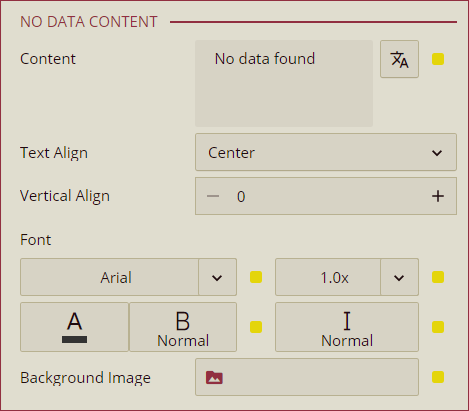
NO DATA CONTENT
Option | Description |
|---|---|
Content | Set the display content in case no data is found in the Kanban scenario. |
Text Align | Select Left, Center, or Right option from the dropdown to align the no data content text. |
Vertical Align | Set the vertical alignment of the no data content using this property. |
Font | Set the family, size, color, weight, and style of the font of no data content using this property option. |
Background Image | Add an embedded, shared, or external image as a background image for the no data content. |
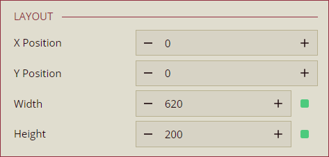
LAYOUT
Option | Description |
|---|---|
X-Position | Set the horizontal position of the Kanban scenario using the X Position property. |
Y-Position | Set the vertical position of the Kanban scenario using the Y Position property. |
Width | Set the width of the Kanban scenario using this property. |
Height | Set the height of the Kanban scenario using this property. |
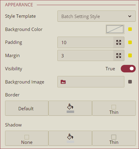
APPEARANCE
Option | Description |
|---|---|
Style Template | Select a template from the dropdown to apply a style to the Kanban scenario. |
Background Color | Set a background color of the Kanban scenario using this property. |
Padding | To create space around the Kanban scenario, set a padding value. |
Margin | Set the margin value for the Kanban scenario using this property. |
Visibility | To hide the Kanban scenario from the dashboard scenario, set this property to False. By default, the Visibility property is set as True. |
Background Image | Add an embedded, shared, or external image as a background image to the Kanban scenario. |
Border | Set the border type, border color, and thickness of the Kanban scenario using this property. |
Shadow | Create a shadow of the Kanban scenario by setting the Shadow Type, Shadow Color, and thickness. |