


In data visualization, an area chart is an extension of a line graph. It combines the line chart and the bar chart to reveal how one or more groups' numeric values change over a second variable.
An area chart is a great chart to visualize a volume change over a period of time. It gives a sense of summation of the quantitative data.
Data is plotted on the x- and y-axis. D values are plotted using data points that are connected using line segments. Unlike inline charts, the area between the line and x-axis is filled with color or shading in an area chart.
There are three main variations on this chart:
- Stacked area chart
- Percent stacked area chart
- Range area chart
Area Chart Use Cases
Area charts are excellent when describing the overall trend, as opposed to the individual values. Use a stacked area chart for multiple data series with part-to-whole relationships or for cumulative series of values.
Say you have the quarterly sales data for five years. If you want to facilitate a general comparison for your audience, you will use a column or bar chart.
If you're going to reveal the trend of how sales have changed over the years, you will use a line chart or an area chart.
Here, we'll give an overview of each and describe how to create all four area charts in Wyn Enterprise.
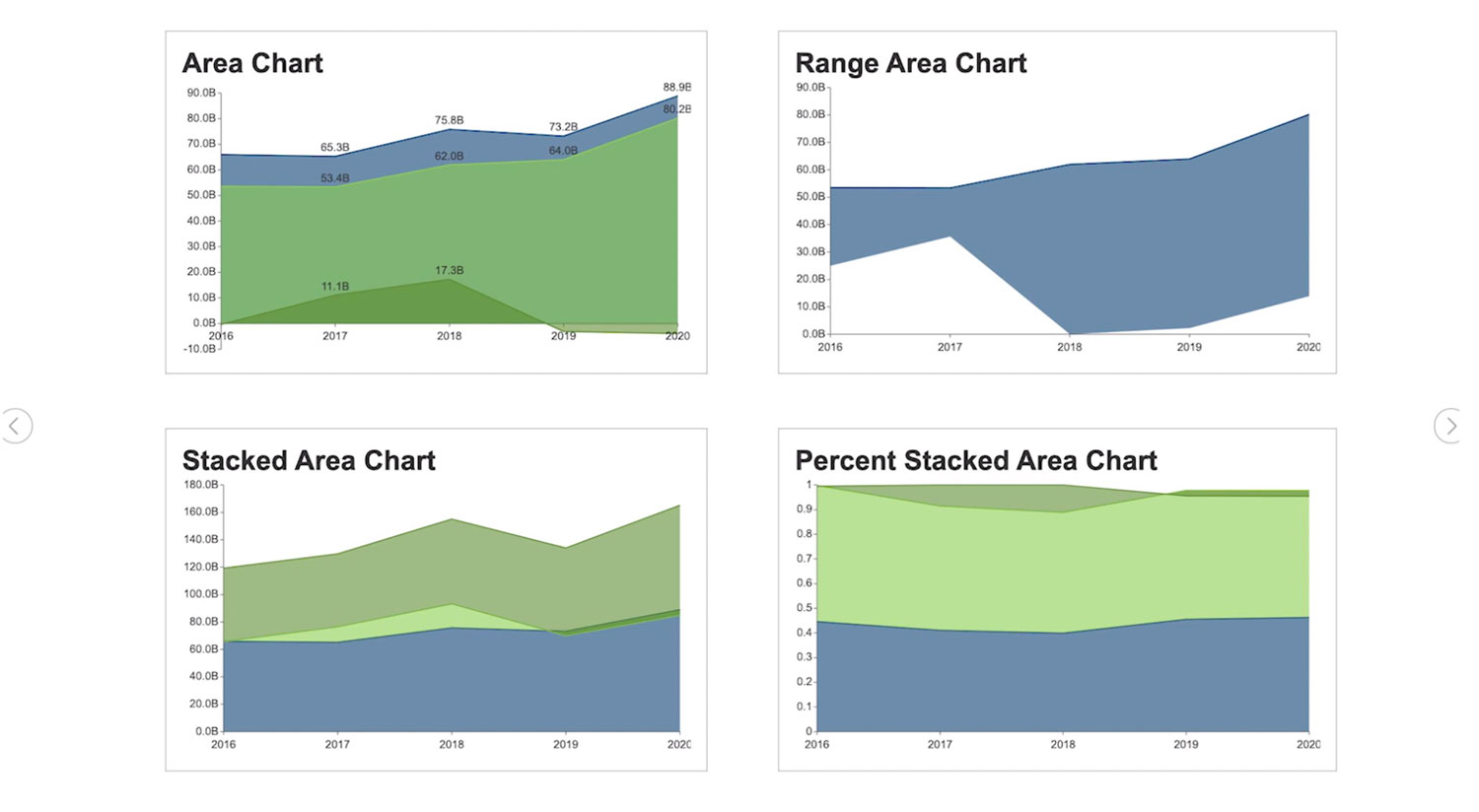
Basic Area Chart
The basic area chart is used to depict the data series as colored regions that help in comparing the values of multiple series for the same data point. This chart shows trends over time.

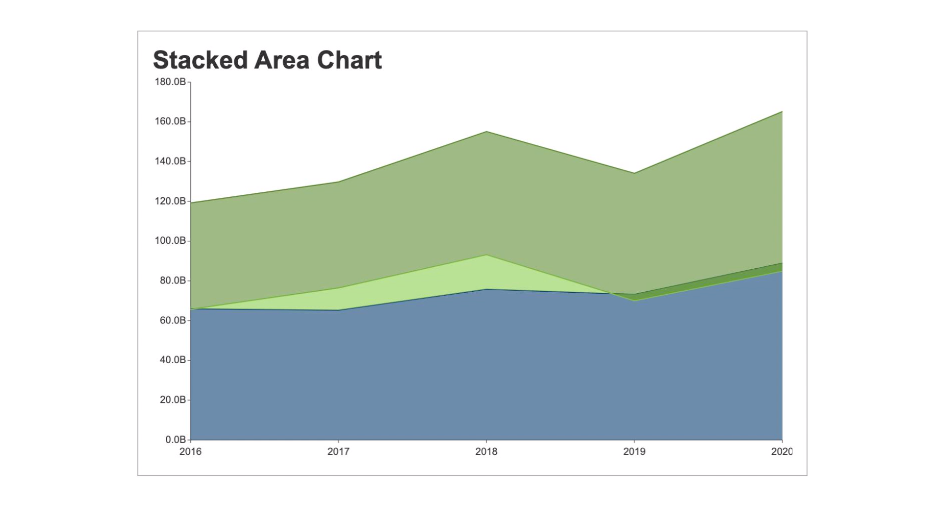
Stacked Area Chart
A stacked area chart depicts data series as stacked regions with different colors that help perform comparisons between multiple series for the same data point.
This chart shows the trend of the contribution of each value over time or other categorical data.
Range Area Chart
The range area chart is used to depict a range of data by plotting the area of two upper and lower values. This chart allows users to see the size difference between their data's high and low values.

Percent Stacked Area Chart
A percent stacked area chart is used to depict the series of data points with positive and negative values shown overtime to reveal values of multiple series for the same data point.
This chart shows the percentage that each value contributes over time or other categorical data.

Creating Area Charts in Wyn Enterprise
Wyn Enterprise Dashboards have four kinds of Area charts: Basic Area Chart, Stacked area chart, Range Area Chart, and the Percent stacked area chart.
Here, we'll show you how easy it is to create area charts in Wyn Enterprise. You can skip ahead chapters to individually view the steps for each chart type.
How to Create a Basic Area Chart
From the Wyn Dashboard interface, select the visualizations icon.
Click and drag the "Area Chart" onto the Dashboard canvas.
Select the data binding tab. Under "Values" you will add the data you are comparing. Under Axis, add data for the x-axis.
To adjust the design, select the Inspector Tab, next to the Data Binding tab. Here you can adjust the palette, text, and other design properties.
Create a Stacked Area Chart
From the Wyn Dashboard interface, select the visualizations icon.
Click and drag the "Stacked Area Chart" onto the Dashboard canvas.
Select the data binding tab. Under "Values" you will add the data you are comparing. Under Axis, add data for the x-axis.
To adjust the design, select the Inspector Tab, next to the Data Binding tab. Here you can adjust the palette, text, and other design properties.
Create a Percent Stacked Area Chart
From the Wyn Dashboard interface, select the visualizations icon.
Click and drag the "Percent Stacked Area Chart" onto the Dashboard canvas.
Select the data binding tab. Under "Values" you will add the data you are comparing. Under Axis, add data for the x-axis.
To adjust the design, select the Inspector Tab, next to the Data Binding tab. Here you can adjust the palette, text, and other design properties.
Create a Range Area Chart
From the Wyn Dashboard interface, select the visualizations icon.
Click and drag the "Range area chart" onto the Dashboard canvas.
Select the data binding tab. Under "Values" you will add the data you are comparing. Under Axis, add data for the x-axis.
To adjust the design, select the Inspector Tab, next to the Data Binding tab. Here you can adjust the palette, text, and other design properties.

Laurie Smith
Try Wyn Enterprise for Free
With our 15-day online evaluation, get started using Wyn's dashboard and reporting modules.

